Zero element loading animations
A technique for loading animations that can be applied to existing elements.
With a "zero element" loading animation, a loading state can be applied to any element with just the addition of a class name.
First of all, I'm not a huge fan of loading animations and neither are your users but sometimes, for various reasons an action is going to take time and we need to let people know we're working on it. So if we must use a loading animation we want it to have a light footprint and be easy to toggle on and off when and where we need it.
I've seen a lot of css only loading animations. A quick search on CodePen will find thousands of examples. They are popular because they are relatively quick and easy to make, yet can be creatively challenging and the result is usually visually pleasing. These type of experiments are fun and can be a rewarding and worthwhile exercise, but the practicality of many examples is more questionable.
There are definite benefits to css only solutions such as improving the number of network requests, page weight and animation performance. But in my opinion these benefits are often outweighed by the need to insert a div soup into the mark-up. Not only that, positioning a css only "spinner" can be challenging, it often requires changes to the surrounding mark-up to avoid breaking the layout.
Perhaps slightly more practical are the "single element" examples. They tend to be a bit more robust and whilst it's simple enough to toggle a single element to show and hide the loading animation, I don't like toggling element visibility or adding and removing elements with JavaScript. To me this seems to defeat the purpose of a CSS only solution. It feels like the correct way to approach a css loading animation would be for it to work simply by adding a class name such as loading to an element to indicate that it's in a loading state.
After all loading is a "describing word", it indicates the state of something and is not an object itself. Maybe it is a little silly to think we should apply this logic to our mark-up, but it feels right to me. So I set out to make a "zero element" loading animation, one that can be applied simply by adding a class name.
I eventually settled on a solution that works almost everywhere. There are only 2 conditions. The element we're adding the loading animation to:
- cannot have
:beforeor:afterpseudo-elements applied - must be possible to change the
positionproperty torelative
This works in every situation I’ve ever needed a loading animation but if we want to apply this technique to an element that requires absolute positioning or already has pseudo-elements, it’s usually possible to add the loading class to a container or child element.
How it works permalink
This technique works by using :before and :after pseudo-elements to create the different parts of the animation. CSS transformations and absolute positioning are applied and these properties are animated to create different types of loading indicators.
The difficult part is working out how to position and animate the various parts, taking into account the width, height, borders and css transformations.
For a typical horizontal loading animation we can work this out without too much trouble but to create a smooth radial animation or anything more complex you will probably want to rely on something like sass or a generator.
If you want to understand how it works let’s look at making a simple horizontal example.
.loading {
position: relative;
background: rgba(255, 255, 255, 0.8);
}
.loading:before {
content: "";
box-sizing: border-box;
/* centre everything */
position: absolute;
top: 50%;
left: 50%;
transform: translate(-50%, -50%);
width: 200px;
height: 30px;
border: solid 1px #000;
border-radius: 30px;
}
.loading:after {
content: "";
box-sizing: border-box;
/* centre everything */
position: absolute;
transform: translate(-50%, -50%);
top: 50%;
left: 50%;
border: solid 5px #000;
width: 28px;
height: 28px;
border-radius: 50%;
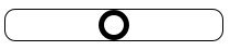
}With the above css we can add a class name loading to any element on the page and we should get something like the following, positioned in the centre:
If you want to apply this to the whole page, by applying the class name to the body element, you will also need to add the following css:
html,
body {
  height: 100%;
}
To complete the loading animation we need to move the circle back and forward along the bar.
To our circle add the following css:
.loading:after {
  ... -webkit-animation: loading 3s ease-in-out infinite alternate;
  animation: loading 3s ease-in-out infinite alternate;
}
Important animation properties in this example are the animation-timing-function and animation-direction. For the timing function I selected ease-in-out which causes it to slow before changing direction, although linear also works, however for this example the animation direction must be set to alternate. Next we add the animation keyframes.
@keyframes loading {
  0% {
    transform: translate(-99px, -50%);
  }
  100% {
    transform: translate(71px, -50%);
  }
}

@-webkit-keyframes loading {
  0% {
    transform: translate(-99px, -50%);
  }
  100% {
    transform: translate(71px, -50%);
  }
}
For the animation keyframes we translate the position of the circle so that is starts with its left edge against the left edge of the bar and ends with its right edge against the right edge of the bar. We also need to translate the vertical position by -50% to maintain its vertical centring. We do not change the vertical position in this animation.
Without any transformations applied, the left edge of the circle is positioned in the centre of the bar. Since we know the width of the bar is 200px, to position the left edge of the circle against the left edge of the bar we need to move it -100px horizontally. So why in the example do I have -99px? This is simply because I want the circle to bounce against the inside edge of the bar. In the css I have box-sizing: border-box; applied to the bar so I need to account for the border width. It’s barely noticeable with a border width of 1px but with a thick border it will make a difference. This is the same reason the width and height of the circle are 28px rather than 30px.
The full calculation for the first keyframe is:
-(half the width of the bar - border width of the bar)
-(100 - 1) = -99
For the final keyframe the calculation is similar however as already stated positions in css are relative to the top left corner of the element, so we need to take off the width of the circle.
The full calculation is for the final keyframe is:
(half the width of the bar - border width of the bar – width of circle)
100-1-28 = 71
Note: You might not want to confine the circle to the inner width of the bar. Take a look at some of the examples I’ve done in the links at end of this article.
You can of course change the sizes and colors to suit your preferences, as well as the border width or other properties, just remember if you change these adjust the calculations accordingly.
If you’d like to make a horizontal zero element loading animation you can, fork my zero element animation boilerplate.
This is of course only one possible type of loading animation. There are plenty of alternatives that could be made using the same technique.
I’ve created some other examples such as a radial loading animation - I'll admit, this one generates some lengthy css, but in most cases it is still smaller than an image or even an SVG. To create more complex animations like this you are going to need a preprocessor or some kind of script to generate the keyframes. Otherwise minor changes are going to result in a significant re-calculations and this is not something you would want to do by hand.
Please let me know on twitter if you find this useful, if you have some more examples or if you have any questions. I'll be happy to add your examples here.