11ty has the power of multiple template engines. This is a somewhat unique feature among static site generators. I find it incredibly convenient, but also know it’s a source of some confusion.
11ty decides which template engine to use based on the file extension. This can be configured in your .eleventy.js
config file, but we’re going to assume the default configurations. The most common file types I see people using for templates in 11ty are markdown (.md
) and nunjucks (.njk
). Personally I use nunjucks for layout and markdown for simple content.
The default template engine for Markdown is Liquid and for Nunjucks, it’s unsurprisingly Nunjucks. Both Nunjucks, Liquid and other template languages in 11ty have capabilities for filters, data and tags. The addShortcode
method is simply 11ty a unified way of creating tags and extensions.
11ty also has addFilter
which provides a unified method for creating filters that will be available no matter which template engine is used.
Filters take a single input on the left, modify this inline and return a single value. They are good for modifying a single piece of data in some way.
For example, in a markdown file I can use the upcase
filter in liquid to modify the value “mike”:
{{ "mike" | upcase }}
The result of this filter will be “MIKE”.
In Markdown and Nunjucks you can chain multiple filters using the pipe (|
) operator.
If you take a look at the 11ty documentation, you’ll see there’s not really a good list of available filters anywhere. You might find 4 universal 11ty filters, and if you’re not familiar with 11ty or templating languages in general, you might assume these are the only filters available.
For a complete list of filters take a look at the Liquid and Nunjucks or the documentation for your template engine of choice.
Looking at these docs you might notice some filters accept a values on the right such as divided_by:
{{ 16 | divided_by: 4 }}
Or split:
{% assign beatles = "John, Paul, George, Ringo" | split: ", " %}
{% for member in beatles %}
{{ member }}
{% endfor %}
This is where things get a little bit blurry. You can use filters like this, but when creating your own, the ability to pass parameters other than the value to the left of the pipe is not supported by 11ty universal filters. This is primarily what distinguishes it from a shortcode in 11ty.
Note: 11ty does allow you to extend the underlying template engine. But I’d strongly recommend sticking with the universal options as much as possible and making a clear distinction between filters, shortcodes and data for all your needs.
Unlike filters, shortcodes don’t modify a value, but they can take any number of parameters, so they can do largely the same thing as a filter and more.
Personally I think filters provide an easier to read API and stop you from over complicating things. They should be used where it makes sense.
Shortcodes work best when you need to pass multiple parameters.
Before making a shortcode, consider if the parameters are dynamic or if they can be set once using static config. An example might be a JSON.stringify()
shortcode:
{% stringify object, indentation %}
It’s likely indentation can be configured once per site so this example could probably be made into a filter.
The place where shortcodes really shine is when using paired shortcodes. Paired shortcodes have opening and closing tags that allow you to access and modify the content between the tags.
Let’s write a complete simple example.
Filename: .eleventy.js
:
eleventyConfig.addPairedShortcode(‘my_shortcode’, (content) => {
console.log(content); // Log in Node
return content;
});
Filename: index.md
:
---
var_in_shortcode: "I am resolved first"
---
{% my_shortcode %}
Hello {{ var_in_shortcode }}
{% my_shortcode %}
{% raw %}
With this example, it’s important to know that the value of var_in_content
will be resolved from the front matter before it is passed to my_shortcode
.
Shortcode look similar to other template language features such as iteration:
{% raw %}
{% for product in collection.products %}
{{ product.title }}
{% endfor %}
The key difference is that shortcodes cannot modify the global context and provide data to templates inside the paired tags.
One of my favourite things about 11ty is how it manages data. Typically data is read from front matter and is available to use inside templates. 11ty provides the means to inject custom global data at stages during the process.
One of the great things is that data can be literally anything. It’s really useful for a set of global variables like a site name, navigation menus or copyright statements.
Data can also be async. This means you can fetch data from other sources, for example a product list from Stripe or Shopify, or a feed from Twitter or Instagram. And you can use this data in the generation of a static site rather than as client side operation.
What makes data incredibly powerful is that, for some template languages at least, it can be more than a static value. In Nunjucks templates, but not Liquid, 11ty data can also be a function. This means we can create something similar to shortcodes by exporting a function from a data file:
Filename: _data/example.js
:
module.exports = {
site_name: "Example",
add: (a,b) => a + b
}
In our templates we can now access the example
data:
Filename: index.njk
:
{{ example.add(1, 2) }}
Add to this the fact that data can be async (ok, filters and shortcodes can also be async as of version v0.2.13 but I started with 11ty before all this) and I think that data is probably the triangle at the top of the Triforce for me. I hope this has helped clarify how and where to use data, filters and shortcodes. There may still be some confusion as a result of different implementations between template languages. Generally I’d say before getting too far into an 11ty project, pick the template language that works best for you and stick with it. Understand how each of the above work with your choice. Make a few test shortcodes and filters as well as experiment with data before early in the project. Also choose nunjucks.
]]>I then asked, "How many people feel the difficulties they have writing CSS at scale have been largely solved by CSS-in-JS?". They weren't stupid, they knew this question was a set-up, nonetheless, many of them obliged me and put their hand up.
From the looks in the room, I think many more people felt this way than were willing to admit. At the very least, I think a lot of people believe CSS architecture is no longer relevant in the context of modern JavaScript applications.
That perspective was very kindly put to me by Alex Louden on Twitter:
"Styled Components etc has removed the need for class names completely for me. Now since styles are included in my presentation components (to me at least) it doesn’t feel like a style architecture issue any more?"
This is not to criticise that perspective; it's completely valid! Alex is saying tooling helped make some of the challenges he had dealing with CSS (in particular specificity) easier. The challenge now is dealing with components in an application.
I understand this perspective, but find it interesting when people see classnames and components as completely different concerns. Classnames and components are just different ways of composing user interfaces. There are still many challenges involved in making good re-useable and scalable front-end systems, no matter how you put them together.
These challenges are not new. In fact, there are some well established solutions in CSS architecture that can be easily transferred to component-based style systems. So why are so few people talking about this? And why are many more people completely unaware of the topic?
I believe there is a lot that has contributed to this and it's worth reflecting on how we got here...
I believe the initial response to CSS-in-JS, from many leaders in the CSS community hasn't helped with understanding and knowledge sharing. I've often heard comments like "People (i.e. younger JavaScript developers) just need to learn CSS better." People who have knowledge about CSS architecture need to do a better job of articulating this experience in a way that is accessible and relevant to new developers. If I'm honest about it, the CSS community has failed at this.
But it's not that simple. There are some non-human factors and context we need to consider as well.
Before the rise of JavaScript components. The strong and obvious naming conventions of BEM gave developers a system to follow that helped avoid specificity clashes in the "terrifying global scope" of CSS. This alone was reason enough for many people to use BEM. You could get good enough results, without necessarily understanding nuanced reasons behind the conventions.
When JavaScript tooling provided a better solution than humans following naming conventions, it opened up UI development to a wider spectrum of developers who previously had less interest in, or reason to focus on, style architecture.
Business jumped on the dogpile. They reasoned it would be cheaper to employ developers who could "do everything" and got what they considered to be adequate results by under-investing in UI specialists. Some developers who'd spent half a career perfecting skills in this area felt threatened. Perhaps some were defensive.
At the same time, developers working in spaces of growth and opportunity could sometimes be dismissive of skills that were not flavour of the month. There was pride, and hype, and reluctance to admit that new tooling and approaches were not always producing better, more re-useable, front-end architecture.
I've been consulting in this space for the last 5 years and I've seen many different systems for building UIs with component-based architecture. The reality is, whilst some aspects of building large scale JavaScript applications are easier, the promise of better, more re-usable UI components hasn't been delivered. Front-end architecture is more varied in approach and the results less re-useable than it was before the rise of JavaScript tooling.
Some people might challenge this, but I've seen enough examples to consider it an objective truth. What I have seen is:
Somewhere in the turbulence, we lost the more nuanced reasons behind the naming conventions.
The aim of this was to give context, not blame (it's a little bit of everybody's fault). So let's draw a line, and look at how to apply some lessons from CSS architecture to modern JavaScript applications.
First of all, we need to consider what makes sensible abstractions in UI development. OOCSS, SMACSS and BEM all have a common language when they talk about the different parts of a UI component. I can summarise these as:
If re-use or long-term maintainability is important, keeping these concerns separate is beneficial. Yet, this is not typically how teams approach the design of a component library.
Components can do many things, they might fetch data, they might render HTML, they might call functions to execute business logic and manage application state. Sometimes a single component does all these things. There is usually little distinction around what the responsibility of a component should be. People draw boxes around the visual boundaries of a design and then mix this with application logic. That's how most components are built. We can do better than that.
BEM gave semantic meaning to classnames and one of the biggest unseen values in this was we could immediately transfer our intentions to other developers across teams and even projects. If you know BEM you can look at a classname, e.g. button--state-success
and immediately recognise this as a modifier for a button class.
This kind of semantic meaning is sorely needed for components.
With that in mind, let's look at different parts of a UI component, identified in CSS architecture methodologies and redefine them in terms of component architecture.
Find a way to distinguish layout components in your application. It might be a comment in the file, a naming convention or the organisation of components in folders... it doesn't matter. What matters is we need a way to convey our intentions quickly to other developers.
When we have common understanding of what a layout component is we can enforce expectations in code-reviews or linting.
Layout components:
That last point might be a little confusing at first. Why children and not themselves?
In modern CSS there are two parts that contribute to layout:
In other words, we have a grid-container
and grid-items
, or a flex-container
and flex-items
. There is always a parent/child relationship.
To get the intended layout, we need the parent item and the child item to work together. Updating one of them independently from the other, will result in a broken layout. We have a word for this, it's called a dependency.
Despite this dependency, we continue to make these separate components with no direct link. We simply hope that people put them together in the right way and don't change them. We call that an unmanaged dependency.
The solution is to co-locate the layout concerns with the parent item. There are a number of ways this can happen...
Use the cascade to your advantage and apply a *
selector to target all immediate children of a layout component.
For example:
.layout {
display: flex;
}
.layout > * {
flex-basis: 50%;
}
This works, even with CSS-in-JS and you might be interested to know the *
selector doesn’t increase specificity, so it’s easy to override with classic CSS, should you need.
This might seem simple, but it works in most cases.
Another option is to make the layout component responsible for rendering mark-up that wraps child items.
This allows us to more directly control both sides of the parent/child relationship and is useful for ensuring semantic and accessible mark-up.
const Layout = ({items}) -> (
<ul classname={parentStyles}>
{items.map(item => (
<li classname={childItem}>{item}</li>
))}
</ul>
)
In the example above I'm ensuring the children of a ul
will always be an li
. At the same time I'm applying styles for the layout to both the parent and child items. These are managed somewhere in the layout component.
The biggest downside of rendering mark-up that wraps child items is you need to pass a list of items that get rendered into specific slots. That's ok for a simple list, but not ideal for more complicated layouts. As a final escape hatch for complicated components, you can export styles from the parent to be used by a child item.
This allows us to co-locate layout concerns for a particular component.
import { sectionHeader } from "./Page";
const Heading = () => <h1 classname={sectionHeader}>A Heading</h1>;
In the example above Heading
still needs to be a child of Page
but the dependency between these components is no longer hidden.
By passing just the layout styles between components (not presentation) we're being explicit about what the dependency is. The Heading
component is still responsible for any presentational styles applied to the h1
.
Once again we need a way to convey intentions and set expectations about what aspects of UI development presentational components are responsible for. It should be immediately apparent that a component is a presentational component.
Presentational components:
display
or positioning properties,
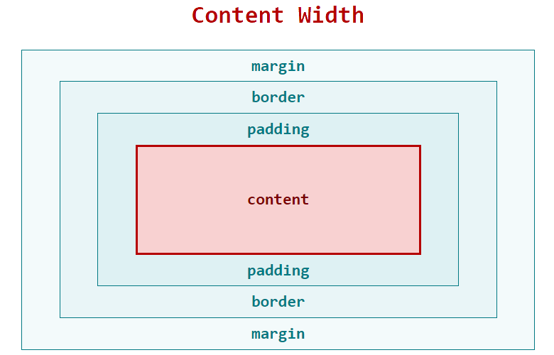
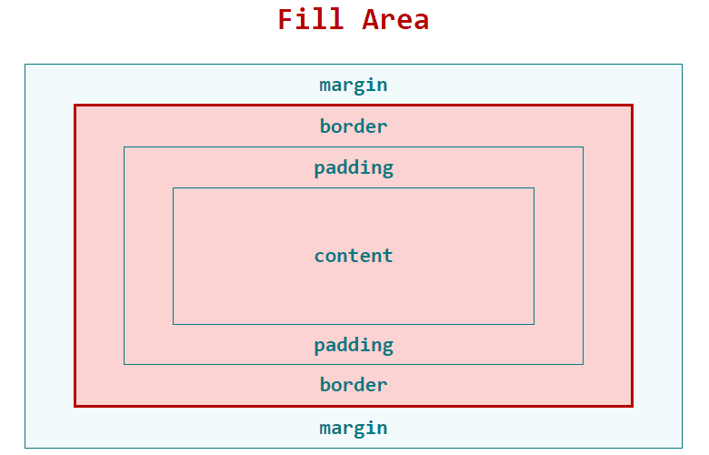
Once again, the last point is the least intuitive. Size agnostic means presentational components should fill the space available. Trust in the layout components to set the constraints.
In practical terms this means most UI components have no display
, width
, height
or margin
properties.
This is sometimes hard to achieve. Working on presentational components is going to reveal problems or oversights in the layout (or even missing layout components). It feels easier to quickly add a margin to 'fix' the presentational component, but by keeping the responsibility for layout with the parent item, presentational components can be re-used in any part of the application.
By adding CSS to presentational components to 'fix' layout issues, we are adding hidden dependencies between components. For long term maintainability, it's far better to fix these problems at the layout level.
I know this is not always simple, so I'm going to give you an escape hatch. However, consider this the !important
of CSS-in-JS. Use it when you absolutely must, and use it right. For certain types of components (usually inline-block
elements where content is dependent on dynamic data and there is no obvious parent layout component) it sometimes makes sense to add a utility class, or a prop to set a single CSS property. If possible, these should still remain separate from the presentational component and be imported from a utility file. I suggest naming this liabilities.js
or debt.js
.
Always try to avoid hard coding width
and height
in presentational components.
Both layout and presentational components have different types of UI state. UI state is different from application state, but the two are often conflated in modern web applications.
From a UI development perspective, the state of a component refers to different display or layout variations that might occur when a user interacts with it.
As a UI developer knowing the number variations and what styles are applied in each case is not only critical, it's the job description. So why has this has become so hard to know in modern JavaScript applications?
When props are passed to a function that resolves styles, the number of variations can be hard or impossible to verify. This is an example from a real-word application I worked on:
import { theme } from "theme.js";
const styles = ({ selectedItems, activeItems, id }) => {
return {
backgroundColor: selectedItems.includes(id)
? activeItems.includes(id)
? theme.color
: theme.colorAlt
: activeItems.includes(id)
? theme.color
: null,
":hover": {
border: `solid 1px ${theme.colorAlt}`
}
};
};
These styles are so difficult to reason about because you have to consider how the application state (props) effects each individual CSS property.
Not only does this make it hard to read, it makes it difficult to test. If the props passed to a style function don’t represent a finite set of UI states, how do we know the current set of resolved values is something intended in the design?
Once again CSS architecture taught us some things about how to manage UI state. SMACSS in particular talked about state and identified three different types of UI state:
I'm paraphrasing, because SMACSS was not thinking about components, so let's revise some of these ideas for modern front-end architecture.
Modifier states are top-level variations in design. They are not necessarily dependent on application state and may be applied as a stylistic choice.
Examples include size variations, primary and secondary buttons, or the position of an image within a layout component.
Modifier states can be extended with behavioural states.
Behavioural states are dependent on application logic. They communicate something about the state of a component to the user. Examples might include success, failure and loading indicators, or the current item in a navigation menu.
Pseudo states are more temporary. They usually map directly to persistent states in the browser, rather than application logic. Typical examples include hover
, focus
and active
but this might also include disabled
or selected
.
The solution to verifying UI states is to resolve styles down to a set of finite states that can be easily understood.
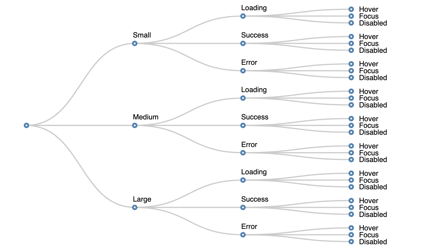
To ensure this, I start by mapping out UI states into a table:
Modifier state | Behavioural state | Pseudo state |
---|---|---|
Large | Loading | Hover |
Medium | Success | Focus |
Small | Error | Disabled |
Next consider how these states combine. Typically you only have one modifier and one behavioural state active at any one time.
You can visualise this as a tree:
If you find it's possible to have two behavioural states active at the same time, split them into different categories.
Modifier state | Network state | Todo state | Pseudo state |
---|---|---|---|
Large | Loading | To Do | Hover |
Medium | Success | Doing | Focus |
Small | Error | Done | Disabled |
Warning: If you find you do need this, consider carefully, as it’s often a sign that you have two components pretending to be one.
Because state can be additive, (i.e. behavioural states can change depending on the modifier state), to work out the total number of variations, we multiply the possibilities. With 3 types of state and 3 possibilities for each, there are (3 x 3 x 3
), 27 possible variations.
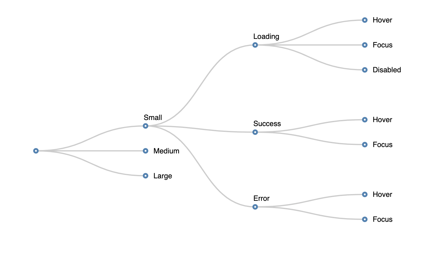
Obviously not every combination matters. The disabled state might look the same for every type of modifier and maybe the pseudo states are the same for all modifiers. We can eliminate duplicate states:
CSS forced us to flatten the state tree and have a single selector for each possible combination of state. Although sometimes tedious, this made us acutely aware of how many variations there were.
JavaScript doesn't force us to flatten the state tree in any way. The concept of different types of UI state often lost and at worst the value of individual CSS properties depends on the resolution of business logic and data within the “style sheet”.
It doesn’t matter whether you’re composing styles with classnames, template strings or objects in JavaScript. It remains important to have a single representation for each of the possible UI states.
My current favoured approach is to resolve application logic outside the style function, then and pass keys for modifier and behavioural state. Where a behavioural state changes depending on the modifier, I use CSS custom properties to set variations that are later applied in the behaviour.
const modifiers = {
light: {
color: "#777",
"--pressed-color": "#333"
}
};
const behaviours = {
pressed: {
color: "var(--pressed-color, #777)"
}
};
export const style = ({ modifier, behaviour }) => ({
fontSize: "1em", // Default Styles
...modifiers[modifier], // Apply Modifiers
...behaviours[behaviour] // Apply Behaviours
});
This allows me to have additive states with a fairly flat and readable representation of each of the styles applied to each variation of a UI component.
The final type of component we need to distinguish is a container component. Many people might already have an understanding of what this means, but from a UI perspective, I'm not referring to any particular design pattern.
From a UI perspective a container component is simply where the application logic is resolved down to a set of modifiers and behavioural keys that are passed to presentational and layout components.
A container component:
As the responsibilities of front-end developers have become more broad, some might consider the conventions outlined here to be not worth following. I've seen teams spend weeks planning the right combination of framework, build tools, workflows and patterns only to give zero consideration to the way they architect UI components. It's often considered the last step in the process and not worthy of the same level of consideration.
It's important! I've seen well-planned project fail or go well over budget because the UI architecture was poorly planned and became un-maintainable as the project grew.
This disappoints me because the problems are hard and my colleagues and friends who helped establish best practices in CSS are serious engineers, with broad skills, who applied knowledge across disciplines.
Many of the ideas in CSS architecture predate CSS itself and have strong foundations in computer science and software architecture. I know developers who can understand complex architectural problems but fail to see the similarities, or worse yet, choose not to apply this knowledge to declarative front-end code.
I know you can do it. To help, I've got some questions to ask yourself when planning UI components.
Keep practising this and you will build better lasting UIs.
]]>If you're familiar with basic Git terminology you might want to skip ahead.
It took me a long time to get comfortable with Git. Perhaps because some of the terminology is a little strange but also, I think there is an assumption that everyone around you just gets it. They probably don't. The best developers I know still struggle with Git sometimes.
I thought I'd take the time to cover:
Git is a version control system. It's one of many, but it's the most widely used by web developers. Version control helps manage changes to code. It's great for individual projects but becomes practically essential when working in teams.
There are a few terms you will need to learn before you use Git:
A repository represents the entire project. All of the project code along with any changes are stored in a repository. Your local copy of the repository doesn't necessarily contain every change. It may in-fact be missing large portions of code that are stored in other repositories. For example two developers working independently can each have changes in their local repository that the other is not aware of.
To share changes we can push code to a remote repository and pull to get updates. By regularly synchronising with a centralised repository multiple developers can share work and manage changes.
Git does not require a centralised remote repository, although this is the most common way of working with Git. Services like GitHub provide hosting for repositories as well as tools to help us review code and manage changes via pull requests.
The initial step of copying an existing repository to your local file system is called cloning.
Git allows individuals to have their own copy of the code, or even multiple copies at the same time, each stored on a different branch. A branch typically contains a new feature or a significant change.
You can checkout a branch at any time to work on it. This will update all the files in your local repository to reflect the selected branch.
Git is clever and it only stores changes we make from the time we create a new branch. It remembers the base, (the point where the branch was forked) and saves the minimal amount of information required to represent that change. The ability to store only the differences from the previous version is central to Git.
Branches are intended to eventually be merged back into the trunk. The trunk is just the main branch and it's typically called 'master'. You normally branch off master, but if you have a good reason, you can create a branch off any other branch.
A branch is made up of one or more sets of changes to files. We call these commits. If a branch represents a feature, a commit represents an implementation step. Each commit has an associated message and ideally this message should describe the step taken and perhaps more importantly why. Selecting files to be added to a commit is called staging.
A good series of commit messages should read like steps in a recipe or a set of instructions. For example the commit messages for adding timestamps to posts on my Writing page, might look something like this:
formatDate
functionformatDate
functiontime
elementTruthful Disclaimer: On my personal blog, they usually do not look like this.
That covers the main terminology, and if you can understand repositories
, branches
, commits
as well as follow some of the other terms I've introduced here, then you are on your way to mastering Git.
If you're new to Git one of the first things you need to decide is whether you'd prefer to use a graphical application or type commands in the terminal. There's no right answer here. I know plenty of skilled developers who prefer graphical applications as well as plenty of weekend hackers who get by just fine learning a few commands. Whatever you decide to use is fine.
Personally, I use a combination of the command line and graphical tools within VSCode.
To install Git in the terminal first check, because you may already have it. Type git --version
. Instructions here will assume you're running version 2 or later. If you don't have Git installed:
Mac:
brew install git
Ubuntu:
sudo apt-get install git
Windows:
In my experience the Windows version of Git is significantly slower. If you want to use a Git terminal in Windows, I strongly recommend setting up WSL and Ubuntu. To get started, download and install Ubuntu from the Windows Store. Once you have a Ubuntu terminal running in Windows you can follow instructions for Linux\Ubuntu.
If you absolutely must, you can download Git for Windows.
If you use VSCode there are a number of built in tools in the source control pane. These allow you to diff files, stage changes, manage merge conflicts and even push, pull and execute more advanced commands without leaving the editor. I find the source control pane practically essential for dealing with merge conflicts. If you are after a simple GUI, this might be all you need.
The source control pane makes use of a git terminal in the background Follow instructions above for installing a command line version of Git before running VSCode.
Note: At the time of writing VSCode source control pane will not work with WSL Git.
On top of the built-in tools, the only plugin I recommend is GitLens. It adds a lot of features, but the one I enjoy most is, it un-obtrusively adds information to the text editor that shows when each line of code was changed and what the commit message was. This contextual information is brilliant when working on larger projects.
There are a bunch of free and commercial Git clients. Free includes GitHub Desktop as well as Sourcetree. On the commercial side I have friends that use Git Tower and GitKraken they both look good, but haven't used either of them.
After you install Git it's a good idea to add your user name and email address. This is important because every Git commit uses this information. To configure these in the terminal type:
git config --global user.name "Mike Riethmuller"
git config --global user.email mike@madebymike.com.au
You can use your own name and email rather than mine. And you can change these settings for specific projects by removing the --global
flag.
Note: If you don't want to share your email publicly, GitHub provides options to set up a private email address. Go to https://github.com/settings/emails and Select "Keep my email address private". Then follow the instructions.
If you are making a lot of changes and regularly pushing these to a remote repository, you will be prompted to enter a username and password. To avoid entering this every time you can use a git credential manager.
To store credentials indefinitely on your hard drive:
git config credential.helper store
To store credentials in memory for a short period of time:
git config credential.helper cache
Hopefully I don't need to say it, but you should consider security before storing credentials.
There are a number of other ways you can authenticate with a remote repository including SSH keys and third-party credential managers. I'm not going to cover them here.
One of the first things I do on any new machine is set up a bunch of aliases for the commands I'll be using ever day: status
, checkout
, branch
and commit
. Aliases allow me to give a command an alternative name. I could not work without these.
git config --global alias.s status
git config --global alias.co checkout
git config --global alias.br branch
git config --global alias.ci commit
You can set up your own aliases, but I recommend these. I use git s
religiously. For some reason, I don't use an alias for add
or push
. I think add
is short and simple to type and I find it satisfying to pound the letters P-U-S-H as I demonstrate my victory over the code.
For even more aliases see the tips and tricks at the end of this article.
When working with an existing repository you need to clone it. Go to either GitHub, BitBucket, or some other hosted repository and copy the URL.
In the terminal, navigate to a directory, then type:
git clone https://github.com/MadeByMike/madebymike.madebymike.git
Use the URL for your project, not my blog, although feel free to clone it if you want.
This will create a new directory for the project. If you want to clone into a existing directory you can add this after the URL. For example, adding .
after the URL will clone it into the current directory.
Once you have cloned your project it will be set-up to track the remote origin. This means when you push git
, it knows where to send things.
You don't need to do this when you clone, but sometimes you will start new project that doesn't have an existing repository. Using GitHub you can initialise a new repository via the UI and then clone it. Make sure you check the "initialise this repository" option.
Once this is done you just clone the repository using the instructions above.
However, if you have existing work, you probably want to initialise the repository locally. You do this by typing:
git init
If using a graphical application look for an initialise repository option.
If you initialise a repository locally you probably want to add a remote origin sooner or later. The steps are a bit less intuitive.
First create a new remote repository. For example, if using GitHub, follow the instructions above but don't select the option to "initialise this repository". Once a remote repository has been created, you add the remote origin like this:
git remote add origin https://github.com/MadeByMike/madebymike.madebymike.git
Now your local knows where to push and pull from you can sync with the remote repository as long as you have the correct permissions.
By now you should have created a local repository using one of the methods above. The next step is to create a branch and add some commits.
You will want to check git status
often (very often) to see what files are staged, unstaged, and how many commits ahead of origin your local branch is. That's why we created a short alias. Use:
git s
Or git status
without the alias.
Before we start any work we should create a new branch. Working on master is not a good idea and almost any workplace will have processes that prevent this. Most work will be merged to master via a pull request. Working in branches is a good habit when working locally too.
To create a branch we can use the alias we set-up earlier.
git br name-of-branch
Or git branch name-of-branch
if you don't have the alias.
After you create a branch don't forget to checkout
before you start work.
Using our alias:
git co name-of-branch
Or git checkout name-of-branch
.
Once you've edited some files you will want to add them to a commit. You can be clever and surgical to make sure you only stage the files and folders you want, but in truth, about 90% of the time I want to stage everything. I usually type:
git add .
If you want to stage specific files or folders you can add a path after add
. For example git add ./my-folder/
will stage files in my-folder
only. You might do this so that your commits are smaller and more meaningful. In my opinion, it's easier, and a better habit to just commit more often. I like to only edit files I intend to go into the next commit and try to think just one stage ahead. It's hard, but it's a good habit.
If you want to pluck individual files into different commits, the VSCode source control pane is how I usually do it. I find the visual editor better for these kind of tasks.
Sometimes I will stage files I didn't intend. To unstage we use the command:
git reset ./path-to/file.js
I also find the VSCode source control pane handy for this.
Once staged, you add these files to a commit with the command:
git commit -m "Add a useful commit message here"
If you don't add a the -m
parameter it's typical to end up in Vim. You can add a message here but this can be intimidating for new users. BTW to exit Vim press Esc
to exit edit mode, then type :q!
and start again.
Sometimes I commit a set of changes before realising I've made a mistake or I commit files to the wrong branch. When this happens, the easiest way to fix it is to reset like this:
git reset HEAD~1
This tells Git to reset everything back to the previous commit. By default it will keep all your changes and just unstage them. Use --hard
after the command if you want to reset and wipe everything back to the previous state. But be careful!
Note: If you have pushed and reset a commit after this, your history will be different from the remote. Try to avoid it, but if you need to fix a mistake like this you can force push git push -f
.
After each commit you want to push these to the remote repository. You do this with:
git push
Once a branch is complete and ready to be merged you use the merge
command. First checkout the branch to want to merge into (usually master). Then type:
git merge my-branch
Another way to merge changes is on the remote repository via pull requests. Pull requests can be reviewed by the team and merged to master on the remote. After this every one needs to pull to update their local copy of the master branch.
When the remote repository ends up ahead your local copy you need to pull.
git pull
This will fetch the latest code for the branch you are on as well as an index of any branches other developers have pushed to remote. Now you can now checkout their branches too.
Sometimes when you merge or pull you will end up with conflicts where 2 branches have modified the same files. If Git can't resolve this automatically it will ask you to resolve the conflict manually.
The terminal will tell you which files have conflicts:
> Auto-merging FILE-NAME.JS
> CONFLICT (content): Merge conflict in FILE-NAME.JS
> Automatic merge failed; fix conflicts and then commit the result
You resolve these in your editor and stage the files when the conflicts have been removed. This is where a VSCode or a GUI are especially useful for highlighting the differences and allowing you to select the desired change.
For larger merge conflicts use git status
to see which files still need changes.
When all your files have no conflicts you can stage them as usual using git add
and git commit
to complete the merge.
There are not magic secrets for making merge conflicts easier. They can be terrible. Making smaller commits and syncing often helps avoid having them, which is the best strategy.
You should now have a grasp of the basic commands and a developing understanding of how git works. This is enough to be effective with git. The next section focuses on some more advanced commands and tricks that might help make working with Git a little easier.
Stash is good for when you want to quickly check out a different branch but are not ready to commit your current work. To quickly stash files, use the command:
git stash
You can now switch branches and work on something else and when you are ready to retrieve work from the stash run:
git stash pop
If you are like me, git stash
is sometimes where things go to die. You can use git stash list
to remember what you put there. And you can even add a message to any stash with -m
just like a commit.
You can then retrieve a specific stash with git stash apply stash@{1}
where stash@{1}
is the index from the list.
Sometimes you want to checkout a specific file from another branch. Usually master, and usually to fix a mess. You can do that:
git co master ./path-to-file
This will replace the file on you current branch with what is on master.
You can also replace the branch with a commit hash from git log
to checkout a particular revision.
Usually after creating a branch the first thing I do is to checkout and start working on it. I can do this in one step with the -b
parameter.
git checkout -b name-of-branch
When I started I never remembered this so I aliased it to "new": git config --global alias.new checkout -b
Added a new alias but can't remember it yet?
git config --get-regexp alias
This section has some even more advanced tips.
git for-each-ref --count=10 --sort=-committerdate refs/heads/ --format="%(refname:short)"
I have to admit, I learnt this one from Harry Roberts but I use it all the time. I've also aliased this to git recent
and you should too. Read the rest of Harry's git tricks.
On larger projects eventually you end up with a lot of local branches. If you automatically delete branches on remote after merging you can run:
git fetch --prune
This will delete local branches that have been deleted on remote.
This next one is not so much a Git command as a bash
command - sorry Window users (use WSL).
If your remote branches are not tidy or you just have a local mess, the following command will find all branches merged into the current branch, and delete them:
git branch --merged |
grep -v "\*" |
grep -v "master" >/tmp/merged &&
nano /tmp/merged &&
cat /tmp/merged |
xargs -n 1 git branch -d
It's a little long because it tries to be safe. It will always exclude master and allow you to edit the list of branches in nano
first. Delete any you don't want removed.
I've always wielded Git with a healthy dose of fear and trepidation. It can be quite intimidating, but I've come to realise, it's actually hard to break anything with Git. Almost every change is reversible, but figuring out how is often the hard part.
Remember you can always reset
. Good luck :).
render()
method of a component and it will update automatically when data changes.
The render()
method returns elements via JSX
that instruct React to update the DOM. This is the strength of React because it can manage updates to the DOM more efficiently than I would, and JSX
provides a declarative means of describing a component structure, much like HTML.
There is however, one key assumption in all of this and that is that updating data should result in updates to the DOM. This assumption is central to the React component lifecycle, and in-fact the render method is the only required method of a React component. That's a pretty core assumption, and as a result accessing the DOM node of a React rendered element, is not always straight-forward.
Typically DOM manipulation outside the render method is discouraged, but there are some elements in HTML that are not quite as descriptive when it comes to updates. Examples of these include elements like <video>
and <canvas>
. Updating these usually requires calling a native method to clear the canvas, or to pause video playback. To interact with these native methods we need to get a reference to the element in the DOM and for this React has refs.
Refs, as the name implies, provide us with a reference to an element in the DOM. We can access this only after React has rendered the element.
Methods for creating and retrieving refs have changed between React versions with backward compatibility, so you might see other techniques used in the wild. Here I am using the createRef()
method introduced in React 16.3.
class CanvasComponent extends React.Component {
constructor(props) {
super(props);
this.myCanvas = React.createRef();
}
componentDidMount() {
const ctx = this.myCanvas.current.getContext("2d");
ctx.fillRect(0, 0, 100, 100);
}
render() {
return <canvas ref={this.myCanvas} width={100} height={100} />;
}
}
In this example I create a ref named myCanvas
in the constructor()
, attact it to the component in the render()
method, and then access it after the component has mounted, where I can finally draw to the HTML canvas.
This technique works well enough if I only need draw once, but for more complex examples, we're going to run into problems. React is calling the render method constantly, but because it is clever, it's recycling the DOM elements rather than re-building it each time. This is great because we want the canvas to be persistent. However changes to the surrounding HTML, and particularly higher up the document tree, can result in re-building parts of the DOM. If you'd like to know more about why and when React re-builds the DOM, I'd suggest reading the React documentation on reconciliation.
Take a look at this example of a random "Rainbow Walker":
It looks great, but "information" is stored directly on the canvas. Each tick
of the animation draws a new part of the line and the previous position and color information is lost. The cumulative result of this drawing procedure is stored on the canvas for as long as the canvas exists, but if React creates a new element, this information is lost forever. This is one of the challenges of working with persistent and stateful media objects in React.
Take a look at this updated example and click the wrap\unwrap button to see what happens:
All the button does is change the render()
method to wrap the <canvas>
in an extra <div>
. This is something that can happen frequently with larger applications and it's not always easy to avoid. Wrapping an element is one of many things that can cause parts of the DOM to be re-drawn.
It's worth noting that the current position of the walker is not reset when clicking the wrap\unwrap button. That's because the component itself is not unmounted when its output changes. However, it's not always easy to avoid unmounting components either. Logically we try to split components into smaller chunks and once again the sorrounding layout can change. Take a look at this example of a canvas clock:
Here I've split the logic for the clock and the layout between two different components. When the layout surrounding the clock changes the component is re-mounted. In addition to a new canvas
, data in state is lost and the counter is reset to 0. You will also see a noticeable flash as the canvas is re-initialised. For elements like canvas
this is much more expensive than re-drawing a typical DOM node. This is especially true if we need to re-initialise a 3rd-party library as well.
It's not just canvas
, these issues exist for video
and other media, as well as 3rd-party libraries for things like data visualisation, mapping and charts. The problem is that libraries like D3.js, three.js, mapbox and whatever the hottest chart library is right now, have imperative APIs. This typically means that there is a single object that represents an entity on the page and we invoke actions directly on it. For example with Mapbox after creating a new map, we call methods like flyTo()
to trigger actions. E.g.
var map = new mapboxgl.Map(mapboxOptions);
map.flyTo({ center: [0, 0], zoom: 9 });
This approach is very different from HTML or JSX that have a more declarative API. With a declarative API it's more descriptive. We update the description of the map with new properties and the library resolves these changes into a set of actions required to update the map.
Animations or any action that occurs over time can be difficult to describe using a declarative API. This is because declarative components don't typically have a persistent state. Think about how animations work in CSS. New animations can be triggered by the addition of a classname but these properties will reset the existing animation, causing it to start from its initial state.
Despite this, I see numerous attempts to "solve" the challenges of working with stateful media in React by creating libraries that convert imperative APIs into a set of declarative React components. They do this by wrapping another layer of abstraction around 3rd-party tools and native APIs.
The react-map-gl library has more than 4000 stars. This recreation of the HTML5 canvas API react-konva has more than 2000. The react-d3-components library has over 1400 and there are many more like these.
To me these are the jQuery plugins of this era. They all provide limited on-rails solutions that serve to comfort developers with a React mindset. Perhaps the only advantage is that the better-designed examples of these allow developers to continue splitting logic into smaller components.
Often a <canvas>
, <video>
, or chart container will be the lowest level item in the DOM that React is aware of. Therefore the React component that mounts these can become bloated with all the custom methods, events and other logic that controls the embedded object.
I don't think the solution is to try and envelope everything into React. Although declarative APIs can be amazingly succinct and performant they are not the solution to everything. I also think that trying to map an existing imperative API to a set of React components going to result in something less than the original.
My solution is to get the heck out of React when I need to and find a way to make these things work together. Let's take a look at an example of an HTML <video>
element and a solution that avoids:
Note: In this example, I'm using es6 imports to demonstrate how elements, functions and components can be shared between files.
In one file I create a component with a ref similar to the first example.
import React from "react";
const videoElement = document.createElement("video");
class Video extends React.Component {
constructor(props) {
super(props);
this.myVideoContainer = React.createRef();
}
componentDidMount() {
this.myVideoContainer.current.appendChild(videoElement);
}
render() {
return <div ref={this.myVideoContainer} />;
}
}
export { videoElement, Video };
Instead of attaching it to a canvas or video element, the ref is attached to an empty <div>
container. The video element is a detached DOM node that exists outside the component. I append this to the container once the React component is mounted.
Because the video element exists outside a React component, even if React re-renders the container, or unmounts the component, the video will be re-mounted without losing its source, play state, or any other data.
We're exporting the videoElement
so we can access it in different components. I can now create a load button that applies a video source to the element:
import React from "react";
import { videoElement } from "./video";
class LoadButton extends React.Component {
render() {
return (
<button
onClick={function() {
// Thank you MDN for the video source!
videoElement.src =
"https://interactive-examples.mdn.mozilla.net/media/examples/flower.mp4";
}}
>
Load
</button>
);
}
}
export { LoadButton };
As well as a play button:
import React from "react";
import { videoElement } from "./video";
class PlayButton extends React.Component {
render() {
return (
<button
onClick={function() {
videoElement.play();
}}
>
Play
</button>
);
}
}
export { PlayButton };
I can even create custom functions that extend the native <video>
element. Here I've added a method to inverts colours by toggling a classname:
import React from "react";
import { videoElement } from "./video";
function invertVideo() {
videoElement.classList.toggle("invert");
}
class InvertButton extends React.Component {
render() {
return (
<button
onClick={function() {
invertVideo();
}}
>
Invert
</button>
);
}
}
export { InvertButton };
In a real application, functions like invertVideo()
might not be tied to a single UI element such as in this example. A function that clears data on a map, for example, might be triggered by multiple UI actions. In cases like this, it makes more sense to import functions rather than co-locating them with the UI components.
Either way, the ability to split this code and organise it in different ways is a huge win compared with a massive React component and some of the techniques used to pass imperative actions —like that of a play button— between independent components.
You can check out a full demo here:
Note: By importing the videoElement
we're creating an implicit link between components.
Ideally, React components are dumb and fully reusable. I wanted to show the simplest example first, but also practically speaking, I think this technique is sufficient for many applications. Most importantly it's not difficult to refactor if you need greater flexibility or multiple instances of components later.
The examples above deal with a single instance of a media element. If we needed a 2nd video, we'd have to create a 2nd component along with a 2nd play button, load button etc...
Despite its limitations, if you can get away with it, I think a single entity is a lot easier to work with, but there are problems when we have multiple instances.
If you pass the videoElement
as a prop a lot of the problems can be solved. However, if we are going to re-structure components to be more reusable, rather than just passing the DOM element, it might help to organise some of the functions and exports into methods and properties within a class.
There are several different patterns you could use. What's best depends on your particular project. This is an example I created for the canvas clock:
class Counter {
constructor() {
this.element = document.createElement("canvas");
this.ctx = this.element.getContext("2d");
this.element.width = 100;
this.element.height = 100;
this.ctx.font = "40px Georgia, serif";
this.ctx.textAlign = "center";
this.ctx.textBaseline = "middle";
this.timer = false;
this.counter = 0;
this.step = this.step.bind(this);
}
start() {
this.timer = setInterval(this.step, 100);
}
stop() {
clearInterval(this.timer);
}
step() {
this.counter = this.counter < 99 ? this.counter + 1 : 0;
this.ctx.fillStyle = "black";
this.ctx.fillRect(0, 0, 100, 100);
this.ctx.fillStyle = "white";
this.ctx.fillText(this.counter, 50, 50);
}
}
With this generic class, we create an instance of Counter
for each clock, I then pass the instance as a parameter to the <Clock/>
and <StopButton/>
components.
import { Clock } from "./clock";
import { StopButton } from "./stop-button";
import { Counter } from './counter'
const clockA = new Counter();
const clockB = new Counter();
<Clock counter={clockA} />
<StopButton counter={clockA} />
<Clock counter={clockA} />
<StopButton counter={clockA} />
In the <Clock/>
and <StopButton/>
components we can retrieve the DOM element and access methods via the counter
prop:
class Clock extends React.Component {
constructor(props) {
super(props);
this.myClockContainer = React.createRef();
}
componentDidMount() {
this.myClockContainer.current.appendChild(this.props.counter.element);
this.props.counter.start();
}
render() {
return <div ref={this.myClockContainer} />;
}
}
Once again you can see a full example here:
The final challenge we have is sharing data between React and the media elements. Many of these have internal state and retrieving this is often as easy as calling a method. For example to get the current play time of a video we can import the element and query the currentTime
property:
import { videoElement } from "./video";
const time = videoElement.currentTime;
This is adequate in many cases, but React is not going to re-render when the currentTime
changes. We need to communicate relevant internal state changes to React. The video element has a timeupdate
event. We can import the element and listen for timeupdate
, then set state within React.
import React from "react";
import { videoElement } from "./video";
class VideoTimer extends React.Component {
constructor(props) {
super(props);
this.state = { time: 0 };
this.setTime = this.setTime.bind(this);
}
setTime() {
this.setState({ time: videoElement.currentTime });
}
componentDidMount() {
videoElement.addEventListener("timeupdate", this.setTime);
}
componentWillUnmount() {
videoElement.removeEventListener("timeupdate", this.setTime);
}
render() {
return <p>{this.state.time}</p>;
}
}
There are situations where we want to keep large amounts of data in-sync. We can call imperative actions on media elements and listen for events within React components, and this is adequate for things like a video play button, a timer, or a simple flyTo()
action on a map, but examples can easily become more complex than this.
Consider a search and filtering interface that updates the application UI, then triggers a map to zoomTo
and fit the bounds of filtered items.
Here there are numerous state changes, computations and derived actions that need to be triggered on the map. It's not clear which component should be responsible for listening to updates and triggering imperative actions on the map.
In these situations, it helps to use some kind of store for state management. With this, we can share state between React and the media element. You can use Redux if you are familiar with it, or if you want a recommendation I've been enjoying Unistore recently. It doesn't matter what you use as long as you can subscribe to state changes and imperatively get the state from the store.
There are two different approaches we can use. With canvas animations, games, and libraries like Three.js or D3.js you might want to implement a render loop. A render loop will run periodically (usually several times a second) and we can fetch state from the store and call an update method.
A very simple example of a render loop looks something like this:
import { store } from "./store";
function loop() {
const state = store.getState();
// Do updates
requestAnimationFrame(loop);
}
requestAnimationFrame(loop);
This approach is constantly calling loop()
using requestAnimationFrame()
. It then gets state from the store and applies updates on every frame.
The other approach is to subscribe to the store and call update only when the store changes.
import { store } from "./store";
function update() {
const state = store.getState();
// Do updates
}
store.subscribe(update);
With both these examples, it is possible to call store.setState()
or dispatch actions and have React components respond to data changes initiated by the media element.
Here's an example of a map application that shares data between media elements, UI components within React:
I really like this approach because we can have two highly separate applications that work largely independently yet share the same data source. In theory, it's not necessary to mount the map into a React application. It could just as easily be mounted by a different framework or plain old JavaScript. This makes things much more portable and easy to test.
If you find working with canvas, video and 3rd-party libraries like D3.js, three.js, or mapbox difficult within React, I hope this has helped you understand some of the reasons, as well as some possible solutions.
]]>this
keyword in JavaScript is something I learned to work with and around, long before I gained any proper understanding of how it works. Recently I was asked to describe it and found despite my experience I still strugled to find simple terms. So I thought I'd write down my best attempt.
There is a special keyword in JavaScript called this
. It is a reference to an object. This reference is sometimes called a binding
because it ties the value of this
to a specific object. What object, and the value of this
, depends on how and where the function is called.
The default value of this
is the window
object in browsers or undefined
when in strict mode.
We can explicitly set what this
points by executing functions with methods like call
, bind
and apply
.
function myFunction() {
return this;
}
myFunction(); // window
var myBinding = myFunction.bind("hello"); // .bind() returns a new function
myBinding(); // 'hello'
myFunction.call("hello"); // 'hello'
myFunction.apply("hello"); // 'hello'
What confuses me sometimes is JavaScript will implicity bind this
if the function is called within a context owning object. This means when a function is a property of a context owning object, the value of this
will be the object itself. In the example below the owning object, and therfore value of this
is myObject
:
function myFunc() {
return this.greeting;
}
var myObject = {
greeting: "hello",
function: myFunc
};
console.log(myObject.function()); // 'hello'
Calling a function with the keyword new
will result in a new empty object bound to this
.
function myFunc(something) {
this.thing = something;
return this.thing;
}
console.log(new myFunc("something"));
This has been a very short introduction that covers only basic information. If you want to know more I was inspired to attempt my own explaination after reading Willian Martins, Taming this In JavaScript With Bind Operator . I could also not write about this
without recommending Kyle Simpson's explaination in You Don't Know JavaScript, especially the TLDR.
She wanted to keep it simple with minimal CSS and ideally set the theme by applying just a single class in the HTML.
Since we wanted to change the color of more than just paragraphs in the body text, it made sense to start by setting the color
property on a container element. This would allow all elements inside the container to inherit the theme color and we could just set the headings back to black.
Since we wanted to set the color in just one place, I suggested we set the value of border-color
on the headings to inherit. This would cause the heading element to have the same value for border-color
as its parent element. To my initial surprise the color of the border was black.
My CSS was something like this:
.theme {
color: #2378a3;
}
.theme-heading {
color: black;
border-color: inherit;
}
Since there is no border-color
set on the .theme
class, the default value is used. The default for border-color
is currentColor
, and in the context of .theme
, the value of currentColor
in this example is #2378a3
. This is the value I expected .theme-heading
to inherit.
You might be wondering, as I was, what exactly is happening? The answer is, it’s not a bug, and it’s still inheriting from the parent element. It turns out, when we inherit currentColor
we are not retrieving the resolved value of that property from the parent. Instead we are inheriting the keyword itself, and the computed value will be resolved in the local context. And, therefore in this example the border color will be black.
The solution is of course to set the value of the border-color
as well as color
in the .theme
selector:
.theme {
color: #2378a3;
border-color: #2378a3;
}
.theme-heading {
color: black;
border-color: inherit;
}
Now we are no longer inheriting a dynamic property and the border color will be #2378a3
as expected. And we are still setting the color values only on the .theme
class.
Maybe this is what you expected. Perhaps the reason I didn’t, is that I’ve been working with custom properties a lot recently, and although they are both dynamic, custom properties will not work like currentColor
in the same situation.
An equivalent example with custom properties would look something like this:
.theme {
--theme-color: #2378a3;
color: var(--theme-color);
border-color: var(--theme-color);
}
.theme-heading {
--theme-color: black;
color: var(--theme-color);
border-color: inherit;
}
In this situation the border-color
of .theme-heading
is inheriting the --theme-color
custom property from the parent element. Yet even though the value of --theme-color
is set locally to black, its border-color will not use this local value in the same way currentColor
did.
Inheriting a value set by a custom property will always match the resolved value from the parent.
Note: The color
property in this example will take the local value, because it is not inherited.
The key difference here is: The currentColor
keyword is not resolved at computed-value time, but is a reference to the used value of the local color
property.
Since learning about custom properties, I'd started to think of currentColor
as a dynamic property in a very similar to custom properties. It turns out there are some fundamental differences that have real implications that we should be aware of. And again, this example highlights how different custom properties are from variables in preprocessors.
CSS Custom Properties (sometimes known as ‘CSS variables’) are now supported in all modern browsers, and people are starting to use them in production. This is great, but they’re different from variables in preprocessors, and I’ve already seen many examples of people using them without considering what advantages they offer.
Custom properties have a huge potential to change how we write and structure CSS and to a lesser extent, how we use JavaScript to interact with UI components. I’m not going to focus on the syntax and how they work (for that I recommend you read “It’s Time To Start Using Custom Properties”). Instead, I want to take a deeper look at strategies for getting the most out of CSS Custom Properties.
Custom Properties are a little bit like variables in preprocessors but have some important differences. The first and most obvious difference is the syntax.
With SCSS
we use a dollar symbol to denote a variable:
$smashing-red: #d33a2c;
In Less we use an @
symbol:
@smashing-red: #d33a2c;
Custom properties follow a similar conventions and use a --
prefix:
:root {
--smashing-red: #d33a2c;
}
.smashing-text {
color: var(--smashing-red);
}
One important difference between custom properties and variables in preprocessors is that custom properties have a different syntax for assigning a value and retrieving that value. When retrieving the value of a custom property we use the var()
function.
The next most obvious difference is in the name. They are called ‘custom properties’ because they really are CSS properties. In preprocessors, you can declare and use variables almost anywhere, including outside declaration blocks, in media rules, or even as part of a selector.
$breakpoint: 800px;
$smashing-red: #d33a2c;
$smashing-things: ".smashing-text, .cats";
@media screen and (min-width: $breakpoint) {
#{$smashing-things} {
color: $smashing-red;
}
}
Most of the examples above would be invalid using custom properties.
Custom properties have the same rules about where they can be used as normal CSS properties. It’s far better to think of them as dynamic properties than variables. That means they can only be used inside a declaration block, or in other words, custom properties are tied to a selector. This can be the :root
selector, or any other valid selector.
:root {
--smashing-red: #d33a2c;
}
@media screen and (min-width: 800px) {
.smashing-text,
.cats {
--margin-left: 1em;
}
}
You can retrieve the value of a custom property anywhere you would otherwise use a value in a property declaration. This means they can be used as a single value, as part of a shorthand statement or even inside calc()
equations.
.smashing-text,
.cats {
color: var(--smashing-red);
margin: 0 var(--margin-horizontal);
padding: calc(var(--margin-horizontal) / 2);
}
However, they cannot be used in media queries, or selectors including :nth-child()
.
There is probably a lot more you want to know about the syntax and how custom properties work, such as how to use fallback values and can you assign variables to other variables (yes), but this basic introduction should be enough to understand the rest of the concepts in this article. For more information on the specifics of how custom properties work, you can read “It’s Time To Start Using Custom Properties” written by Serg Hospodarets.
Cosmetic differences aside, the most significant difference between variables in preprocessors and custom properties is how they are scoped. We can refer to variables as either statically or dynamically scoped. Variables in preprocessors are static, whereas custom properties are dynamic.
Where CSS is concerned, static means that you can update the value of a variable at different points in the compilation process, but this cannot change the value of the code that came before it.
$background: blue;
.blue {
background: $background;
}
$background: red;
.red {
background: $background;
}
results in:
.blue {
background: blue;
}
.red {
background: red;
}
Once this is rendered to CSS, the variables are gone. This means that we could potentially read an .scss
file and determine its output without knowing anything about the HTML, browser or other inputs. This is not the case with custom properties.
Preprocessors do have a kind of “block scope” where variables can be temporarily changed inside a selector, function or mixin. This changes the value of a variable inside the block, but it’s still static. This is tied to the block, not the selector. In the example below, the variable $background
is changed inside the .example
block. It changes back to the initial value outside the block, even if we use the same selector.
$background: red;
.example {
$background: blue;
background: $background;
}
.example {
background: $background;
}
This will result in:
.example {
background: blue;
}
.example {
background: red;
}
Custom properties work differently. Where custom properties are concerned, dynamically scoped means they are subject to inheritance and the cascade. The property is tied to a selector and if the value changes, this affects all matching DOM elements just like any other CSS property.
This is great because you can change the value of a custom property inside a media query, with a pseudo selector such as hover, or even with JavaScript.
a {
--link-color: black;
}
a:hover,
a:focus {
--link-color: tomato;
}
@media screen and (min-width: 600px) {
a {
--link-color: blue;
}
}
a {
color: var(--link-color);
}
We don’t have to change where the custom property is used — we change the value of the custom property with CSS. This means using the same custom property, we can have different values in different places or context on the same page.
In addition to being static or dynamic, variables can also be either global or local. If you write JavaScript, you will be familiar with this. Variables can either be applied to everything inside an application, or their scope can be limited to specific functions or blocks of code.
CSS is similar. We have some things that are applied globally and some things that are more local. Brand colors, vertical spacing, and typography are all examples of things you might want to be applied globally and consistently across your website or application. We also have local things. For example, a button component might have a small and large variant. You wouldn’t want the sizes from these buttons to be applied to all input elements or even every element on the page.
This is something we are familiar with in CSS. We’ve developed design systems, naming conventions and JavaScript libraries, all to help with isolating local components and global design elements. Custom properties provide new options for dealing with this old problem.
CSS Custom Properties are by default locally scoped to the specific selectors we apply them to. So they are kinda like local variables. However, custom properties are also inherited, so in many situations they behave like global variables — especially when applied to the :root
selector. This means that we need to be thoughtful about how to use them.
So many examples show custom properties being applied to the :root
element and although, this is fine for a demo, it can result in a messy global scope and unintended issues with inheritance. Luckily, we’ve already learned these lessons.
There are a few small exceptions, but generally speaking, most global things in CSS are also static.
Global variables like brand colors, typography and spacing don't tend to change much from one component to the next. When they do change, this tends to be a global rebranding or some other significant change that rarely happens on a mature product. It still makes sense for these things to be variables, they are used in many places, and variables help with consistency. But it doesn’t make sense for them to be dynamic. The value of these variables does not change in any dynamic way.
For this reason, I strongly recommend using preprocessors for global (static) variables. This not only ensures that they are always static, but it visually denotes them within the code. This can make CSS a whole lot more readable and easier to maintain.
You might think given the strong stance on global variables being static, that by reflection, all local variables might need to be dynamic. While it’s true that local variables do tend to be dynamic, this is nowhere near as strong as the tendency for a global variable to be static.
Locally static variables are perfectly OK in many situations. I use preprocessors variables in component files mostly as a developer convenience.
Consider the classic example of a button component with multiple size variations.
My scss
might look something like this:
$button-sml: 1em;
$button-med: 1.5em;
$button-lrg: 2em;
.btn {
// Visual styles
}
.btn-sml {
font-size: $button-sml;
}
.btn-med {
font-size: $button-med;
}
.btn-lrg {
font-size: $button-lrg;
}
Obviously, this example would make more sense if I was using the variables multiple times or deriving margin and padding values from the size variables. However, the ability to quickly prototype different sizes might be a sufficient reason.
Because most static variables are global, I like to differentiate static variables that are used only inside a component. To do this, you can prefix these variables with the component name, or you could use another prefix such as c-variable-name
for component or l-variable-name
for local. You can use whatever prefix you want, or you can prefix global variables. Whatever you choose, it’s helpful to differentiate especially if converting an existing codebase to use custom properties.
If it is alright to use static variables inside components, when should we use custom properties? Converting existing preprocessor variables to custom properties usually makes little sense. After all, the reason for custom properties is completely different. Custom properties make sense when we have CSS properties that change relative to a condition in the DOM — especially a dynamic condition such as :focus
, :hover
, media queries or with JavaScript.
I suspect we will always use some form of static variables, although we might need fewer in future, as custom properties offer new ways to organise logic and code. Until then, I think in most situations we are going to be working with a combination of preprocessor variables and custom properties.
It's helpful to know that we can assign static variables to custom properties. Whether they are global or local, it makes sense in many situations to convert static variables, to locally dynamic custom properties.
Note: Did you know that $var
is valid value for a custom property? Recent versions of Sass recognize this, and therefore we need to interpolate variables assigned to custom properties, like this: #{$var}
. This tells Sass you want to output the value of the variable, rather than just $var
in the stylesheet. This is only needed for situations like custom properties, where variable names can also be a valid CSS.
If we take the button example above and decide all buttons should use the small variation on mobile devices, regardless of the class applied in the HTML, this is now a more dynamic situation. For this, we should use custom properties.
$button-sml: 1em;
$button-med: 1.5em;
$button-lrg: 2em;
.btn {
--button-size: #{$button-sml};
}
@media screen and (min-width: 600px) {
.btn-med {
--button-size: #{$button-med};
}
.btn-lrg {
--button-size: #{$button-lrg};
}
}
.btn {
font-size: var(--button-size);
}
Here I create a single custom property: --button-size
. This custom property is initially scoped to all button elements using the btn
class. I then change the value of --button-size
above 600px for the classes btn-med
and btn-lrg
. Finally, I apply this custom property to all button elements in one place.
The dynamic nature of custom properties allows us to create some clever and complicated components.
With the introduction of preprocessors, many of us created libraries with clever abstractions using mixins and custom functions. In limited cases, examples like this are still useful today, but for the most part, the longer I work with preprocessors the fewer features I use. Today, I use preprocessors almost exclusively for static variables.
Custom properties will not (and should not) be immune from this type of experimentation, and I look forward to seeing many clever examples. But in the long run, readable and maintainable code will always win over clever abstractions (at least in production).
I read an excellent article on this topic on the Free Code Camp Medium recently. It was written by Bill Sourour and is called “Don't Do It At Runtime. Do It At Design Time.” Rather than paraphrasing his arguments, I'll let you read it.
One key difference between preprocessor variables and custom properties is that custom properties work at runtime. This means things that might have been borderline acceptable, in terms of complexity, with preprocessors might not be a good idea with custom properties.
One example that illustrated this for me recently was this:
:root {
--font-scale: 1.2;
--font-size-1: calc(var(--font-scale) * var(--font-size-2));
--font-size-2: calc(var(--font-scale) * var(--font-size-3));
--font-size-3: calc(var(--font-scale) * var(--font-size-4));
--font-size-4: 1rem;
}
This generates a modular scale. A modular scale is a series of numbers that relate to each other using a ratio. They are often used in web design and development to set font-sizes or spacing.
In this example, each custom property is determined using calc()
, by taking the value of the previous custom property and multiplying this by the ratio. Doing this, we can get the next number in the scale.
This means the ratios are calculated at run-time and you can change them by updating only the value of the --font-scale
property. For example:
@media screen and (min-width: 800px) {
:root {
--font-scale: 1.33;
}
}
This is clever, concise and much quicker than calculating all the values again should you want to change the scale. It’s also something I would not do in production code.
Although the above example is useful for prototyping, in production, I'd much prefer to see something like this:
:root {
--font-size-1: 1.728rem;
--font-size-2: 1.44rem;
--font-size-3: 1.2em;
--font-size-4: 1em;
}
@media screen and (min-width: 800px) {
:root {
--font-size-1: 2.369rem;
--font-size-2: 1.777rem;
--font-size-3: 1.333rem;
--font-size-4: 1rem;
}
}
Similar to the example in Bill's article, I find it helpful to see what the actual values are. We read code many more times than we write it and global values such as font scales change infrequently in production.
The above example is still not perfect. It violates the rule from earlier that global values should be static. I'd much prefer to use preprocessor variables and convert them to locally dynamic custom properties using the techniques demonstrated earlier.
It is also important to avoid situations where we go from using one custom property to a different custom property. This can happen when we name properties like this.
Change the value not the variable is one of the most important strategies for using custom properties effectively.
As a general rule, you should never change which custom property is used for any single purpose. It's easy to do because this is exactly how we do things with preprocessors, but it makes little sense with custom properties.
In this example, we have two custom properties that are used on an example component. I switch from using the value of --font-size-small
to --font-size-large
depending on the screen size.
:root {
--font-size-small: 1.2em;
--font-size-large: 2em;
}
.example {
font-size: var(--font-size-small);
}
@media screen and (min-width: 800px) {
.example {
font-size: var(--font-size-large);
}
}
A better way to do this would be to define a single custom property scoped to the component. Then using a media query, or any other selector, change its value.
.example {
--example-font-size: 1.2em;
}
@media screen and (min-width: 800px) {
.example {
--example-font-size: 2em;
}
}
Finally, in a single place, I use the value of this custom property:
.example {
font-size: var(--example-font-size);
}
In this example and others before it, media queries have only been used to change the value of custom properties. You might also notice there is only one place where the var()
statement is used, and regular CSS properties are updated.
This separation between variable declarations and property declarations is intentional. There are many reasons for this, but the benefits are most obvious when thinking about responsive design.
One of the difficulties with responsive design when it relies heavily on media queries is that the no matter how you organize your CSS, styles relating to a particular component become fragmented across the stylesheet.
It can be very difficult to know what CSS properties are going to change. Still, CSS Custom Properties can help us organize some of the logic related to responsive design and make working with media queries a lot easier.
Properties that change using media queries are inherently dynamic and custom properties provide the means to express dynamic values in CSS. This means that if you are using a media query to change any CSS property, you should place this value in a custom property.
You can then move this, along with all the media rules, hover states or any dynamic selectors that define how the value changes, to the top of the document.
When done correctly, separation of logic and design means that media queries are only used to change the value of custom properties. It means all the logic related to responsive design should be at the top of the document, and wherever we see a var()
statement in our CSS, we immediately know that this property that changes. With traditional methods of writing CSS, there was no way of knowing this at a glance.
Many of us got very good at reading and interpreting CSS at a glance while tracking in our head which properties changed in different situations. I’m tired of this, and I don't want to do this anymore! Custom properties now provide a link between logic and its implementation, so we don’t need to track this, and that is incredibly useful!
The idea of declaring variables at the top of a document or function is not a new idea. It's something we do in most languages, and it's now something we can do in CSS as well. Writing CSS in this way creates a clear visual distinction between CSS at the top of the document and below. I need a way to differentiate these sections when I talk about them and the idea of a "logic fold" is a metaphor I’ve started using.
Above the fold contains all preprocessor variables and custom properties. This includes all the different values a custom property can have. It should be easy to trace how a custom property changes.
CSS below the fold is straightforward and highly declarative and easy to read. It feels like CSS before media queries and other necessary complexities of modern CSS.
Take a look at a really simple example of a six column flexbox grid system:
.row {
--row-display: block;
}
@media screen and (min-width: 600px) {
.row {
--row-display: flex;
}
}
The --row-display
custom property is initially set to block
. Above 600px the display mode is set to flex.
Below the fold might look like this:
.row {
display: var(--row-display);
flex-direction: row;
flex-wrap: nowrap;
}
.col-1,
.col-2,
.col-3,
.col-4,
.col-5,
.col-6 {
flex-grow: 0;
flex-shrink: 0;
}
.col-1 {
flex-basis: 16.66%;
}
.col-2 {
flex-basis: 33.33%;
}
.col-3 {
flex-basis: 50%;
}
.col-4 {
flex-basis: 66.66%;
}
.col-5 {
flex-basis: 83.33%;
}
.col-6 {
flex-basis: 100%;
}
We immediately know --row-display
is a value that changes. Initially, it will be block
, so the flex values will be ignored.
This example is fairly simple, but if we expanded it to include a flexible width column that fills the remaining space, it's likely flex-grow
, flex-shrink
and flex-basis
values would need to be converted to custom properties. You can try this or take a look at a more detailed example here.
I've mostly argued against using custom properties for global dynamic variables and hopefully implied that attaching custom properties to the :root
selector is in many cases considered harmful. But every rule has an exception, and for custom properties, it's theming.
Limited use of global custom properties can make theming a whole lot easier.
Theming generally refers to letting users customize the UI in some way. This could be something like changing colors on a profile page. Or it might be something more localized. For example, you can choose the color of a note in the Google Keep application.
Theming usually involves compiling a separate stylesheet to override a default value with user preferences, or compiling a different stylesheet for each user. Both of these can be difficult and have an impact on performance.
With custom properties, we don't need to compile a different stylesheet; we only need to update the value of properties according to the user's preferences. Since they are inherited values, if we do this on the root element they can be used anywhere in our application.
Custom properties are case sensitive and since most custom properties will be local, if you are using global dynamic properties, it can make sense to capitalize them.
:root {
--THEME-COLOR: var(--user-theme-color, #d33a2c);
}
Capitalization of variables often signifies global constants. For us, this is going to signify that the property is set elsewhere in the application and that we should probably not change it locally.
Custom properties accept a fallback value. It can be a useful to avoid directly overwriting the value of a global custom properties and keep user values separate. We can use the fallback value to do this.
The example above sets the value of --THEME-COLOR
to the value of --user-theme-color
if it exists. If --user-theme-color
is not set, the value of #d33a2c
will be used. This way, we don’t need to provide a fallback every time we use --THEME-COLOR
.
You might expect in the example below that the background will be set to green
. However, the value of --user-theme-color
has not been set on the root element, so the value of --THEME-COLOR
has not changed.
:root {
--THEME-COLOR: var(--user-theme-color, #d33a2c);
}
body {
--user-theme-color: green;
background: var(--THEME-COLOR);
}
Indirectly setting global dynamic properties like this protects them from being overwritten locally and ensures user settings are always inherited from the root element. This is a useful convention to safeguard your theme values and avoid unintended inheritance.
If we do want to expose specific properties to inheritance, we can replace the :root
selector with a *
selector:
* {
--THEME-COLOR: var(--user-theme-color, #d33a2c);
}
body {
--user-theme-color: green;
background: var(--THEME-COLOR);
}
Now the value of --THEME-COLOR
is recalculated for every element and therefore the local value of --user-theme-color
can be used. In other words, the background color in this example will be green
.
You can see some more detailed examples of this pattern in the section on Manipulating Color With Custom Properties.
If you want to set custom properties using JavaScript there is a fairly simple API and it looks like this:
const elm = document.documentElement;
elm.style.setProperty("--USER-THEME-COLOR", "tomato");
Here I’m setting the value of --USER-THEME-COLOR
on the document element, or in other words, the :root
element where it will be inherited by all elements.
This is not a new API; it's the same JavaScript method for updating styles on an element. These are inline styles so they will have a higher specificity than regular CSS.
This means it's easy to apply local customizations:
.note {
--note-color: #eaeaea;
}
.note {
background: var(--note-color);
}
Here I set a default value for --note-color
and scope this to the .note
component. I keep the variable declaration separate from the property declaration, even in this simple example.
const elm = document.querySelector("#note-uid");
elm.style.setProperty("--note-color", "yellow");
I then target a specific instance of a .note
element and change the value of the --note-color
custom property for that element only. This will now have higher specificity than the default value.
You can see how this works with this example using React. These user preferences could be saved in local storage or, perhaps in the case of a larger application, in a database.
In addition to hex values and named colors, CSS has colors functions such as rgb()
and hsl()
. These allow us to specify individual components of a color such as the hue or lightness. Custom properties can be used in conjunction with color functions.
:root {
--hue: 25;
}
body {
background: hsl(var(--hue), 80%, 50%);
}
This is useful, but some of the most widely used features of preprocessors are advanced color functions that allow us to manipulate color using functions like lighten, darken or desaturate:
darken($base-color, 10%);
lighten($base-color, 10%);
desaturate($base-color, 20%);
It would be useful to have some of these features in browsers. They are coming, but until we have native color modification functions in CSS, custom properties could fill some of that gap.
We’ve seen that custom properties can be used inside existing color functions like rgb()
and hsl()
but they can also be used in calc()
. This means that we can convert a real number to a percentage by multiplying it, e.g. calc(50 * 1%)
= 50%
.
:root {
--lightness: 50;
}
body {
background: hsl(25, 80%, calc(var(--lightness) * 1%));
}
The reason we want to store the lightness value as a real number is so that we can manipulate it with calc
before converting it to a percentage. For example, if I want to darken a color by 20%
, I can multiply its lightness by 0.8
. We can make this a little easier to read by separating the lightness calculation into a locally scoped custom property:
:root {
--lightness: 50;
}
body {
--lightness: calc(var(--lightness * 0.8));
background: hsl(25, 80%, calc(var(--lightness) * 1%));
}
We could even abstract away more of the calculations and create something like color modification functions in CSS using custom properties. This example is likely too complex for most practical cases of theming, but it demonstrates the full power of dynamic custom properties.
One of the advantages of using custom properties is the ability to simplify theming. The application doesn’t need to be aware of how custom properties are used. Instead, we use JavaScript or server-side code to set the value of custom properties. How these values are used is determined by the stylesheets.
This means once again that we are able to separate logic from design. If you have a technical design team, authors can update stylesheets and decide how to apply custom properties without changing a single line of JavaScript or backend code.
Custom properties also allow as to move some of the complexity of theming into the CSS and this complexity can have a negative impact on the maintainability of your CSS, so remember to keep it simple wherever possible.
Even if you're supporting IE10 and 11, you can start using custom properties today. Most of the examples in this article have to do with how we write and structure CSS. The benefits are significant in terms of maintainability, however, most of the examples only reduce what could otherwise be done with more complex code.
I use a tool called postcss-css-variables to convert most of the features of custom properties into a static representation of the same code. Other similar tools ignore custom properties inside media queries or complex selectors, treating custom properties much like preprocessor variables.
What these tools cannot do is emulate the runtime features of custom properties. This means no dynamic features like theming or changing properties with JavaScript. This might be OK in many situations. Depending on the situation, UI customization might be considered a progressive enhancement and the default theme could be perfectly acceptable for older browsers.
There are many ways you can use postCSS. I use a gulp
process to compile separate stylesheets for newer and older browsers. A simplified version of my gulp
task looks like this:
import gulp from "gulp";
import sass from "gulp-sass";
import postcss from "gulp-postcss";
import rename from "gulp-rename";
import cssvariables from "postcss-css-variables";
import autoprefixer from "autoprefixer";
import cssnano from "cssnano";
gulp.task("css-no-vars", () =>
gulp
.src("./src/css/*.scss")
.pipe(sass().on("error", sass.logError))
.pipe(postcss([cssvariables(), cssnano()]))
.pipe(rename({ extname: ".no-vars.css" }))
.pipe(gulp.dest("./dist/css"))
);
gulp.task("css", () =>
gulp
.src("./src/css/*.scss")
.pipe(sass().on("error", sass.logError))
.pipe(postcss([cssnano()]))
.pipe(rename({ extname: ".css" }))
.pipe(gulp.dest("./dist/css"))
);
This results in two CSS files: a regular one with custom properties (styles.css
) and one for older browsers (styles.no-vars.css
). I want IE10 and 11 to be served styles.no-vars.css
and other browsers to get the regular CSS file.
Normally, I’d advocate using feature queries but IE11 doesn’t support feature queries and we’ve used custom properties so extensively that serving a different stylesheet makes sense in this case.
Intelligently serving a different stylesheet and avoiding a flash of unstyled content is not a simple task. If you don’t need the dynamic features of custom properties, you could consider serving all browser styles.no-vars.css
and using custom properties simply as a development tool.
If you want to take full advantage of all the dynamic features of custom properties, I suggest using a critical CSS technique. Following these techniques, the main stylesheet is loaded asynchronously while the critical CSS is rendered inline. Your page header might look something like this:
<head>
<style>/* inlined critical CSS */</style>
<script> loadCSS('non-critical.css'); </script>
</head>
We can extend this to load either styles.css
or styles.no-vars.css
depending on whether the browser supports custom properties. We can detect support like this:
if (window.CSS && CSS.supports("color", "var(--test)")) {
loadCSS("styles.css");
} else {
loadCSS("styles.no-vars.css");
}
If you’ve been struggling to organize CSS efficiently, have difficulty with responsive components, want to implement client-side theming, or just want to start off on the right foot with custom properties, this guide should tell you everything you need to know.
It comes down to understanding the difference between dynamic and static variables in CSS as well as a few simple rules:
1. Separate logic from design;
2. If a CSS property changes, consider using a custom property;
3. Change the value of custom properties, not which custom property is used;
4. Global variables are usually static.
If you follow these conventions, you will find that working with custom properties is a whole lot easier than you think. This might even change how you approach CSS in general.
]]>They have the potential to change how we write and think about CSS. I thought I'd do a few quick demos that show some good and bad ways to use CSS variables, and how their differences from preprocessors might change how we structure CSS.
Firstly how do they differ? The main difference is CSS variables can change. This might not sound surprising, variables typically do change. You might not have thought about it, but variables in preprocessors like Sass are static. Sure, you can update the value of a variable at different points in the compilation process, but when it's rendered to CSS the values are always static.
This makes variables in preprocessors a great tool for writing DRY (Don't Repeat Yourself) code and manageable CSS. CSS variables on the other hand, can respond to context within the page.
We can refer to variables as statically or dynamically scoped and CSS variables as dynamically scoped.
In this instance, dynamically scoped means they are subject to inheritance and the cascade. This is great because you can change the value of a CSS variable inside a media query or when an element matches a CSS selector. Using the same variable we can have different values in different places on the page. You can even read and manipulate CSS variables with JavaScript.
If you haven't thought of a ton of uses for CSS Variables already you will have by the end of this article. But first let me demonstrate how not to use CSS variables.
I'm going to use modular scales as an example. A modular scale is a mathematical scale that can be used as a basis for choosing heading sizes. I like to do this, and I like to choose different scales for small and large screens.
I'm going to use a scale 1.2 for smalls screens and 1.33 for large screens. I don't like maths so I got these values from modularscale.com and these are my heading sizes:
1.2 | 1.33 |
---|---|
2.488rem | 4.209rem |
2.074rem | 3.157rem |
1.728rem | 2.369rem |
1.44rem | 1.777rem |
1.2rem | 1.333rem |
1rem | 1rem |
This is a perfect situation to use CSS variables. The way I would have approached this with Sass, and how I've seen most people use CSS variables so far, is something like this:
:root {
/* scale for 1.2 */
--ms-small-1: 1rem;
--ms-small-2: 1.2rem;
--ms-small-3: 1.44rem;
--ms-small-4: 1.728rem;
--ms-small-5: 2.074rem;
--ms-small-6: 2.488rem;
/* scale for 1.33 */
--ms-large-1: 1rem;
--ms-large-2: 1.333rem;
--ms-large-3: 1.777rem;
--ms-large-4: 2.369rem;
--ms-large-5: 3.157rem;
--ms-large-6: 4.209rem;
}
This seems fairly logical, We've defined variables for each of the values in each of the different scales. Next I'd expect to see this:
/* Small scale for small screens: */
h1 {
font-size: var(--ms-small-6);
}
h2 {
font-size: var(--ms-small-5);
}
h3 {
font-size: var(--ms-small-4);
}
h4 {
font-size: var(--ms-small-3);
}
h5 {
font-size: var(--ms-small-2);
}
h6 {
font-size: var(--ms-small-1);
}
/* And large scale for larger screens */
@media screen and (min-width: 800px) {
h1 {
font-size: var(--ms-large-6);
}
h2 {
font-size: var(--ms-large-5);
}
h3 {
font-size: var(--ms-large-4);
}
h4 {
font-size: var(--ms-large-3);
}
h5 {
font-size: var(--ms-large-2);
}
h6 {
font-size: var(--ms-large-1);
}
}
This works! More than that, if I want to change any of these values I can do it in one place. That's an even bigger advantage if I'm using variables elsewhere in my CSS.
This is DRY like Sass and I guess that's better than regular CSS. But we can do better.
The example above might seem like the most logical way to do things but it's not taking advantage of how CSS variables work. Let's try again, remembering that CSS variables are scoped to the DOM therefore subject to inheritance and the cascade.
:root {
/* scale for 1.2 */
--font-size-1: 1rem;
--font-size-2: 1.2rem;
--font-size-3: 1.44rem;
--font-size-4: 1.728rem;
--font-size-5: 2.074rem;
--font-size-6: 2.488rem;
}
@media screen and (min-width: 800px) {
:root {
/* scale for 1.33 */
--font-size-1: 1rem;
--font-size-2: 1.333rem;
--font-size-3: 1.777rem;
--font-size-4: 2.369rem;
--font-size-5: 3.157rem;
--font-size-6: 4.209rem;
}
}
Notice that I have only one set of variables now and not one for each scale. I change the value of the variable depending on the screen size. This indirectly results in two things:
I'm forced to name the variables differently (not small or large anymore)
There is no need for media queries elsewhere in my CSS
I can now use variables directly in my property declarations knowing they will change as required. All the responsive logic is in the variable. The rest of my CSS looks like this:
h1 {
font-size: var(--font-size-6);
}
h2 {
font-size: var(--font-size-5);
}
h3 {
font-size: var(--font-size-4);
}
h4 {
font-size: var(--font-size-3);
}
h5 {
font-size: var(--font-size-2);
}
h6 {
font-size: var(--font-size-1);
}
The example above demonstrates a better way of writing CSS with variables. Now let's see if we can define some of these techniques in more detail.
Variables have the potential to change how we organise and structure CSS, especially in relation to responsive design.
The main advantage is we now have the ability to fully separate logic from design. Effectively this means separating variable declarations from property declarations.
/* This is a variable declaration */
.thing {
--my-var: red;
}
/* This is a property declaration */
.thing {
background: var(--my-var);
}
My view is you should probably keep variable declarations and property declaration separate. Separating variables from the rest of the declarations is considered good practice when working with preprocessors. This shouldn't change when working with CSS variables.
In most cases, I'd now consider it code smell if a media query or CSS selector swaps one variable for another. Rather than swapping variables it's better to define one variable, set its initial value and change it with a selector or media query.
I'm convinced that in almost all cases, responsive design logic should now be contained in variables. There is a strong argument too, that when changing any value, whether in a media query or an element scope, it belongs in a variable. If it changes, it is by definition a variable and this logic should be separated from design.
It makes sense for all the logic related to variables to be at the top of the document. It's easier to maintain because you can change it in one place and it's easier to read because you can see what is changing without reading the entire stylesheet.
We couldn't do this with media queries because it fragmented the rules for styling an element across different parts the stylesheet. This was not practical or maintainable, so it made sense group media queries with declarations relating to the sames selectors they changed.
Variables now provide a link between the logic and the implementation of design. This means in most cases media queries should not be required except for changing CSS variables and they belong at the top of the document with variable declarations. Above the 'logic fold'.
Effectively separating logic from design also keeps the complexity out of the main property declarations to the point that you can combine selectors.
In this example I have an aside and a main element with different font-sizes. The aside has a dark background and the main element has a light background.
/* Default values */
:root {
--font-size: 1.2rem;
--background-color: #fff;
--text-color: #222;
}
/* Values in aside */
aside {
--font-size: 1rem;
--background-color: #222;
--text-color: #fafafa;
}
/* Same property declarations */
main,
aside {
font-size: var(--font-size);
color: var(--text-color);
background-color: var(--background-color);
}
Try it out:
See the Pen Organising code with CSS Variables by Mike (@MadeByMike) on CodePen.
Despite having a completely different appearance these two elements have exactly the same property declarations.
A quick warning about combining selectors with overly generic variables. You might think it's a fun idea to have a universal selector and let variables handle all the logic:
/* Don't do this. */
* {
display: var(--display);
width: var(--width);
height: var(--Height);
border: var(--border);
background: var(--background);
...;
}
Although fun, we should be careful about reusing variables and combining selectors. CSS variables are subject to the cascade. With the above example, when setting a border on a class .container
like this:
.container {
--border: solid 2px tomato;
}
Everything inside that container will inherit the same border. Pretty soon you will be overriding variables on everything, and you don't need a universal *
selector to fall into this trap.
Do CSS variables replace preprocessors? No. Using preprocessors still makes sense. It's a good idea to keep all your static variables in Sass (or whatever preprocessor you use).
// Static variables:
$breakpoint-small: 600px;
$theme-color: rebeccapurple;
// Dynamic variables
@media screen and (min-width: $breakpoint-small) {
body {
--background: $theme-color;
}
}
Not only does this denote static variables from dynamic variables in your code, but CSS variables can only be used for property declarations. In other words they can't be used in media queries.
Preprocessor also have color functions, mixins and allows us to keep styles related to different components in different files. All of this stuff still makes sense.
I think CSS variables offer a completely new approach to responsive design and will challenge some techniques and thinking we've developed over many years. These tips are just a few of the obvious things we need to consider.
I made a detailed example of a simple responsive site that demonstrates some of the techniques and suggestions outlined in this article.
Open this demo in CodePen to see how it responds to different viewport sizes.
See the Pen Responsive design with CSS variables by Mike (@MadeByMike) on CodePen.
If you have any thoughts about how CSS variables might change how we think about, manage and structure CSS please let me know on Twitter.
]]>Recently these ideas have circulated and gained more traction. I've seen more large sites using fluid typography and other people writing about it and expanding on my initial ideas and techniques. One recent example of this was an article by Jake Wilson CSS Poly Fluid Sizing using calc(), vw, breakpoints and linear equations.
One of the most interesting things in Jake's article is the idea of having multiple points of transition. He refers to these as "Breakpoints + Multiple Linear Equations" but I like to think of these as "bending points". I like the term bending points rather than breakpoints for these because to me, a breakpoint implies there should be a jump and that's not what this is. These are intermediary points where the rate of scale changes.
This idea of non-linear transitions is something I’ve been thinking about for a while. Unfortunately at the moment we can't do this with CSS alone. So when I’m asked about this, I usually reply with the same suggestion Jake has, that is to use multiple linear transitions. But I remain a little hesitant about how people might use this technique.
I'd love to be able to use non-linear equations for transitions of font-size or other properties, but until there is a native function in CSS, I think adding a large number of intermediary steps only adds complexity.
Undoubtedly some people will be willing to set many bending points at the cost readability and maintainability. In a lot of cases, readability and maintainability are more important than finessing a few pixels difference at uncommon screen sizes. That's why the original examples I created only allowed for only a single minimum and maximum font-size.
I also felt that that equations and ideas were complex enough and based on the feedback I've had, I think this is often still the case. I get that, sometimes you just want the font to bend and you don’t want to worry about how the maths works.
Yet this is only one type of user. Clearly many people want to do this, and despite the complexity, some designs could benefit from using a small number of bending points. Besides, CSS has other complex concepts.
If you want to use bending points to transition CSS values between multiple intermediary points, it should be done deliberately and with restraint; not just because you can. Aside from adding complexity to the CSS, for standard body text with limited variation in size the difference is not particularly noticeable. This is a technique better reserved for headings and other key features where small details matter. Assuming you do have a good case for more than one bending point, how do you determine what those intermediary points should be? And how do we make this accessible to all types of users?
Jake talks about statistics as a tool for determining the minimum and maximum font-sizes at points along a trendline. I found this to be an interesting idea. I like the mathematical approach, but if maths is not your thing and calculating a polynomial regression trendline is probably not going to be up your alley either.
For me the statistical approach is an interesting aside to what we are trying to do; choose a set of appropriate bending points. If you like this type of mathematics you can of course use statistics as a tool for determining these points, however, it would be equally valid to choose points that have no mathematical basis, or to use a modular scale, or a cubic bezier function, or any other method you can imagine for drawing a line between two points. If we were to have a native interpolation function in CSS, it would likely be similar to existing features. One of the great things about CSS is that all the different parts of it are interoperable. That is, they work together and it is because calc() and viewport units work together that we’re able to get linear-interpolation in CSS. If we want a native interpolation function in CSS should be interoperable as well.
Changing the way we are used to doing things is difficult, learning a new syntax is hard, even when it's superior to previous techniques. Interoperability can help with this and that’s one of the reasons why you see when new layout properties shared between flexbox and CSS grid. It turns out that fluid values in CSS have a lot in common with animation.
That's why I think polynomial regression and statistics might not the best mental model for thinking about interpolation in CSS. After all, we already have native interpolation with animation. Animation-timing-functions like cubic-bezier
and keywords like ease-in
, provide all the tools we need in a way that will be somewhat familiar to developers and designers.
The missing piece is direct access to the internal interpolation function that powers animation in CSS and the ability to replace the time dimension with the viewport or another custom completion value. A custom completion value could provide further compatibility with future CSS features such as container queries. I wrote about these ideas in more detail in an article interpolation outside of animation.
It might sound a little complex but it's the same mathematics we use when creating animation on the web. CSS does a good job of abstracting away the mathematical complexities you probably don’t think about it but you understand the result of applying keywords like ease-in
to an animation. The average doesn't need to understand what type of function this is or how it works. It's not a big leap to take these ideas and use them for creating the effects in typography and other areas of the web.
Fluid typography doesn’t need to be hard, so I've taken these ideas and feedback from the community to create a mixin that generates one or more bending points with a syntax that closely aligns with animation-functions:
See the Pen Bending points by Mike (@MadeByMike) on CodePen.
To properly see this in action you might want to open it in a new window so you can resize it.
You can grab the mixin you can get it here.
This code for the mixin looks complex but it does a lot of the maths, so that you don't need to consider anything except the type of easing you want to apply.
Like other examples of fluid typography this one requires a min and max value for the target CSS property and screen sizes. But unlike other examples this one also takes an optional easing value.
The easing value works exactly like an animation-timing-function. You can give it a keyword or even a cubic-bezier
function and it will calculate the intermediary values and set up the transitions. Note: It does not accept step
values.
The final optional parameter is the number of bending points. This defaults to 2, and in most cases I'd recommend leaving it at the default, but because I know you are going to do it anyway, you can set as many bending points as you like.
Here are some examples to get you started:
.classic-linear {
@include interpolate("font-size", 600px, 12px, 900px, 24px);
}
.easy-peasy {
@include interpolate("font-size", 600px, 12px, 900px, 24px, "ease-in");
}
.cubic-bezier {
@include interpolate(
"font-size",
600px,
12px,
900px,
24px,
"cubic-bezier(0.755, 0.05, 0.855, 0.06)"
);
}
.bloat-my-css {
@include interpolate(
"font-size",
600px,
12px,
900px,
24px,
"ease-in-ease-out",
10
);
}
This aims to show how I think native interpolation should work in browsers, but it still only works where calc does. I think there is a lot more discussion to be had and problems that we need to solve before we can have a real native interpolation in CSS. I welcome contributions to this discussion and ideas from maths, statistics, animation or any areas. One thing that I think is increasingly apparent is that the web is fluid medium and breakpoints will not continue to be the only answer, or the key feature in the future of responsive design.
If you want to use this in a project grab the mixin here.
If you want to don't want multiple bending points you can still use the example above, but if you want a simple linear interpolation mixin you can find my previous example here.
Finally if you want to look at some more examples I have a fluid typography collection on CodePen.
]]>You may not have realised it, but the visual results of CSS are often an indirect consequence of manipulating hidden properties. Some CSS properties such as background-color
have a direct and obvious relationship with what you see. While others such as display
remain ambiguous to many of us because the results seem highly dependant on context.
I doubt many developers could describe in simple terms what setting display: block
actually does. At best you probably have an intuitive understanding of how properties like this work. That's ok, you can have a pretty good wrangle of CSS without understanding the underlying principles. Although, this might be knowing the solution without necessarily understanding the problem.
If this describes you, that's ok. I learnt how to work with CSS, long before I understood how it worked. I guess that doesn’t make it ok, ...but at least you’re not alone!
The underlying features of CSS are complicated and intentionally abstracted, yet we can't be completely unaware of them. Concepts such as the Box Model, Cascade and Specificity will be familiar to many of us. Although they are often misunderstood, knowing a little of how these work can help us write better CSS.
The same can be said for many other hidden parts of CSS. The problem with understanding these better is that the barrier to entry is even higher. It often feels like nothing can be explained in isolation. You need to know everything before you can understand the smallest part of the process.
Because of this I want to attempt to shed some light on the invisible parts of CSS, touching only on what you need to know and hopefully explaining the process in a logical order, so that you can gain a better understand of how CSS actually works.
This is a long article so if you want to skip ahead to one of these sections, I'm totally fine with that:
When you load an HTML document there is a lot that happens in order for that page to render.
The first step is to parse the HTML document. From this the browser builds a 'document tree'. A tree structure is a way of representing information with an obvious hierarchy like HTML. Elements in a tree can be described in terms similar to a family tree, such as descendants, parents, children and siblings.
You might have heard the term DOM. This stands for Document Object Model. It is an extension of the document tree structure, and is used to store and manipulate information about the content of a web document.
As HTML is being parsed, stylesheets and other resources are fetched. Style declarations are interpreted and resolved through a process known as the Cascade.
During this process the final values of CSS properties are resolved. After calculation these values may be different to what is written in our stylesheets. For example keywords like auto
and relative units are assigned real values, and inherited values are applied. These computed values are stored in a tree, similar to elements in the DOM, in what is unsurprisingly called the CSS Object Model or CSSOM.
It is now possible to begin the process of rendering the page. The first step in this process is the calculation of the Box Model. This is an important step for working out the size and spacing of elements, although not their final position.
Less well known than the Box Model is a process called the Visual Formatting Model. This process determines the layout and positioning of elements on the page. It encompases some concepts you might already be familiar with such as positioning schemes, formatting contexts, display modes, and stacking contexts.
Finally the page is rendered.
There might be a few terms in the paragraphs above that you are not yet familiar with. If so, what's most important is to understand that the Cascade, the Box Model, and the Visual Formatting Model are the key steps involved in interpreting, processing and rendering HTML and CSS. I’ve skipped over a lot of detail when describing each of these so we’re now going to look at these 3 steps more closely.
The cascade is probably one of the most misunderstood features of CSS. It refers to the process of combining different stylesheets and resolving conflicts between CSS selectors.
The cascade looks at the importance, origin, specificity, and order of declarations to determine which style rules to use.
What you need to know:
Most websites have multiple stylesheets. Typically styles are added with a link
tag that references a css file, or with a style
tag in the HTML body. Even the most basic page will have default styles provided by the browser. This default stylesheet is sometimes called the user-agent stylesheet.
During the cascade stylesheets are interpreted in the following order:
Note: I've skipped over user stylesheets here because they are not a common thing anymore and probably wouldn’t factor in consideration for anyone reading this.
After combining these sources, if multiple rules apply to the same element, specificity is used to determine which rules to apply.
Specificity is a weighting given to selectors. It's a common mistake to think of this as a single number. It’s actually 4 separate numbers or 4 categories of weighting.
To calculate specificity, count the number of:
For example: #nav .selected:hover > a::before
will be 1, 2, 2.
No number of classes will ever have a higher specificity than an ID. When comparing selectors you compare the specificity of IDs first. Only if these match do you compare the value of classes, attributes and pseudo-classes and finally, if still equal, elements and pseudo-elements.
If specificity is equal in every category, the last declaration in the source takes precedence.
Yes! I know I said 4 categories. Inlines styles have a higher specificity than IDs. Although they are technically the first category in specificity calculations you don't typically end up with competing inline styles, so it’s easier just remember that inline styles will always win specificity.
Important note: !important declarations are not factored in specificity calculations but they do have a greater precedence than normal declarations in the cascade.
Inheritance is not part of the cascade but I've included it here because it is often discussed in conjunction with the cascade.
Inheritance is the process where values that apply to an element can be passed on (or inherited) by its children.
You are likely familiar with the fact that font properties, when applied to the body or another container element, are also inherited by every element inside that container. This is inheritance.
Not all properties are inherited by default. Understanding inheritance is key to writing more deliberate and less verbose CSS. Forcing inheritance with the inherit
keyword can be incredibly useful.
Note: Some properties are such as border-color
have a default value of currentcolor
. This means they will use the value set on the color
property. This default value is not the same thing as inheritance. Although the color property itself is often inherited so I tend to think of this as defacto kind of inheritance.
Understanding the Box Model is essential and necessary for limiting frustration when working with layout and positioning. It is one of the most fundamental concepts in CSS.
The box model is used to calculate the width and height of elements. It is a calculation step and not solely relied upon for determining the final layout and positioning of elements.
What you need to know:
Every element in HTML is a rectangular box. Each box has four regions defining the margin, borders, padding, and content areas of an element.
By default, when you set the width of an element, this sets the width of the content area only. When you add padding, border or margin to an element, this is added in addition to the width. In practical terms this means that two elements with a width of 50%, will not fit side-by-side if padding, margin or borders are added.
That's it! It’s pretty simple right? So why is this often a source of confusion? Well, you might have encountered a few situations where things seem to behave a little differently…
When you set the background of an element this fills not only the content area but also the padding and border areas as well.
Conceptually we think of an HTML element as a single thing, so it's easy to think that the visual boundaries of an element are equal to its width however this is not the case. Although the visual boundaries of an element include the padding and border areas the width property is applied explicitly to the content box.
Note: Altering the box-sizing
property can change this behaviour.
Another source of potential confusion is how width: auto
works. A width of auto is the default setting for most HTML elements and for block elements such as divs and paragraphs, auto
will calculate the width so that the margin, border, padding and content areas combined all fit within the available space.
In this situation it can feel like adding padding and margins push inwards on the content, but in reality, the width is being recalculated to ensure everything fits. By comparison when setting a width of 100%
, the content area will fill the space available regardless of margin, padding and borders.
The box-sizing property changes the way the box model works. When box-sizing is set to border-box
padding and border will reduce the inner width of the content area, rather than adding to the overall width of an element. This means that a width of an element is now the same as its visual width.
A lot of people prefer this, and if you're building a grid system, or any other kind of layout that requires aligning items horizontally, this can be much more intuitive way to work.
It can be really confusing when margins collapse unexpectedly and you don't know what is going on. Margins will sometimes collapse when two or more adjacent vertical margins touch and they are not separated with padding or border. A collapsing margin can also occur if the margin of a child element extends into that of its parent and is not separated by padding.
Margins will not collapse if elements are absolutely positioned, floated, or have a different formatting context, as well as in a few other less likely situations.
If you're confused that’s ok. The rules for when margins will and will not collapse are complicated. The main thing you need to know is when elements don’t have padding or borders, vertical margins can collapse.
If you need more detail CSS Tricks has a wonderful explanation of collapsing margins.
While the box model calculates an element's dimensions, it’s the Visual Formatting Model that is responsible for determining the layout of these boxes. The Visual Formatting Model takes into account the box type, positioning scheme, relationships between elements and constraints imposed by content to determine the final position and presentation of each element on the page.
What you need to know:
The visual formatting model traverses the document tree and generates one or more boxes required to render elements according to the CSS box model. The CSS display
property plays a key role in determining how an element participates in the current formatting context and positioning scheme. Together these pieces determine the final layout and positioning of elements.
This is a complex step and was by far the most difficult to try and summarise. If you don't follow everything that’s ok. Understanding how we manipulate positioning schemes and formatting contexts through the CSS properties is a good start. If you can follow the interplay between different pieces of this model you are doing better than most. At very least you should know that they exist.
We know that setting the display
property in CSS determines the how an element is rendered but it's not immediately clear how this works. In fact sometimes, it can even seem unpredictable.
This is because the display property determines the element's 'box type’. This hidden property consists of an inner display type, and an outer display type which together help determine how the element is rendered.
The outer display type usually resolves to either 'block' or ‘inline’ and is pretty much consistent what you expect of theses display
properties in CSS. Technically speaking the outer display type dictates how an element participates in its parent formatting context.
The inner display type determines what formatting context that element will generate. This will impact how its child elements are laid out.
Think of how a Flexbox container works. Its outer type is block
and its inner type is flex
. Its children can also have an outer type of block, but their layout is influenced by the formatting context of the Flexbox container.
One way of thinking about this is that the responsibility for display is shared between an element and it's parent element.
Formatting context are all about layout. They are the rules that govern the layout of elements inside a container and how they interact with each other.
Some formatting contexts can be established directly on containers such as through the use of display
values flex
, grid
or table
. Other types such as block and inline formatting contexts are created as required by the browser.
Note: At one time, because of the way it interacts with floats, it was important to understand how to make the browser establish a new block formatting context. Elements with a block formatting context will contain floats. This is not as important today as it once was. In fact it's not even how modern clearfix techniques work.
A box can be laid out according to one of three positioning schemes. These are Normal flow, Floats and Absolute positioning. You are probably familiar with floats and absolute positioning because we interact with these more directly when writing CSS. Normal flow is just a name for the default positioning scheme when an element is not floated or positioned.
Normal Flow describes the default positioning scheme and 'in-flow' describes elements that conform to this. You could consider in flow to be the natural position of elements laid out according to their source order and formatting context.
Float is a CSS property that causes an element to be taken out of the normal flow and shifted to the left or right as far as possible, until it touches the edge of its containing box or another floated element. When this happens, text and inline elements will wrap around the floated elements.
Normally if not set, the height of an element will adjust to fit all of its descendant elements. When elements are floated they are taken out of flow and this means containers will not adjust their height to clear them.
It is this behaviour that allows multiple lines of text, heading and other elements to fluid wrap around floated content. But sometimes this is problematic. Clearfixes and establishing a new block formatting context will causes a container to clear its floated children. This technique has allowed floats to be used for layout which has been a corner-stone of web development techniques for a long time. It's still important to know but this is gradually being replaced with newer layout techniques such as Flexbox and Grid.
Elements with absolute positioning are removed from the flow entirely and unlike floated elements they have no impact on surrounding content.
A container with relative positioning allows you to control the offset of descendant elements using absolute positioning.
Relatively positioned elements can also be given an offset but this offset is relative to the element's normal position not another relative container.
CSS properties top
, bottom
, left
and right
are used to calculate 'box offsets'. These properties are not two dimensional offsets but allow positioning of each edge, relative to its container’s content box.
Positioned elements with overlapping offsets can result in elements occupying the same space. A stacking context is used to resolve this.
Stacking context determines the order that things are rendered to the page. You can think of a stacking context like a layer. Layers on the bottom of the stack are painted first and elements higher up the stack appear on top.
Placing a z-index
on an element that is absolutely or relatively positioned is the most common way to establish a new stacking context. But there are a number of other ways a stacking context can be formed including, setting opacity, transforms, filters or using the will-change
property.
Some of these reasons are not intuitive and have more to do with rendering performance than developers expectations. It helps to understand that these layers can be rendered separately by the browsers. As a result it can sometimes be useful to intentionally to create a new stacking context for performance reasons.
Setting a z-index has no effect unless a stacking context is established. The higher the z-index the higher up the stack the layer is placed.
One of the most confusing parts about stacking is that a new stacking context can be established inside an existing one. This means you can have layers of layers.
In this situation, it's not always a case of the highest z-index wins.
Almost 3000 words and I've only briefly touched some of the important hidden parts of CSS. If you’ve read this in full congratulations and please be sure to let me know, because you deserve some kind of reward!
If you've just read some parts that’s ok too. I hope I’ve managed to clarify something or give a general insight into the processes involved. It’s been a real challenge to explain this stuff in simple terms without sacrificing accuracy. I hope got it right.
]]>If you are a web designer the chances are you frequently have two primary screen sizes in mind, a small screen and a large screen, or the device and the desktop. I know you probably think about more than just these two sizes, but these two sizes are especially important, they represent the upper and lower bounds of your design. When you make adjustments for screen sizes between these constraints, what you are doing is like interpolation.
When adjusting properties such as font-size, font-weight, image width or grid dimensions at specific screen sizes between the upper and lower bounds, these values usually fall somewhere between the choices you've made for the largest small and smallest screen size. It would be unusual for the font to get larger, then smaller, then larger again as the viewport changes. Or to give another example, if a font varied between bold, normal, italic, then bold and italic. It's not unusual for these things to change from one state to another, but typically these changes are progressive, not back and forward.
We choose break-points where properties are to be adjusted. We don't do this because it is ideal, we're forced to select a fixed number break-points, often quite arbitrarily, where the design should change. Although sometimes we may want these break-points, more often it is due to technical limitations on the web.
Media queries are our primary tool for adjusting design in relation to the screen size and for practical reasons, we are constrained to using a limited number of these. These limitations have shaped how we think about web design, and the choices we make about using break-points don't necessarily reflect the pure intentions of the designer.
I've been told that good design is rarely arbitrary. It serves a purpose. If the font size is smaller, larger or its weight stronger, it's because that is the best experience for users, at that screen size. It's feasible to say that the best experience for some aspects of design, will vary directly in relation to the screen size rather than only at set points. This is the use-case for interpolation without animation.
Let's illustrate this with an example, imagine the following CSS:
body {
font-weight: bold;
}
@media screen and (min-width: 700px) {
body {
font-size: 1.2rem;
font-weight: normal;
}
}
It's unlikely a designer would decide bold font is uniquely suited to screen resolutions below 700px. Why would one pixel make such a difference? Design decisions like this are often the result of constrains imposed by media queries. A more likely intention is for the font-weight to be adjusted in relation to its size, for improved legibility on smaller screens.
Media queries are the best tool available for approximately achieving this goal, but they are not always an accurate reflection of the designers intent.
I noticed the label on my barbecue gas cylinder says it has a maximum safe operating pressure. If I exceed this pressure when refilling it, it might explode (it actually won't, they have safety valves, but just imagine would). Web design doesn't explode quite as spectacularly as gas cylinders, but responsive design is exposed to a different kind of operating pressure.
As the screen size gets smaller, there is often a point where a design is pressured by the limitations imposed by smaller screens. A break-point represents the point where the design cannot withstand this pressure any longer; it reached its maximum safe operating pressure and the appropriate response is to adjust some aspects of the design.
Designers choose these break-points carefully. They probably have in mind where constraints like this begin to pressure the design, and how quickly it impacts overall quality. But in a compromise to technology, we are forced to choose a middle point, knowing that immediately before and after the break-point the design is often still pressured by constrains that demanded change.
This graphic attempts to illustrate the location of ideal font-sizes in relation to a break-point. You can move the ideal font-size closer to the break-point but this only shifts the pressure to somewhere else in the design. Alternatively you can add more break-points until this becomes problematic, but ideally these changes would be introduced gradually and continuously to reduce pressure on the design as it's required.
Media queries are not the right tool for this. Media queries have been around longer than responsive design and responsive design was as much a reaction to the available technology, as the idea of media queries was to user needs. As is often the case, real world implementations of responsive design pushed the technology further than spec writers had imagined, and uncovered new uses, new requirements and new limitations.
This is normal process. And with the perspective we have now, it's easy to ask, if we were designing a technical solution for responsive design today, would media queries be the best tool to implement designers intentions? I think not; or at least not the only tool.
Theoretically, between two ideal points, there is an ideal value for every screen size, that can be expressed as a ratio, or a function relative to the screen-size (or even another relative factor).
Previously I've written about techniques you can use to achieve some forms of interpolation using calc() and viewport units.
My favourite example of this demonstrates how you can interpolate between different modular scales with heading levels.
Not only do the individual font-sizes change in a controlled way relative to the viewport, but the ratio between the heading levels also fluidly changes. This means there is a changing but consistent relationship between each of the headings. If you haven't seen this yet, you should read my article precise control over responsive typography.
This technique allows linear interpolation between any two length values. This is great, but linear interpolation is not the only form of interpolation, and length values are not the only properties that change in responsive design. In addition to that, the first example in this article demonstrated a situation where font-size should change relative to the screen size, and font weight should change relative to font-size. At the moment this isn't possible with CSS.
There are some limiting factors when it come to changing the font-weight in relation to the font-size. Firstly the calc() techniques work only with length values and font-weight is a unitless value.
The problem with interpolating unitless values could potentially be solved with something called 'unit algebra'. Unit algebra would allow calc() expressions that contain CSS units to resolve to a different unit type or even a unitless number. E.g calc(2rem * 2rem) = 4
. This could allow us to interpolate unitless values like font-weight or line-height, and maybe even open the door to non-linier equations (by multiplying units by themselves). Whilst this would be a great feature, the syntax for these equations is likely to be complicated and still leaves us wanting a more native solution. We're also not likely to see this anytime soon. As far as I am aware there is no formal proposal, and this exists only as an idea discussed in w3c mailing lists.
The second problem with interpolating properties like font-weight is that by default a web font won't have all the variations required to smoothly interpolate between these values. Usually a font-family will include the standard font and a single variation for bold, or at worse, just a faux-bold. Adding more variations will increase network requests, loading time and FOUF (Flash Of Unstyled Font). This is another constraint designers will be familiar with.
Luckily the problem of limited font variations has a solution that is relatively close on the horizon. Variable fonts offer the ability to specify how bold or italic a font should be. And not just bold or italic but other 'axes of variation'. You can read more about variable fonts in Andrew Johnson's excellent A List Apart article: Live font interpolation on the web.
In his article Andrew mentions a need for "bending points—not just breaking points—to adapt type to the design". He also hints at some challenges we face interpolating font-values effectively on the web.
My main concern is that many of these 'axes of variation' are not length values and therefor, whilst I'm excited for the opportunities that variable font will provide, I see their potential limited by existing constraints.
CSS is already great at interpolating values and it knows how to do this with a whole bunch of different animatable properties and property types.
We can interpolate the value of any property that can be animated using CSS transitions or keyframe animations.
During an animation the browser works out how much time has elapsed for every frame and picks an intermediary value. For example if 1 second of a 4 second animation has elapsed, we pick a point that is 25% of the way between the original and final value.
This is easy to understand with numeric properties like width or position, but it works exactly the same with properties like color. Just imagine the same process happening for each of the R, G and B values that represents the color. You can think of them as 3 separate 2D interpolations that combine to give a color at each step of the animation.
An interesting side note with CSS animations, is that no matter what values you use to define color the browser will always transition through an RGB colour space. This means that although the final colour will be the same, the path taken and intermediary colors will be different.
We can manipulate the timing of an animation to get different results at different points of interpolation. By plotting an animation timing function on the same graph above, we can see how this changes the value returned at different points in the animation, while the start and end values remain the same.
This is a non-linear interpolation and it’s really handy for creating all kinds of animation effects and more natural looking movement with acceleration and easing. We can define animation timing functions in CSS using keywords, steps or cubic bezier curves for greater control.
So far I've discussed the problem with media queries not always reflecting design intentions, and the limitations of interpolation with calc(). I've also shown how new features like variable fonts might be constrained by these limitations. The interesting thing is, we have all the tools we need to solve these problems, in CSS right now. Only they are tied closely to animation in the browser.
The rest of this article is going to talk about the idea of exposing a native interpolation function in CSS, how it might work, and what problems might solve. It's very hypothetical and it's ok if you don't agree with either the idea in general or how it should work.
I've talked about interpolation and animation together, however interpolating values over time is just one possibility. The duration and elapsed time of an animation simply provides a percentage completion. Somewhere within the browser an interpolation function is called and it will dutifully return a value at the given percentage completion, according to the timing function.
Let’s imagine we could access this function directly in CSS and pass it our own percentage. If we could change this value using media queries, CSS variables (custom properties) and calc(), what are some of the things we might be able to do?
First let’s imaging a syntax. We need an initial-value
, a target-value
, a percentage-completion
and a timing-function
. The timing function could be an optional value and default to a linear interpolation. That means it might look something like this:
interpolate(initial-value, target-value, percentage-completion, [timing-function])
And could be used like this:
.thing {
width: interpolate(0px, 500px, 0.5, linear);
}
Note: This is a not real CSS, it is a hypothetical solution to a real problem for the purpose of discussion.
Obviously in the example above it would be far easier to set the width to 250px. So, interpolation functions are not that useful without variables. We do have some variable values in CSS. Things like:
These are all things that in one context or another we can know and use in CSS; unfortunately in many cases these variables are not easily queried to create conditional statements. There are some useful tricks to take advantage of them. Things like advanced fluid typography and quantity queries are great real world examples.
A more hypothetical example in a native interpolation function might look something like this:
:root {
--max-viewport: 500px;
--min-viewport: 1000px;
--range: var(--max-viewport) - var(--min-viewport);
--percentage-completion: calc((100vw - var(--min-viewport)) / var(--range));
}
.thing {
width: interpolate(0px, 500px, var(--percentage-completion), ease-in);
}
Although the above calculation is quite simple, but it's more than a bit ugly. This is because it uses CSS variables and unit algebra concepts I mentioned earlier to work out a percentage completion.
A far neater solution would be a function to work out a percentage. This would reduce the above to something far more digestible like this:
root: {
--percentage-completion: percentage(500px, 1000px, 100vw);
}
.thing {
width: interpolate(0px, 500px, var(--percentage-completion), ease-in);
}
Note: Any interpolation function would probably need to clamp returned values to the specified range, as negative completion percentage are a likely result with variables.
This doesn't need to work with just length values. I mentioned that CSS has a whole bunch of animatable properties that it already knows how to interpolate. It makes sense that any native function should work with these definitions. This means interpolating a color is also valid:
root: {
--percentage-completion: percentage(500px, 1000px, 100vw);
}
.thing {
background-color: interpolate(red, greed, var(--percentage-completion));
}
The above example of changing the background color doesn't make much sense in relation to the viewport, but there are more legitimate use cases for interpolating a color in relation to an elements width. We just can't as easily query the properties needed to do this, as we can with the viewport. Container queries seem to be forever on the horizon. It won't be soon, but my hope is that container queries also ship with container and element units, that work much like viewport units, only for the width of an element.
Container query units might look something like this:
Unit | Description |
---|---|
cqw | Relative to 1% of the container width |
cqh | Relative to 1% of the container height |
cqmin | Relative to 1% of the container width or height, whichever is smaller |
cqmax | Relative to 1% of the container width or height, whichever is larger |
eqw | Relative to 1% of the element width |
eqh | Relative to 1% of the element height |
eqmin | Relative to 1% of the element width or height, whichever is smaller |
eqmax | Relative to 1% of the element width or height, whichever is larger |
Note: I used the cq
prefix is because ch
is already a valid unit type and eq
for consistency.
With units like these, we could do something like this:
root: {
--percentage-completion: percentage(0px, 100cqw, 100eqw);
}
.thing {
background-color: interpolate(red, greed, var(--percentage-completion));
}
In this example the percentage-completion is the percentage width of a child element, in relation to it's parent element. Allowing CSS property values to be relative to context like this opens up a whole range of possibilities for things like, dynamic progress bars, creative navigation components and data-visualisation.
But maybe this isn't the right solution. If we have a unit type for viewport width, container width and element width, where does this stop? DOM order, line length, color? Is it better introduce another function to get a value? E.g. value-of(width)
if we do this, what about container width and non CSS properties like DOM order or line length? Magic keywords? value-of(dom-order)
. I don't know!
Perhaps you don't agree with any of this. Perhaps you think we shouldn't introduce more functional features to CSS. That's ok. I hope you will agree that there is a need for discussion, that break-points don't necessarily match the intentions of designers and that interpolation will become a more significant feature of web design with the introduction of variable fonts, and an increasing adoption of viewport units and dynamic layout features.
I'd like to start a discussion and if you have ideas please let me know or consider contributing to the issue on the CSS Working Group's, GitHub page.
]]>On the one hand I was right, it didn't change and I've only recently learnt to use maths to great effect when coding. On the other hand, although my abilities haven't changed, my approach and appreciation for maths has.
Another thing I was wrong about was that I hated maths. This turned out to be a symptom of a different problem. For whatever reason, and to this day still, my brain sometimes freaks out when asked to do simple mental arithmetic.
This has been a real issue for me. If you ask me to calculate something in my head, there is a small but very real chance my brain will have a kernel panic. Sometimes it recovers and I get the answer in about the same time as an average 5 year old. On other occasions my brain just shuts down. At this point I have the choice to reboot and start the problem again from the beginning, or I could just run away. It can be embarrassing, so in public I avoid situations where I might be asked to do maths and if stuck try to divert attention from myself. This has led to me avoiding maths in general and downplaying any ability in this area.
It was eventually coding that allowed me to realise that my handicap with mental arithmetic was not an in indication of my overall ability or my capacity to enjoy mathematical problems, and it does not need to be a limiting factor me as a developer.
Obviously there are many different roles that you can choose as a developer. Some of these probably do require a greater affinity for maths. I'm not making physics engines, 3D rendering applications, or sending spacecraft to Mars. If you are doing these things, and I'm just guessing here, maybe my experience doesn't apply to you.
Primarily, I'm a web developer and I consider myself more of a front-end developer as well. At any level this is still a highly technical role and there is a lot that front-end developers need to be aware of, but for the most part, hard maths is not one of those things.
So for a long time, despite my job as a developer, I successfully avoided thinking about maths in a direct way. This was particularly true early on in my career, but at some point I started to see maths in the things I was doing. Things like animation, colour, layout, typography, almost everywhere actually. Do you know what else I realised? I was actually good at many of these things!
I was confidently tweaking numbers that represent bezier curves to manipulate motion in animation. I was using modular scales and other ratios in my designs. I understood colour theory and contrast.
But whilst I understood the results of what I was doing, initially I didn't deeply understand the maths behind a lot of these concepts. I wanted to explore this more and in my spare time I started experimenting with creative coding.
This opened my eyes to a lot of maths I already knew. I found I already had a reasonable understanding of how colour transitions worked in different 2D and 3D colour spaces. I was already using triangles and circles to calculate distance like Pythagoras himself. Occasionally, I was even playing with vectors, calculus and trigonometry in HTML canvas to create complex physics based animation.
Experimenting with these things does not require any mental arithmetic. With code it's easy for me to visualise mathematical concepts and for once I can begin to understand how and why maths works. This was completely different from my attempts at school to understand a black-box with several disconnected, one dimensional experiments.
Suddenly I was not hating maths any more. I looked at the things I was doing with my eyes more open. The more I learnt, the more I discovered mathamatical rules underpin a lot of my work. Daniel Shiffman's book The Nature of Code and his videos showed me even more examples and formulas I could use. I found new practical applications for mathematical concepts everywhere.
Maths now inspires me as much as it scares and I'm willing to engage with more advanced concepts even those I don't fully understand. YouTube channels like Numberphile and Standup Maths have shown me it is possible to understand and appreciate mathematics on a higher level while a deeper understanding may be out of reach. I feel proud that can understand concepts, implications, connections and the beauty of complexity, rather than let down that I can't compute the details. This is the same effect that coding had for me. I never got this inspiration in school.
My brain still crashes sometimes when attempting to do mental arithmetic, but that's ok. Although you can probably do it 10 times faster than me, it doesn't count if you're not solving the right problem. When working on problems I don't fully understand I no longer feel the pressure to solve them in the same 90 minutes as everyone else. I feel my slower pace sometimes allows me to focus better.
Although I haven't become great at maths, with more willingness to engage, my ability has gradually improved. Maybe one day I'll fix whatever bug there is in my brain code, that causes me crash when attempting mental arithmetic.
]]>Perhaps the full potential of SVG on the web remains untapped because to get the most out of it, you need care a little more about the mark-up. I'm not advocating writing SVG by hand, but the level of control that most graphics applications give us is not adequate for implementing anything more than basic techniques.
How we overcome this I'm not sure, unlike HTML we need a graphical interface for producing SVG images, but SVG is also a mark-up language, and there are good reasons why we use text editors for HTML. Perhaps SVG will always need both designers and developers to get the most out of it.
With that in mind, let's take some things you can do with SVG that you might not have seen, and perhaps not even considered possible.
SVG has a complex positioning and coordinate system that is entirely different from the box model that you are (hopefully) familiar with. To gain a full understanding of it, I recommend reading Sara Soueidan's excellent articles on Understanding SVG Coordinate Systems and Transformations as well as Amelia Bellamy-Royd's, How to Scale SVG. I couldn't match the detail provided in these articles, so I choose not to try.
If you think of SVG like any other image format, to be responsive, it should stretch and scale to fill the available space. You should not be surprised to learn that "Scalable Vector Graphics" are great at this. Amelia's article demonstrated that, depending on the viewBox
and preserveAspectRatio
attributes, we can exercise more precise control over how SVG images scale.
Take a look at this example of an ornate border and try to imaging how you might do this with only CSS and HTML.
Dig into the SVG source and you will see we're taking advantage of symbols, masks, transformations and other goodness that HTML and CSS have only ever dreamt of. It works great, but it is by no means the extent of the responsive capabilities of SVG.
One interesting and little known fact about SVG is that the viewBox
is an optional attribute. Did you also know that you can nest SVG elements and establish a new coordinate system on nested SVG and symbol elements, by applying a new viewBox
?
With that in mind, imaging for a minute that this is not an image on the web. How might a traditional artist adapt this design for a different sized page? They would probably not just uniformly scale the design. More likely, the corner flourishes and diamond would remain roughly same size and the length of the line connecting them would be reduced.
We can do this with SVG! Compare this to the prior example, the difference is particularly notable on smaller screens.
This type of responsive design is particularly suited to SVG and with a little understanding of the SVG coordinates system you can break out of the limitations of the box model.
Although the picture element and srcset are now widely supported (with the exception of Internet Explorer), did you know you can create responsive art-directed images using SVG?
Resize your window to see how it works.
You may recognise the image from an influential blog post and example by Eric Portis. Although it looks the same, this example is achieved using only SVG and CSS.
To achieve this technique I'm loading an SVG as the src
attribute for an image. The SVG itself has an image element and embedded CSS that resizes and reframes the image using media queries.
The image element inside the SVG, has a base64 encoded dataURI. I'm using a dataURI because when loading external SVG files in an image element, such as via <image src="image.svg" >
they will not load additional linked resources. This is perhaps to prevent recursive references or for network performance reasons. Either way, to get around this limitation I'm using a dataURI.
Note: Thanks to Amelia Bellamy-Royds for letting me know that external resources will load in SVG files referenced via an object
or iframe
element.
CSS is global, so when embedding SVG in HTML (inline SVG), any CSS in the HTML document can also style SVG elements. Likewise <style>
tags embedded in the SVG, when used inline, will not be scoped to the SVG element. They will be treated just like any other <style>
tag found in the HTML body, that is, applied globally.
Developers often take advantage of this, using SVG sprites and CSS to change the colour of icons. Some developers complain that they cannot use CSS to style SVG elements that are not used inline.
I agree that this would be handy in some cases, but if you think about it the other way around many people are failing to take advantage of the fact that a referenced SVG (not inline) has its own document context.
Therefore, CSS in referenced SVG files, is scoped. This includes media queries! I can take advantage of that fact to create a responsive image that is aware of its own width and adjusts display accordingly. The size of the page doesn't matter, it's responsiveness is relative to the size of the image itself. This works the same for backgrounds and other methods of referencing external SVG.
One disadvantage this technique has over srcset
or the picture
element is that everything in the SVG will be loaded, there is no opportunity to prioritise loading only required assets first, depending on the user agent.
On the flip side, this technique works anywhere SVG does including in IE and offers the opportunity for customisation beyond just supplying a different source image. For example you could apply different filters for particular image sizes or anything else you can do with CSS and SVG.
Depending on the situation, this technique will not necessarily result in a larger download. So be clever and creative; use this technique where it makes sense.
We've learnt that media queries in referenced SVG will be bound to the width of the image or element they are used on. This sounds a lot like container queries, one of the most requested browser features over the last few years, and in many ways (although not all), it works now in SVG.
I've seen very few examples that take advantage of this, the icon library iconic is one that comes to mind. But I don't think I've seen anyone use it to its full potential yet.
How about something that's not an icon? Let's update my ornate border example to resize and even remove the corner flourishes, in response to the available width.
There is no way that I know of to achieve this with just CSS and HTML. Why aren't we doing much more of this on the web?!
How far can we push this? Pretty far is the answer! But as always, with some caveats and limitations.
Let's try and reproduce another influential example. Remember Mat Marquis' article Container Queries: Once More Unto the Breach? Do you think we can do that with SVG?
Note: Sorry this demo is a little buggy in Firefox & IE.
Now that you are hopefully excited, I'm sorry to say this example is intended to demonstrate some limitations. It is obviously not the type of content you would normally use an image for, and this technique does not change that. It is definitely not accessible. On top of that, I've detailed some further technical limitations below.
For the most part setting and changing X and Y attributes of SVG elements with CSS will not work. Although this will be fully possible in SVG 2.0, for now there is an exception to this rule in Chrome with regard to <image>
elements. It is sometimes possible to use CSS transforms to manipulate positioning, but you will find this has limitations as well.
As I mentioned in the earlier example of responsive art directed images, external SVG files loaded as an img
source, will not load additional link references in the SVG source. Other limitations require that I use images, so I've used base64 encoded dataURIs.
In this case I'm encoding additional SVG files as the image source. Each has their own CSS and the ability to be responsive based on their own width. This can get complicated quickly, but it can also be a powerful technique.
The final limitation and the one I could not get around is that setting or changing the height of an SVG with CSS doesn't work! Even if it did, the image in the HTML sets its height based on the SVG attribute value only. I doubt the image would resize when an internal media query changes the height of the resource. It's like the SVG would have to reach up into the parent context and notify it of a change in height. This is the same for other methods of embedding external SVG.
There's still plenty you can do, given these limitations.
Every new technology has limitations, and the web has many. Because of this, I think we often give ourselves perceived limitations, based on our past experience. In this case it's easy to approach SVG with the same mindset as HTML and CSS, because "I know how images work on the web".
When we do this it's easy to miss opportunities to explore new and creative techniques. The examples I've demonstrated, probably only scratch the surface of unique possibilities with SVG. I hope I've got you thinking and I would love to see more examples.
One final though, it's important to be wary of perceived limitations, not just with SVG. This is especially true at the moment with a wealth of new layout features landing in browsers soon. It will require new perspectives to take advantage of new opportunities. Practice this now, there's never been a better time in the history of the web for creativity and discovery.
]]>This is not a criticism of service workers, it's an indication of how powerful and versatile they are. I think in time, as the concepts become more familiar, and the complexities are abstracted away, offline content will become common place. In fact, I drank the kool-aid and can see why many people think that, within a few years, offline content will become as ubiquitous in web development as responsive design today.
Having said that, there are a few things I wish I had known before getting started.
Service workers are an easy candidate for progressive enhancement and on the surface, it's easy to check for support before registering a service worker. You do that like this:
if ("serviceWorker" in navigator) {
// Yay, service workers work!
navigator.serviceWorker.register("/sw.js");
}
It seems simple enough but there is one gotcha. If you look at the MDN page for the service worker cache API, you will see that different versions of Chrome support different caching methods. This means that, despite diligently checking for feature support, versions of Chrome between 40 and 45 will get an error when using the addAll
method. This is less of a problem now than it was when these versions were more widely used. I checked Can I Use and at the time of writing this, it looks like it might impact around 1.15% of users.
I read several blogs and tutorials on getting started with service workers, some advocate using only put
rather than addAll
, others recommend using a cache pollyfill, while others still make no mention of it. Obviously these were all written at different times and it took me a lot of research to work out what the right approach was.
In the end, with such a small number of users, that is only getting smaller, I opted to check for the addAll
method and treat browsers that don't support it, like those that don't support service workers at all.
So, my feature detection now becomes:
if (
"serviceWorker" in navigator &&
(typeof Cache !== "undefined" && Cache.prototype.addAll)
) {
// Yay, this is a problem we didn't need to have!
navigator.serviceWorker.register("/sw.js");
}
This is a bit verbose, and I'm really going out of my way here just to avoid a console error, but I tested this in all major browsers, including critical versions that don't support the addAll
method, and I'm happy with it. It was so much fun!
When you register a service worker you point to a JavaScript file with the service worker logic, and this brings me to the second thing I wish I'd known. That is, if you want to implement service workers across your domain, you must place the service worker in the root directory of your site. For security reasons, service workers only control pages in the same directory as the service worker or below. Effectively this means, not in your site's JavaScript directory as I attempted at first. I'm sure this was written as clear as day, somewhere that was obvious to everyone but me.
While on this topic, it's worth mentioning that service workers only work over HTTPS or localhost domains. Luckily for me my blog was already configured to redirect HTTP traffic to HTTPS. If you can do this, it's a great idea, if not, you could check you are on a secure domain before registering a service worker.
Yes, we are now ready to service worker! When getting started I recommend reading, Jake "The Service Worker" Archibald's Offline Cookbook. It's still a great place to start and the links and references contain a wealth of information.
You'll soon learn that, where offline content is concerned, there are 3 main events we listen for in a service worker:
The install event is fired only once when the service worker is first registered. Here we setup the cache prime it with essential resources. My install event is pretty simple, nothing special here. I cache the homepage, CSS and an offline page:
var CACHE_NAME = "v1::madebymike";
var urlsToCache = ["/", "/offline.html", "/css/styles.min.css"];
// Install
self.addEventListener("install", function(event) {
event.waitUntil(
caches.open(CACHE_NAME).then(function(cache) {
return cache.addAll(urlsToCache);
})
);
});
The activate event is fired after install and every time you navigate to the domain managed by the service worker. It's not fired for subsequent navigation between pages on the same domain.
My activate event is also pretty standard. I'm only using one cache for my service worker. This pattern checks the names of any caches to ensure they match the variable CACHE_NAME
, if they don't, it will delete them. This gives me a manual means of invalidating my service worker cache.
self.addEventListener("activate", function(event) {
event.waitUntil(
caches.keys().then(function(cacheNames) {
return Promise.all(
cacheNames
.filter(function(cacheName) {
return cacheName !== CACHE_NAME;
})
.map(function(cacheName) {
console.log("Deleting " + cacheName);
return caches.delete(cacheName);
})
);
})
);
});
Finally, the fetch event is fired every time a page is requested. The fetch event is intercepted regardless of whether the user is offline or not. Like I said earlier service workers != offline content. Offline content is just one implementation of service workers. And this is really good news! Service workers have the ability speed up everyday web browsing, like, a lot.
Here is my first example of a fetch event. It's really little more than custom error page, but it's a start.
self.addEventListener("fetch", function(event) {
e.respondWith(
// If network fetch fails serve offline page form cache
fetch(event.request).catch(function(error) {
return caches.open(CACHE_NAME).then(function(cache) {
return cache.match("/offline.html");
});
})
);
});
At this point I was pretty happy with myself and if you want to implement offline content, aiming for the above is a great start. Brazened by my success I could see the potential. I needed to cache blog posts for offline reading, and where possible, I needed to return pages from the cache for connected users.
It took me a lot of testing and several mistakes to finally arrive at this pattern. You need to be really careful when serving cached pages by default. You could end up showing really old content, or even breaking your site.
self.addEventListener('fetch', function(event) {
var requestURL = new URL(event.request.url);
event.respondWith(
caches.open(CACHE_NAME).then(function(cache) {
return cache.match(event.request).then(function(response) {
// If there is a cached response return this otherwise grab from network
return response || fetch(event.request).then(function(response) {
// Check if the network request is successful
// don't update the cache with error pages!!
// Also check the request domain matches service worker domain
if (response.ok && requestURL.origin == location.origin){
// All good? Update the cache with the network response
cache.put(event.request, response.clone());
}
return response;
}).catch(function() {
// We can't access the network, return an offline page from the cache
return caches.match('/offline.html');
});
});
});
);
});
This pattern always attempts to serve content from the cache first, but at the same time I start a network request. If the network request resolves successfully, and is not an error page, I update the cache. This means that when a user visits my website, they will see the last cached version, not necessarily the latest version. On a subsequent visit or a refresh, they will retrieve the updated page from the cache. If I make major changes, such as to CSS and I want to manually invalidate the service worker cache, I can change the CACHE_NAME
in my service worker script.
The generic offline page, from my first fetch example, is still served when the content is not cached and the network request fails. I wanted to do more with this. If we can't show the page they want, I thought it would be helpful to list pages the user has available in their cache. So I went down the rabbit hole again.
There is a method for communicating with service workers and web workers called the channel messaging API.
IMPORTANT UPDATE:
I don't need to use the channel messaging API to get a URL from the cache in this example (Thanks to Nicolas Hoizey for brining that to my attention). The channel messaging API is useful when you want to respond to an event that only the service worker is aware of. In this case, since I am only grabbing a list of pages fron the cache I can access the window.caches
object in the offline page. The only thing the service worker is aware of that my ofline page is not, is the CACHE_NAME
variable. It contains the cache version and I didn't want to update it in multiple places each time it changed, but since it follows a predictable pattern I can do something like the following:
// Get a list of cache keys
window.caches.keys().then(function(cacheNames){
// Find the key that matches my cacheName
cacheName = cacheNames.filter(function(cacheName) {
return cacheName.indexOf("::madebymike") !== -1;
})[0]
// Open the cache for that key
caches.open(cacheName).then(function(cache) {
// The rest of this function is very similar to the Channel messaging API example
// where I fetch and return a list of URLs that are cached for offline reading
})
}
This is the old method I used to fetch cached pages from the service worker. Although it turned out I didn't need to message the service worker to do this, it's still a valuable technique for other purposes.
In the service worker, I listen for a message
event. Once received, I get a list of pages from the cache that match the URL pattern for blog posts on my site and post a response back to the offline page.
self.addEventListener("message", function(event) {
caches.open(CACHE_NAME).then(function(cache) {
return cache
.keys()
.then(function(requests) {
var urls = requests
.filter(function(request) {
return request.url.indexOf("/writing/") !== -1;
})
.map(function(request) {
return request.url;
});
return urls.sort();
})
.then(function(urls) {
event.ports[0].postMessage(urls);
});
});
});
In my offline page I send a message to the service worker and listen for a response. It's not very clever. At the moment it doesn't matter what message I post, I will always get the same response. But this is sufficient for now and I didn't want to complicate it more than necessary.
var messageChannel = new MessageChannel();
messageChannel.port1.onmessage = function(event) {
// Add list of offline pages to body with JavaScript
// `event.data` contains an array of cached URLs
};
navigator.serviceWorker.controller.postMessage("get-pages", [
messageChannel.port2
]);
My worst case offline experience now looks something like this:
I'd like to give users an indication of when they are reading something offline. I think this could be helpful, and in poor network conditions it might not always be obvious. This would probably would use the message API as well, but I might also investigate push notifications. I'll update this post if I ever get around to it.
I hope explaining my experience implementing offline content can help make it easier for you or just inspire you to get started. I think the most difficult thing was understanding the impact of choices when serving cached content to all users. Making sure you get this right is important and it takes some time to understanding how service workers, and caching in general works. I'm not an expert at this so please, if I've got anything wrong, let me know so I can update it.
]]>Canvas has no DOM, so when compared to working with HTML and CSS it may be less intuitive, and more work. For example if we want to interact with elements on a canvas we need to define our own object model and events. Why would we want to do this if we can find a solution where things like events, layout and rendering are already taken care of by the browser?
The problem is also the answer. We can take direct control over things like layout and rendering. This means we can effectively bypass many layers of abstraction (albeit often useful abstractions) put in place by the browser, and create very streamlined, purpose-built solutions.
In this article I’m going to use the example of applying an image effect with canvas. I chose this example because it is simple enough, and there are directly comparable methods using CSS and SVG. The aim is not to argue that canvas is in any way better than CSS or SVG for this task. In fact the results and usage cases are slightly different. I want to demonstrate these differences and approaches to solving the problem with canvas.
Recently my friend Una Kravets wrote an excellent article for Smashing Magazine, Web Image Effects Performance Showdown. In the article Una compared the ease of implementation and performance of HTML Canvas, SVG filters, CSS filters and CSS blend modes. One of Una’s conclusions was that we should not use Canvas for image effects and I’m inclined to agree with her conclusion, especially on the basis of simplicity.
Una knows a lot when it comes to applying image effects in the browser. You should checkout some of her other work including her A List Apart article, Finessing feColorMatrix and CSSgram which implements Instagram style filters using only CSS!
That’s amazing right? But it leaves the question; why would we ever want to use Canvas?
The answer is when we want to do more than just apply image effects.
Filters and blend modes don’t change images directly. Instead they are applied like mask layers in Photoshop where the source image is not modified. This means that if a user tries to save the image, they will get the original image without any effects. This might be exactly what you want, but for the average web user it’s probably a little confusing. That’s why I think CSS filters and blend modes work best for subtle effects and on background images, but not so much for applications where you want to make use of the end result.
For purely aesthetic purposes and in probably the vast majority of cases, CSS filters are exactly what you need but if you want to do something more involved, you probably need to start thinking about canvas. If you want to save an image or programmatically access the pixel data after an image effect is applied with CSS, you can’t. In the future Houdini may allow access the rendered output of CSS filters, but for now and in the immediate future, this stuff is locked away by the browser.
Ok, you need to apply an image effect and do something with the result? You will need to use canvas. Hopefully you’ve now read Una’s article and seen the performance of canvas compared with CSS filters and blend modes. You’re probably wondering, what is the best way to apply image effects with canvas, and can I get better performance? You can get great performance from canvas. I’m going to step through a few different techniques for applying image effects with canvas. Each technique has different levels of complexity and performance factors. As always, the best solution will depend on your specific needs and appetite for complexity.
It makes sense that at its most basic Canvas is slower than other image manipulation techniques. We’re accessing the image data and manipulating it pixel by pixel then rendering the result back onto the Canvas. This means that we are doing a lot of extra work, rather than leveraging the built-in rendering capabilities of the browser. As well as this, because canvas can do a lot more than just apply image effects, we need to give explicit instructions, that would otherwise be assumed when using CSS filters and blend modes.
Despite these drawbacks the most basic technique is still useful to learn and we will build upon it in the following examples. Let’s start with an image and apply a desaturation effect using Canvas and JavaScript.
The HTML might look like this:
<img id="image" src="image.jpg" />
We need to make sure the image has fully loaded before we access the image data and because, web browsers, there are some inconsistencies in how the load event is triggered; especially when the image is loading from the cache. I’ve found the following method works well in browsers I tested.
var image = document.getElementById("image");
if (image.complete) {
// From cache
desaturateImage(image);
} else {
// On load
image.addEventListener("load", function () {
desaturateImage(image);
});
}
Now let’s write the desaturateImage function. First we replace the image element with a canvas element:
function desaturateImage(image){
var canvas = document.createElement('canvas');
image.parentNode.insertBefore(canvas, image);
canvas.width = image.width;
canvas.height = image.height;
image.parentNode.removeChild(image);
...
}
Next we get a 2D rendering context, draw the image onto the canvas and get the pixel data using the getImageData
method.
var ctx = canvas.getContext("2d");
ctx.drawImage(image, 0, 0);
var imgData = ctx.getImageData(0, 0, canvas.width, canvas.height);
var data = imgData.data;
Now that we have the image data we want to apply an effect and write it back onto the canvas. Each pixel has 4 pieces of color information, one for each rgb value and an alpha value. Because of this you might expect getImageData
to return some kind of structured data, instead—for reasons that become clear in the next example—it returns a simple unstructured array. The first four values in the array represent the first pixel and so on. This means we have to loop over it in chunks of four. We can do this like so:
for (var i = 0; i < data.length; i += 4) {
...
}
To desaturate the image I’m using the following technique grey = (red _ 0.2126 + green _ 0.7152 + blue * 0.0722)
. There are numerous greyscale conversion algorithms with subtly different results, which I found an interesting and distracting side topic. One thing I like about Canvas is you have fine-grained control over any technique you apply.
Next, inside the loop, assign the grey to the next four values in the imgData
array, leaving the alpha value unchanged.
for (var i = 0; i < data.length; i += 4) {
var grey = 0.2126 * data[i] + 0.7152 * data[i + 1] + 0.0722 * data[i + 2];
data[i] = grey;
data[i + 1] = grey;
data[i + 2] = grey;
}
Finally, outside the loop, let’s write the modified pixel data back onto the canvas.
ctx.putImageData(imgData, image.width, image.height);
We did it! We applied a simple image effect with canvas. If you’d like to see this technique in action here is the code and a working example of basic pixel manipulation with canvas. It’s not as simple as a CSS filter, but it’s not overly complicated either. You can use this technique in moderation for small images, where performance is not critical.
Canvas is very flexible and there are many ways we can optomise our code to ensure that performance is comparable, or in some cases even better than CSS and SVG filters. With canvas unfortunately the trade-off for better performance is often an increase in code complexity.
One of the biggest overheads in the first example was writing to the imgData
array. Write operations are always expensive and although individually insignificant, we needed to write three values to the image data array for every pixel in the image. That’s a lot! Using 32bit pixel manipulation we will be able to write to the array once for each rgba value and reduce the number write operations in our example by a factor of three. This obviously comes with significant performance gains.
In addition to using getImageData, we’re going to create some array buffers that will give a different “view” for accessing the pixel data.
var imgData = ctx.getImageData(0, 0, canvas.width, canvas.height);
var buf = new ArrayBuffer(imgData.data.length);
var buf8 = new Uint8ClampedArray(buf);
var data = new Uint32Array(buf);
We can then replace our loop with the following:
var j = 0;
for (var i = 0; i < data.length; i += 4) {
var grey =
0.2126 * imgData.data[i] +
0.7152 * imgData.data[i + 1] +
0.0722 * imgData.data[i + 2];
data[j] =
(255 << 24) | // alpha
(grey << 16) | // blue
(grey << 8) | // green
grey; // red
j++; // Advance current the increment
}
There are a few things going on in the example above that you might not be familiar with, including [array buffers](Typed Arrays: Binary Data in the Browser) and Bitwise shift operations. For the purpose of this tutorial all you need to know is the array buffers allow us to access the image data array in a 32bit format and the bitwise operations convert separate rgba values into a single 32bit value.
Finally, this is how we write the pixel data back to the canvas:
imgData.data.set(buf8); // Extra step
ctx.putImageData(imgData, 0, 0);
This technique is significantly faster than the basic example and should be applied whenever using basic pixel manipulation techniques. Here is the code and a working example of applying image effects using canvas and 32bit pixel manipulation.
Finally, if we want blazingly fast results that compare with CSS we are going to have to leverage WebGL. WebGL gives you access to hardware acceleration that is usually orders of magnitude faster than basic pixel manipulation. But it’s also the most complicated of the examples demonstrated. It includes some fairly low-level stuff that might not be intuitive if, like me, you don’t have prior experience with 3D graphics programming.
WebGL has good support including on many mobile devices, however support for WebGL may depend on more than just the browser. For example on mobile devices and laptops the GPU may not be available in low power modes. In these cases you can fallback on 2D methods depending on your application.
Note: Do not expect a full WebGL tutorial, that’s more than I could provide in this article, but I’ll aim to give a general overview of the steps involved in setting up a scene for rendering 2D image effects.
We need to setup what is known as the rendering pipeline, a controllable sequence of steps for rendering 3D graphics. In WebGL this pipeline is fully configurable, which means we have the laborious task of setting up all the vertices, textures, variables and other information required by the shaders.
To many people this setup will not be particularly interesting; it’s the same boilerplate whatever the image effect applied. For this reason, and because a full introduction to WebGL deserves its own article, I’m going to skip over of most the initialisation code fairly quickly.
I’m going to create a helper function to compile a WebGL program.
function createWebGLProgram(ctx, vertexShaderSource, fragmentShaderSource) {
this.ctx = ctx;
this.compileShader = function (shaderSource, shaderType) {
var shader = this.ctx.createShader(shaderType);
this.ctx.shaderSource(shader, shaderSource);
this.ctx.compileShader(shader);
return shader;
};
var program = this.ctx.createProgram();
this.ctx.attachShader(
program,
this.compileShader(vertexShaderSource, this.ctx.VERTEX_SHADER)
);
this.ctx.attachShader(
program,
this.compileShader(fragmentShaderSource, this.ctx.FRAGMENT_SHADER)
);
this.ctx.linkProgram(program);
this.ctx.useProgram(program);
return program;
}
This function takes the source code for our fragment and vertex shaders, creates a program, compiles our shaders, and finally links it all together.
The next part of our code should look more familiar. We wait for the image to load then call the desaturateImage
function, prepare our canvas, and replace the image element; the only difference is this time we request a webgl
context rather than a 2D rendering context.
var image = document.getElementById('image');
if(image.complete){
desaturateImage(image);
} else {
image.onload = function(){
desaturateImage(image);
};
}
function desaturateImage(image) {
var canvas = document.createElement('canvas');
image.parentNode.insertBefore(canvas, image);
canvas.width = image.width;
canvas.height = image.height;
image.parentNode.removeChild(image);
var ctx = canvas.getContext("webgl") || canvas.getContext("experimental-webgl")
...
}
We are now ready to call our helper function createWebGLProgram
and we do that like this:
var fragmentShaderSource = document.getElementById("fragment-shader").text;
var vertexShaderSource = document.getElementById("vertex-shader").text;
var program = createWebGLProgram(ctx, vertexShaderSource, fragmentShaderSource);
Before this can work, we need the source code for our shaders.
It’s convenient to write the shaders in unique script tags, not only does this keep them separate, but it avoids the mess and stress of writing strings with line-breaks in JavaScript.
Where image effects are concerned, shaders are the most important part of the process, as this is where the pixel manipulation takes place.
There are two types of shaders:
Generally speaking vertex shaders are responsible for determining the final position of each point (vertex) that forms part of a 3D shape. It does this by setting a variable named gl_Position
. In our example, the 3D shape we are representing is a simple 2D rectangle or plane, upon which we will draw a texture.
Our Vertex shader takes the vertices that represent the rectangle, these points will match our image dimensions, and it converts them to "clip space", a representation of the same points in a space with dimensions between -1 and 1. It also sets the v_texCoord
variable to be used by the fragment shader.
<script id="vertex-shader" type="x-shader/x-vertex">
attribute vec2 a_position;
attribute vec2 a_texCoord;
uniform vec2 u_resolution;
varying vec2 v_texCoord;
void main() {
vec2 clipSpace = (a_position / u_resolution) * 2.0 - 1.0;
gl_Position = vec4(clipSpace * vec2(1, -1), 0, 1);
v_texCoord = a_texCoord;
}
</script>
Note: We give the script tags a type
of x-shader/x-vertex
and x-shader/x-fragment
because we don’t want the browser to try and run them like normal JavaScript.
Next we need a fragment shader. While the vertext shader sets final position of each vertex on the canvas, the fragment shader sets the final color for each pixel, once the shape has been rasterised. Like the vertex shader, it does this by setting a special variable gl_FragColor
.
<script id="fragment-shader" type="x-shader/x-fragment">
precision mediump float;
uniform sampler2D u_image;
varying vec2 v_texCoord;
void main() {
vec4 color = texture2D(u_image, v_texCoord);
float grey = (0.2126 * color.r) + (0.7152 * color.g) + (0.0722 * color.b);
color.rgb = (grey - color.rgb);
gl_FragColor = color;
}
</script>
You will notice the method for converting the color values to greyscale is the same as in the previous examples. The line color.rgb += (grey - color.rgb)
is a short-hand way of setting all the rgb values of color to grey.
We’ve setup our shaders and WebGL program, but we need to provide the data and variables for the shaders to work with.
First we provide canvas dimensions to the vertex shader.
var resolutionLocation = ctx.getUniformLocation(program, "u_resolution");
ctx.uniform2f(resolutionLocation, canvas.width, canvas.height);
Next we provide the data for the rectangle (2 triangles) on which we will draw the image.
var positionLocation = ctx.getAttribLocation(program, "a_position");
var buffer = ctx.createBuffer();
ctx.bindBuffer(ctx.ARRAY_BUFFER, buffer);
ctx.bufferData(
ctx.ARRAY_BUFFER,
new Float32Array([
0,
0,
image.width,
0,
0,
image.height,
0,
image.height,
image.width,
0,
image.width,
image.height,
]),
ctx.STATIC_DRAW
);
ctx.enableVertexAttribArray(positionLocation);
ctx.vertexAttribPointer(positionLocation, 2, ctx.FLOAT, false, 0, 0);
We also need to provide data for shape of our texture. This tells the shaders how to map the texture onto the shape.
var texCoordLocation = ctx.getAttribLocation(program, "a_texCoord");
var texCoordBuffer = ctx.createBuffer();
ctx.bindBuffer(ctx.ARRAY_BUFFER, texCoordBuffer);
ctx.bufferData(
ctx.ARRAY_BUFFER,
new Float32Array([
0.0,
0.0,
1.0,
0.0,
0.0,
1.0,
0.0,
1.0,
1.0,
0.0,
1.0,
1.0,
]),
ctx.STATIC_DRAW
);
ctx.enableVertexAttribArray(texCoordLocation);
ctx.vertexAttribPointer(texCoordLocation, 2, ctx.FLOAT, false, 0, 0);
You can experiment with changing some of the numbers in either of the bufferData
arrays to understand their purpose.
Finally we need to provide the image data itself, and we do this by creating a texture.
var texture = ctx.createTexture();
ctx.bindTexture(ctx.TEXTURE_2D, texture);
ctx.texParameteri(ctx.TEXTURE_2D, ctx.TEXTURE_WRAP_S, ctx.CLAMP_TO_EDGE);
ctx.texParameteri(ctx.TEXTURE_2D, ctx.TEXTURE_WRAP_T, ctx.CLAMP_TO_EDGE);
ctx.texParameteri(ctx.TEXTURE_2D, ctx.TEXTURE_MIN_FILTER, ctx.NEAREST);
ctx.texParameteri(ctx.TEXTURE_2D, ctx.TEXTURE_MAG_FILTER, ctx.NEAREST);
ctx.texImage2D(ctx.TEXTURE_2D, 0, ctx.RGBA, ctx.RGBA, ctx.UNSIGNED_BYTE, image); // Load the image into the texture.
Now that we have setup a program, shaders and provided the data the final step is to draw the scene on the canvas. We do that like this:
ctx.drawArrays(ctx.TRIANGLES, 0, 6);
And that’s it! Checkout the WebGL image effects demo page.
This example is fast! And I mean really fast! The results are directly comparable with CSS and SVG filters. That’s because with WebGL, the image effects are processed directly on your graphics card’s GPU, which is highly optimised for this type of work.
The code is definitely more complicated than using CSS or SVG filters but unlike these methods you can access the result, and apply many more types of effects. This technique is a good choice for an application where performance is critical and you need to save the image.
Once you understand a little about how shaders works it’s not that difficult to modify example above. You can create your own abstractions and make applying different image effects as familiar and easy as using CSS or SVG filters. To demonstrate this I wrote an examples that takes an SVG feColorMatrix
value and applies a color matrix transformation using WebGL. This can produce an almost infinite number of image effects by simply changing the input variables.
As is often the case with modern web development, there are many features you can use to achieve the same results. For image effects CSS, SVG and canvas each have different strengths. Even after choosing the right technology, differences in implementation can make a huge difference in performance.
Whilst it is tempting to pick the simplest implementation from a development perspective, what is simple is sometimes more nuanced than this. The rendering process for CSS and SVG filters, whilst largely hidden from developers, is complicated due to its many features and abstractions. If we need to, we can take more direct control over the rendering process and have purpose-built applications that are amazingly fast. Although the path is less clear, and it may be more work initially, canvas can open a range unique possibilities not available using more defined "paint by number" solutions.
My first attempt at a style guide used an automated tool called KSS, it automatically generated a style guide from comments in the CSS. It was clever. I was sold by the efficiency. It failed quickly. I don't think it failed because of the choice of tool. I just hadn't adequately prepared. I hadn't discussed the objectives with other developers and definitely not more broadly with the team.
However before I could learn that lesson there was an immediate barrier of technical debt. At the time we didn't use build tools or even SASS. I'm ashamed to say that despite my best efforts the CSS was a little all over the place. This meant that the style guide was difficult to maintain. As well as this, people in the development team were also used to working reactively. The style guide was not being used as a tool for development and planning, so inevitably it became a post implementation task to update and it quickly fell behind production.
We needed to change how we worked. I began the mammoth task of refactoring seven thousand lines of CSS as well as making preprocessors and build tools a part our toolkit. We started discussing our prefered approach to CSS architecture and other development principles and guidelines. We settled on SMACSS for naming conventions, Mark Otto’s Code guide and Atomic Design principles. We were not instant experts at any of these things and developing discipline takes time. You never arrive at perfect and it’s a moving target anyway, so we just kept working towards it. I wrote about this in another blog post on how I CSS. We worked with these principles without a style guide for a while. Everyone up-skilled and we noticed better consistency and maintainability of our code. We were pretty sure we were ready and style guide version 2.0 was going to be brilliant. It was for a while. We used Fabricator and Gulp to create a custom style guide. Unlike KSS we manually created a markdown file for each component. The extra work was offset by a high degree of flexibility and the live reload features meant the style guide became the place for development and testing.
This worked really well for developers with only a slightly steeper learning curve and set-up cost for new staff.
The next thing I learnt was that the success of a style guide depends as much on the processes you have within your organisation as it does on on the discipline of your development team. It's not just the development process that matters, content and design processes also influence your chance of success.
This matters even more in large organisations. Unfortunately a lot of developers focus on the build process and no matter how clever that is it's not going to be successful if it doesn't enable content writers and designers to do their job better. They don't care how efficient your build process is. It also has to enable managers and decision makers to get an overview of how isolated changes are going to influence the boarded aesthetic. Only then will they see value in it.
Done well style guides reduce conflict and lead to better design decisions, at worst they cause friction and the development team will soon be seen as a blocker rather than an enabler. Right from the beginning start thinking about how your style guide is going to make other people's jobs easier not your own.
You might need to influence people's thinking and modify existing processes to move to a place in your organisation where a style guide will be accepted as an important design tool. A strong foundation in the concepts of atomic design is important but do not try to sell these concepts to non technical staff. Instead talk about the benefits of visual consistency from a user experience perspective and how patterns help streamline the design process and lead to better business outcomes.
This is easy to say now but this is not how I did it. Instead I harped on about maintainability of stylesheets, about reducing lines of code and more efficient development processes. "So what", was often the response, “I want that button, on that page only, to be corporate bule” and I would fight the good fight, but in the end, more often than not I found myself saying “which of the 49 shades of corporate blue we have, would you like to use”. No doubt only because I'd made such a fuss about it, “can I have a new one?” was the answer.
Eventually I clicked and I started talking about what does blue represent to our customers, where and why do we use buttons and what are the business rules that govern or guide our decisions to use these indicators. Everything in design conveys meaning and if you can define it on a per component basis, you can start to get non-technical people to understand the design language.
For the most part managers, designers and developers are all out to achieve the same goals and style guides can give you a common language to discuss this. Who’d have thought that style guides were not just a vanity exercise in developer tooling.
I started focusing on what purpose each component has on the site. Asking questions like: "What is its function?" and "Where should it be used?" I also realised that it is equally important to define where something should not be used. Soon I found we were wanting to put even more business logic in there, things like “What are the character limits?” and “How many times can a component be used on a single page?”.
Now we have a tool that is a lot more than a style guide it is a framework for discussion. When new feature is proposed we see if we have an existing component that fulfills the stated need. If we do, we use that. If we don’t we create a new one, modify an existing one or create a new variation of a base component. This forces more stringent thinking. Firstly am I happy with an existing feature, secondly am I prepared to modify something globally and if not, can I describe the reason and purpose for a variation.
Does this always work? It’s early days and we need more time to see how much influence this process will actually have. Although I’m optimistic, I don’t think it will always work. At the end of the day a process only works as long as people are prepared to follow it. The style guide now gives us a really good chance of showcasing the value of our process and the reason behind them but if someone high enough up the food chain says "it must be this shade of blue", I guess we'll just have to put that reason in the style guide.
]]>I’ll never forget our first function together:
$(document).ready(function(){
alert(‘page loaded’);
});
Ha! I hope you will forgive me for that alert. That’s how we did things then and I wanted to be sure you worked; of course you worked, I would never doubt it now. We don’t do $(document).ready()
very much these days, but I still remember the good times we had. I also remember the pain I had trying to do this without you!
You were always there for me when things were tough. You made things consistent, how they should be, often without me even realising you were doing it. The web was a scary place and you brought order to it. You gave me confidence.
You were there for me too when I had no clue what I was doing. You helped me achieve things I would have never achieved on my own. In some ways, you made it too easy for me and I did some things I should have never done; I'm sorry, that was my fault not yours.
Shallow though it might be, I like the way you look. I can recognise your form anywhere. I love your neat and tidy closures and your chainable methods that keep me wanting more. I look upon you with comfort and familiarity. You always make me smile.
You are selfless. So selfless in fact, that you made me less reliant on you. You taught me how to think. And not just me, but the world around us has been shaped by your influence. Everytime I hear someone say “Native JavaScript” I smile and I think of you. You are so brilliant they needed a term to describe your absence. You have been my fearless leader and guiding light. That’s why I love you jQuery.
I wish those that didn't know you as well as I do, would treat you with more respect. Younger suitors like Angular and React will come and go; some will make their mark and one day they might even be worthy of comparison. But you will always be my first love; my one true love.
It hurts me when I hear them say things like “you don’t need jQuery”. They don’t remember how dark it was before your light. We needed you then and we still need you now. I like the way you do things and although the years have passed, for certain tasks, you still do what you do better than anyone else could. I trust you. I know you and you know me. There will always be other ways we could do things, but I know I can rely on you and you’re always there when I need you to be.
So thank you jQuery! It’s been a wonderful 10 years. I hope we have another 10, but if we don’t it will always be with dignity and respect that I remember you and never less, because you do the perfect job of making yourself redundant. It is befitting that you do this so gracefully. If the time does come to say goodbye it will be because you have given us all that you can. To not be needed does not mean you will not forever be important to the me and the web.
Thank you jQuery.
]]>It's also easy to extend so I can usually drop it into almost any project.
<span class="icon icon-{icon-name}"></span>
<div class="icon-left-{icon-name}"></div>
<div class="icon-right-{icon-name}"></div>
<span class="icon icon-{icon-name} icon-small"></span>
<div class="icon-right-{icon-name} icon-large"></div>
<span class="icon icon-{icon-name} icon-responsive"></span>
When appending or prepending, no matter the hight of the content, the icon will always be centred. Icons are vertically centred using absolutely positioned pseudo elements and left and right padding is added to the parent element as required to ensure icons and content always have adequate spacing.
The clever part of this technique, apart from the vertical centring, is the use of attribute selectors to target elements that that contain various icon-
prefixes. By targeting attribute selectors we need fewer class names to apply icon styles and adding new icons or modifiers becomes exceptionally easy.
If you follow the naming conventions all you need to add a new icon to the set is a background image. To add a new icon we just need to add following line and change {icon-name}
to the name of our new icon.
Check out some demos on CodePen or just grab the code.
.icon-{icon-name},
.icon-left-{icon-name}:before,
.icon-right-{icon-name}:after{
background-image: url(icon-name.svg);
}
This is the first of hopefully more short articles, where I share some of my favourite design patterns.
]]>This is a simplified version of my original example. The minimum font size is 14px and the maximum is 22px. I've removed a redundant media query and reduced the complexity of the calc() equation.
.fluid-type {
font-size: 14px;
}
@media screen and (min-width: 320px) {
.fluid-type {
font-size: calc(14px + 8 * ((100vw - 320px) / 960));
}
}
@media screen and (min-width: 1280px) {
.fluid-type {
font-size: 22px;
}
}
Lorem ipsum dolor sit amet, consectetuer adipiscing elit. Aenean commodo ligula eget dolor. Aenean massa. Cum sociis natoque penatibus et magnis dis parturient montes, nascetur ridiculus mus. Donec quam felis, ultricies nec, pellentesque eu, pretium quis, sem. Nulla consequat massa quis enim. Donec pede justo, fringilla vel, aliquet nec, vulputate eget, arcu. In enim justo, rhoncus ut, imperdiet a, venenatis vitae, justo.
This example should have the same result as the one above when the base font size is 16px (default).
It shows that the technique works with any length unit, as long as you can use it in a media query. It also addresses comments regarding how my initial example will override user preferences for the default font size.
The only catch is that all unit types must be the same for the calc() equation to work. That's a shame because we often use different unit types for breakpoints in media queries than we do for font-size
.
.fluid-type {
font-size: 0.875rem;
}
@media screen and (min-width: 20rem) {
.fluid-type {
font-size: calc(0.875rem + 0.5 * ((100vw - 20rem) / 60));
}
}
@media screen and (min-width: 80rem) {
.fluid-type {
font-size: 1.375rem;
}
}
Lorem ipsum dolor sit amet, consectetuer adipiscing elit. Aenean commodo ligula eget dolor. Aenean massa. Cum sociis natoque penatibus et magnis dis parturient montes, nascetur ridiculus mus. Donec quam felis, ultricies nec, pellentesque eu, pretium quis, sem. Nulla consequat massa quis enim. Donec pede justo, fringilla vel, aliquet nec, vulputate eget, arcu. In enim justo, rhoncus ut, imperdiet a, venenatis vitae, justo.
In this example the text gets smaller as the viewport gets larger. This might have novel uses or it might not.
.fluid-type {
font-size: 22px;
}
@media screen and (min-width: 320px) {
.fluid-type {
font-size: calc(22px + -8 * ((100vw - 320px) / 960));
}
}
@media screen and (min-width: 1280px) {
.fluid-type {
font-size: 14px;
}
}
Lorem ipsum dolor sit amet, consectetuer adipiscing elit. Aenean commodo ligula eget dolor. Aenean massa. Cum sociis natoque penatibus et magnis dis parturient montes, nascetur ridiculus mus. Donec quam felis, ultricies nec, pellentesque eu, pretium quis, sem. Nulla consequat massa quis enim. Donec pede justo, fringilla vel, aliquet nec, vulputate eget, arcu. In enim justo, rhoncus ut, imperdiet a, venenatis vitae, justo.
In this example the line-height is fluid. This is a pure CSS implementation of Wilto's Molten leading technique.
.molten-leading {
line-height: 1.2em;
}
@media screen and (min-width: 20em) {
.molten-leading {
line-height: calc(1.2em + 0.6 * ((100vw - 20em) / 60));
}
}
@media screen and (min-width: 80em) {
.molten-leading {
line-height: 1.8em;
}
}
Lorem ipsum dolor sit amet, consectetuer adipiscing elit. Aenean commodo ligula eget dolor. Aenean massa. Cum sociis natoque penatibus et magnis dis parturient montes, nascetur ridiculus mus. Donec quam felis, ultricies nec, pellentesque eu, pretium quis, sem. Nulla consequat massa quis enim. Donec pede justo, fringilla vel, aliquet nec, vulputate eget, arcu. In enim justo, rhoncus ut, imperdiet a, venenatis vitae, justo.
This example shows how the technique can be applied to more than just font sizes, in this case width
.
.fluid-box {
width: 200px;
}
@media screen and (min-width: 320px) {
.fluid-box {
width: calc(200px + 300 * ((100vw - 320px) / 960));
}
}
@media screen and (min-width: 1280px) {
.fluid-box {
width: 500px;
}
}
The width of this box will scale and at a different rate to the viewport.
Indrek Paas developed a Sass mixin to help make fluid type using this technique easier. You can find the latest fluid type Sass mixin here.
Update: I now recommend using this mixin
I use a slightly modified version to generate the examples on this page.
.fluid-type {
@include fluid-type(320px, 1280px, 14px, 18px);
}
If Less is how you roll I've got you covered with a Less mixin.
Rucksack is a postCSS module that makes use of this technique for fluid typography.
I have a collection of other examples on CodePen. Let me know if you have one you'd like me to share.
]]>There are so many methodologies and guidelines today that I wonder why you would bother writing your own detailed documentation.
It's pretty simple choose a methodology, choose a set of guidelines and choose a build process.
It doesn't matter which set of methodologies or guidelines you prefer at the end of the day consistency is what you are after. You could just place these all on a big wheel and spin it.
The problem we might have with this approach is they overlap, methodologies wander into the territory of guidelines, and guidelines get opinionated our build tools and processes. In my view we'd be better off if there were clearer guidelines for our guidelines. No, I'm not actually suggesting we write guidelines about guidelines. But if methodologies were primarily about organisation, structure and other big picture stuff, and guidelines were mostly about the style, formatting and other fine detail, we'd be more able to mix and match.
So what do you do about that short of specifying every detail? I recently came across Chris Coyier's tour of CodePen's CSS which was a response to Ian Feather's tour of Lonely Planet's CSS, which was in response to Mark Otto's tour of GitHub's CSS. I promise I am not going to add another 'in response' article to add to that chain! But it did get me thinking. This is the perfect way to state your preferred methodologies and guidelines and how you apply them.
Rather than doing this as a review of how you work what if you did this before starting a project as an agreed way of how you would like to work? You could state how strictly you follow certain guidelines, the things that matter most and where you are more agnostic. You can list your key points of difference and detail your preferred build process and importantly the reasons for these choices. It seems like a much faster way to arrive at a consensus in a new team.
So I've written down how I CSS for a typical website project and I thought I'd share it. Remember this is how I like to CSS and I'm not saying this is how you should CSS, or even that this always works for me. I'll be flattered if you find this useful or apply this method for arriving at a consensus within your team. But there is no expectation that what I have written is right for you.
I lean towards the naming conventions in SMACSS and generally aim to structure my CSS according to these guidelines. However I also prefer common-sense over strict adherence to naming conventions and guidelines.
I try to follow these guidelines by Mark Otto for the smaller things like formatting and declaration order. I also have immense respect for Harry Robert's CSS Guidelines but my personal preferences differ (slightly) from Harry's and his guidelines are so extensive it's easier for me to list my points of difference from Mark's code guide.
Some of my key personal preferences include:
I use SASS and the SCSS syntax because it's widely used and understood. But more importantly because it works for me.
Source SCSS files are compiled into two separate stylesheets:
I minifiy my CSS files straight out of SASS. I also generate source map files and publish my .SCSS files to production.
I did use LESS for a long time because it felt more declarative like CSS is 'meant' to be, however also I enjoyed creating wild experimental things with SASS. Eventually I made the switch using SASS almost exclusively, in part because of its growing popularity. I know, I'm a sell-out and a sheep!
Note: I don't get too excited about my SASS (in production). I keep it basic with variables, keep mixins simple, use color and math functions, don't nest too deeply and don't try to be clever or fancy.
I also frequently inline my critical CSS and load additional styles asynchronously for better performance using the method described by Scott Jhel in How we make RWD sites load fast as heck the results of this can be amazingly noticeable.
I don't use any vendor prefixes in my SCSS or use mixins to generate them. Rather I write regular CSS according to the specification and run Autoprefixer as a post process (after SASS produces the CSS files). Not only is this easier, but it produces a better quality result because developers are human and sometimes forget to use prefixes and mixins. It also allows me to easily remove large chunks of legacy code by simply updating the target browsers in the Autoprefixer config.
Rather than maintaining my own set of rules for code formatting I mostly follow suggestions from Mark Otto's code-guide
I differ in some respects such as I prefer using tabs rather than 2 spaces. But importantly, I don't get upset about this or any other code formatting convention. I understand that each developer has their own habits and preferences. When working together it is nice when if our code looks the same and is reasonably tidy, so that's why my build process usually includes linting.
I am liberal with my use of comments. No one has ever complained a stylesheet is over documented. Comments range from highly structured block declarations describing modules to silly jokes and apologies for hacks, both are good.
Ideally each UI component, utility class, layout module and mixin should have a block comment briefly describing it.
In the past I've tried a whole range of automated documentation tools for SASS and CSS. My "professional" opinion is they all suck a little bit, so I don't get too hung up about it. When you are working with a team of developers a little bit of sucky documentation is often better than none.
At the end of the day documentation is made for humans and machines are only good at providing us a with the templates and structure. You need to put in real work to get good CSS documentation and this is only good if someone is going to read it. Find the right balance of documentation for your project, it might be none or it might be a lot.
I think of the lonely planet style guide and the process described by Ian Feather as the standard we should be aiming for.
I chose Grunt to string together the various tasks that help me build and maintain my stylesheets:
Linting -> Preprocessor -> Autoprefixer -> CSS
I probably should have chosen Gulp cause word is it's much cooler now, but at the end of the day I just want to keep my build process as simple as possible and Grunt has allowed me to do this. I try not to over engineer the build process.
Finally I should say that at best I do this only about 60-70% of the time. Sometimes for small projects I very loosely apply these guidelines or don't follow them at all. Sometimes I'm lazy or tired or I'm tricked into thinking some marketing element will only be on the homepage for "2 weeks absolute maximum" and it's Friday so I just do it quickly. Two years later it's still there. I'm ok with that, these are only guidelines and we are humans not machines.
Final disclaimer: Things are constantly changing. This might not be how I CSS in the future. And ok, I guess this is kind of an 'in response' article.
Update: The legal threats and the DMCA takedown request were withdrawn. In addition to that the person involved has apologised and as such I've removed their name from this post.
Normally I like to write about my projects and experiments but it seems this an unfortunate part of what we do so I will detail it here in case anyone else has this experience.
The reasons for the DMCA takedown are detailed below. At the end of the day, whether there is a legal basis for it or not, the claim is in very poor spirit.
Prior to being informed about the DMCA takedown request I received an impersonal email. In fact it was not just an impersonal email, it was a ‘cease and desist notice’ full of legal speak and threats such as this:
“You neither asked for nor received permission to use the Work… nor to make or distribute copies of it. Therefore, you have infringed my rights under 17 U.S.C. Section 101 et seq. and could be liable for statutory damages as high as $150,000 as set forth in Section 504(c)(2) therein.”
I’d had no prior contact with this person or any knowledge of their work or existence, so it came as a bit of a shock. It was not what I’ve come to expect from the development community. But I respect the rights of fellow developers and designers to make a living by selling their work, so I thought I’d better check this out in more detail before responding.
Like most developers in our community I’m always very careful to check and attribute sources so I could not understand what basis there could be for this claim.
The HTML5 periodic table I made was intended to be just a fun css challenge. It is responsive and the entire project including the interaction is done with just CSS (thank you :target attribute). The information about each element was shamelessly stolen from the Mozilla Developer Network (MDN) and the layout is thanks to Dmitri Mendeleev. But luckily MDN and Dmitri are all about the learning and they support the community; as such I have much love for them both.
But getting back to the basis for this claim. The original idea for the challenge came from an image:
I’m not sure where I first saw this image but I believe it was shown to me by a friend who also proposed the challenge. I later traced the source of the image to Josh Duck and made an effort to attribute him.
The person who contacted me claims to have produced a poster of a HTML periodic table earlier than the work by Josh Duck. They also claimed to have sued Josh Duck. So they seem like a reasonable person. I responded and suggested: “Shall we try talking first?”. I pointed out that:
Further to this I’m not selling anything, it’s purely educational and if someone likes it, they would be more likely to take an interest in a print product with a similar concept.
I’d love to remake this using flexbox and update it with newer HTML elements and more detailed content. I’d love people to be able to fork it and learn more about creating challenging layouts with css. Or develop something new from this concept.
Imagine if we all received copyright challenges over something as tenuous a particular layout and subject matter. This would mean there could only be one single column web development blog (and not only that it would be a book).
At the end of the day whether there is a legal basis for this claim or not it’s in very poor spirit and I think it amounts to nothing more than trolling and is not what DMCA was intended for.
It might be a small, outdated and largely insignificant GitHub project but I intend to challenge this through all reasonable means. Firstly this involves a DMCA Counter Notice with GitHub.
Luckily in the end (after posting this origional story) the person involved had a change of heart. The approach may have been a tad overzealous and the reaction not anticipated, and I think we can forgive that. I also think a lot more can be achieved by working with the community, there is room for similar ideas and generally we're a great bunch of people who are happy to share a link and promote each other's work.
]]>This text is limited to between 20px and 40px, over a viewport range of 600px to 800px.
I don’t know why we don’t see viewport units being used more extensively for creating designs with responsive typography.
Viewport units have been around since 2012 and are fairly well supported. In fact Internet Explorer was an early mover on this and supports viewport units as far back as IE9.
They are also really easy to understand. One viewport unit is simply 1% of the viewport and there are 4 types of viewport units:
So the reason viewport units are not used more extensively is probably not due to a lack of browser support or developers' understanding. My guess is it’s probably more likely to do with the lack of precise control designers have over the font-size.
Designers that love typography often really love typography and they enjoy precise control over line-height, font-size, letter-spacing and other elements of typography those of us not in the club might not even know exist.
This desire for precise control is the reason that some designers still prefer to declare these properties using pixels. But it doesn’t really matter, whether they use ems, rems or percentages the truth is, they are all just abstractions of a base font size and that is usually 16 pixels. So they have never really had to give up complete control. It’s not difficult to work out what font-size an element is, as long as we know the base font-size.
But viewport units are different! They represent a fundamental change in approach. Unlike all the other units, viewport units are not relative to the base font size in any way. Instead they are relative to the viewport, which the user controls, and that might be scary for some.
But there are advantages to using viewport units, a font-size declared with viewport units is fluid, meaning it will scale smoothly. This is a clearly a better experience than clunky responsive typography techniques that require multiple media queries.
Responsive typography with viewport units is really easy to implement, just declare the base font-size using vw; as long as you are not using pixels elsewhere in your stylesheet, other units are relative to the base font-size, (which is now viewport units) so they will all scale accordingly.
But there are a few rough edges you will need to sand back. Firstly when you get down to a very small viewport scaling is problematic. Luckily there are a few good methods for avoiding this.
If you would like set an exact minimum font-size in pixels you can use calc().
:root {
font-size: calc(16px + 3vw);
}
This example says set the default size to 16px + 3vw.
Note: There are still issues in some browsers when using viewport units and calc() together, so for now media queries is probably safer.
You can prevent the text from scaling below a specific threshold simply by using a media query and only applying viewport units above a certain device resolution.
:root {
font-size: 18px; /* default below 600px */
}
@media (min-width: 600px) {
:root {
font-size: 3vw;
}
}
We can also stop scaling above a specific font-size, but for this we need to first work out what the viewport size will be at the font-size we want to stop scaling. For that we need a bit of maths:
font-size / ( number of viewport units / 100 )
Eg. 24 / ( 3 / 100 ) = 800px
With that result just set another media query to change the root font-size back to a fixed unit.
... @media (min-width: 800px) {
:root {
font-size: 24px; /*above 800px */
}
}
The calculations are not that hard but I find it easier to look at a simple table. This helps me visualise the change in font-size across different resolutions.
Viewport units: | 1vw | 2vw | 3vw | 4vw | 5vw |
---|---|---|---|---|---|
Viewport size | font-size in pixels | ||||
400px | 4px | 8px | 12px | 16px | 20px |
500px | 5px | 10px | 15px | 20px | 25px |
600px | 6px | 12px | 18px | 24px | 30px |
700px | 7px | 14px | 21px | 28px | 35px |
800px | 8px | 16px | 24px | 32px | 40px |
900px | 9px | 18px | 27px | 36px | 45px |
1000px | 10px | 20px | 30px | 40px | 50px |
Looking at the table you can see there are many limitations. We have little control over the rate at which viewport units change and we are confined to the options available in the table.
In his 2012 article on Fluid Type Trent Walton said:
"It's been hard to let go of setting a static font-size for a site and calling things done. I’m realizing that the predictability & control we've had over web type is becoming a thing of the past."
But perhaps not all predictability and control is lost.
Let's imagine that as a typography nerd with an eye for absolute precision, you want the font-size at a resolution of 600px to be 12px. Great! Looking at the table, setting a font-size of 2vw will achieve this. But you also want the font-size at 800px to be 32px. It seems you can’t do this without changing from 2vw to 4vw and this means a break-point and our font scaling will be jumpy and not fluid. I consider this a pretty significant limitation.
There is a solution to this! It's not exactly pretty but it works – at least in modern browsers. As stated earlier, some browser have bugs when using calc() and viewport units together, so this might be buggy in some older browsers. (This is not really a concern anymore, just set sensible default font sizes before declaring a fluid type calc() expression.)
It appears that by using calc() and vw we can get responsive typography that scales perfectly between specific pixel values within a specific viewport range.
This means you can have perfect smooth scaling between any 2 font sizes over any viewport range. The font will start scaling and stop scaling exactly where you want.
Try the demo: Precise control over responsive typography The demo uses SASS so you can easily change the upper and lower limits of the font-size and media queries. But the important part looks something like this:
font-size: calc(12px + (24 - 12) * ((100vw - 400px) / (800 - 400)));
Note: In the example above, 12px is the minimum font-size and 24px is the maximum. 400px is the start of the viewport range and 800px is where it should stop scaling. The inclusion or absence of the units after each value is important.
Put simply, it is a function that takes a value within a range and works out what the new value would be if applied to a different range. I can take the current viewport width (100vw) as input into this ‘function’. For example if I had viewport range of 500px to 1000px, and let’s imagine the current viewport is 750px, I then apply this to a font-size range. If my font-size range was 20px to 30px, because the input of 750px is right in the middle of 500px and 1000px my new font-size will also be right in the middle, 25px. Simple right?
This seems like it could be a pretty useful way to control the scaling of viewport units. It could also have uses beyond typography. You can do other interesting things, by inverting the range for example, you can have font sizes that get smaller as the viewport gets larger. Perhaps there is a use for this? I’d love to hear your thoughts and see other applications or extensions of this idea.
Update: Each of the methods above use pixels for 'precise' control, however some readers have expressed concern that this will override user preferences for default font size. This is true, however all methods also work equally well with rem or any other unit type.
First of all, I'm not a huge fan of loading animations and neither are your users but sometimes, for various reasons an action is going to take time and we need to let people know we're working on it. So if we must use a loading animation we want it to have a light footprint and be easy to toggle on and off when and where we need it.
I've seen a lot of css only loading animations. A quick search on CodePen will find thousands of examples. They are popular because they are relatively quick and easy to make, yet can be creatively challenging and the result is usually visually pleasing. These type of experiments are fun and can be a rewarding and worthwhile exercise, but the practicality of many examples is more questionable.
There are definite benefits to css only solutions such as improving the number of network requests, page weight and animation performance. But in my opinion these benefits are often outweighed by the need to insert a div soup into the mark-up. Not only that, positioning a css only "spinner" can be challenging, it often requires changes to the surrounding mark-up to avoid breaking the layout.
Perhaps slightly more practical are the "single element" examples. They tend to be a bit more robust and whilst it's simple enough to toggle a single element to show and hide the loading animation, I don't like toggling element visibility or adding and removing elements with JavaScript. To me this seems to defeat the purpose of a CSS only solution. It feels like the correct way to approach a css loading animation would be for it to work simply by adding a class name such as loading
to an element to indicate that it's in a loading state.
After all loading is a "describing word", it indicates the state of something and is not an object itself. Maybe it is a little silly to think we should apply this logic to our mark-up, but it feels right to me. So I set out to make a "zero element" loading animation, one that can be applied simply by adding a class name.
I eventually settled on a solution that works almost everywhere. There are only 2 conditions. The element we're adding the loading animation to:
:before
or :after
pseudo-elements appliedposition
property to relative
This works in every situation I’ve ever needed a loading animation but if we want to apply this technique to an element that requires absolute positioning or already has pseudo-elements, it’s usually possible to add the loading class to a container or child element.
This technique works by using :before
and :after
pseudo-elements to create the different parts of the animation. CSS transformations and absolute positioning are applied and these properties are animated to create different types of loading indicators.
The difficult part is working out how to position and animate the various parts, taking into account the width, height, borders and css transformations.
For a typical horizontal loading animation we can work this out without too much trouble but to create a smooth radial animation or anything more complex you will probably want to rely on something like sass or a generator.
If you want to understand how it works let’s look at making a simple horizontal example.
.loading {
position: relative;
background: rgba(255, 255, 255, 0.8);
}
.loading:before {
content: "";
box-sizing: border-box;
/* centre everything */
position: absolute;
top: 50%;
left: 50%;
transform: translate(-50%, -50%);
width: 200px;
height: 30px;
border: solid 1px #000;
border-radius: 30px;
}
.loading:after {
content: "";
box-sizing: border-box;
/* centre everything */
position: absolute;
transform: translate(-50%, -50%);
top: 50%;
left: 50%;
border: solid 5px #000;
width: 28px;
height: 28px;
border-radius: 50%;
}
With the above css we can add a class name loading
to any element on the page and we should get something like the following, positioned in the centre:
If you want to apply this to the whole page, by applying the class name to the body element, you will also need to add the following css:
html,
body {
height: 100%;
}
To complete the loading animation we need to move the circle back and forward along the bar.
To our circle add the following css:
.loading:after {
... -webkit-animation: loading 3s ease-in-out infinite alternate;
animation: loading 3s ease-in-out infinite alternate;
}
Important animation properties in this example are the animation-timing-function
and animation-direction
. For the timing function I selected ease-in-out
which causes it to slow before changing direction, although linear
also works, however for this example the animation direction must be set to alternate
. Next we add the animation keyframes.
@keyframes loading {
0% {
transform: translate(-99px, -50%);
}
100% {
transform: translate(71px, -50%);
}
}
@-webkit-keyframes loading {
0% {
transform: translate(-99px, -50%);
}
100% {
transform: translate(71px, -50%);
}
}
For the animation keyframes we translate the position of the circle so that is starts with its left edge against the left edge of the bar and ends with its right edge against the right edge of the bar. We also need to translate the vertical position by -50%
to maintain its vertical centring. We do not change the vertical position in this animation.
Without any transformations applied, the left edge of the circle is positioned in the centre of the bar. Since we know the width of the bar is 200px, to position the left edge of the circle against the left edge of the bar we need to move it -100px
horizontally. So why in the example do I have -99px
? This is simply because I want the circle to bounce against the inside edge of the bar. In the css I have box-sizing: border-box;
applied to the bar so I need to account for the border width. It’s barely noticeable with a border width of 1px but with a thick border it will make a difference. This is the same reason the width and height of the circle are 28px
rather than 30px
.
The full calculation for the first keyframe is:
-(half the width of the bar - border width of the bar)
-(100 - 1) = -99
For the final keyframe the calculation is similar however as already stated positions in css are relative to the top left corner of the element, so we need to take off the width of the circle.
The full calculation is for the final keyframe is:
(half the width of the bar - border width of the bar – width of circle)
100-1-28 = 71
Note: You might not want to confine the circle to the inner width of the bar. Take a look at some of the examples I’ve done in the links at end of this article.
You can of course change the sizes and colors to suit your preferences, as well as the border width or other properties, just remember if you change these adjust the calculations accordingly.
If you’d like to make a horizontal zero element loading animation you can, fork my zero element animation boilerplate.
This is of course only one possible type of loading animation. There are plenty of alternatives that could be made using the same technique.
I’ve created some other examples such as a radial loading animation - I'll admit, this one generates some lengthy css, but in most cases it is still smaller than an image or even an SVG. To create more complex animations like this you are going to need a preprocessor or some kind of script to generate the keyframes. Otherwise minor changes are going to result in a significant re-calculations and this is not something you would want to do by hand.
Please let me know on twitter if you find this useful, if you have some more examples or if you have any questions. I'll be happy to add your examples here.
To view the demo you are going to need a web cam and a modern Chrome, Firefox or Opera browser. If you have what it takes you can view my demo here. Please select allow when asked for permission to use the web cam.
These tests have some potential real world uses. For example to advise of optimal lighting in a camera app or to estimate the size of the subject in the frame.
Before I explain my demo, it's worth sharing what I've learnt about the history of video capture and webRTC as well as its state today.
The first thing to know is, it had a bit of a rocky start. This history is well covered in this excellent HTML5rocks article by Eric Bidelman.
The next thing to know is that getUserMedia()
is still not fully supported in all browsers and there are some quirks (huge gaping inconsistencies) in implementation across browsers.
Not to fear because web development superhero Addy Osmani and others have come to the rescue with pollyfills such as:
To keep it as simple as possible I haven't included any pollyfills in my demo, but I've tested them and they work, so there's no reason not to start using this now.
In my demo there were 2 methods I trialed for determining the brightness.
The first method was to find the average color of all the pixels in the frame then work out the relative brightness of this color. This method worked really well, in most situations it gave a good indication of the general brightness and would be suitable for uses such as a light indicator in a camera app.
But eventually I found some limitations with the average color method when testing subjects with a high level of contrast. Images with a very dark background can give a false indication of the overall brightness and there is not enough information in the average color method to determine the 'quality' of light.
I realised that I wanted to know not just the average brightness but also how much of the frame was lit. To do this I applied a threshold filter to the incoming video stream. The threshold filter determines the brightness of each pixel and sets it to either black or white depending on whether it's above or below a certian level of brightness. In the end I can tell what percentage of the frame is lit and this is number can be very differnt to the average brightness.
Used together we can determine a lot about the composition and lighting of the frame.
If I apply more than one threshold I can set a maximum and minimum brightness and measure which parts of the image are potentially under or over exposed.
Finally and it's not in my demo but you could potentially automatically adjust the threshold based on the average color brightness.
So there we have a ton of information we can use to make inferences about the quality of lighting in a video stream. Now it's up to you work out how to put them to practical application.
Despite being very poorly optomised my demo seems to run ok. Not only am I adjusting the brightness before rendering each frame to a canvas, I'm also showing the results of the threshold and average filters on a separate smaller canvas. In most cases you won't need to do either of these things.
I was able to get these methods working on an average machine with a HD video input by combining each of the filters so that I was only looping over the pixel data once. I used an off screen canvas and only processed every 5th frame and every 5th pixel. The results were as accurate as the method shown in this demo.
Interesting articles I found along the way include:
I published an article on the Codrops website: Resizing and Cropping Images with Canvas
This tutorial focuses on the interaction and design aspects of this task rather than just the technical details of using Canvas for image resampling.
I also recommend using this example with the FileReader and Drag and Drop APIs which are not covered in this tutorial.
A huge thanks to Mary Lou (Manoela Ilic) for support with the design and much more!
]]>If you don't know what Flexbox is, it's a layout method best suited for distributing the available space inside a container, amongst child items, even when the number of child items, their size and even their DOM order is not known or might change. Have a look at this guide, and take a look at some examples it might look like magic, but it's not, there is a method for calculating the size of child items.
The full algorithm for working out a flexbox layout in any situation is available here, but as the spec rightly states:
Authors writing web pages should generally be served well by the individual property descriptions, and do not need to read this section unless they have a deep-seated urge to understand arcane details of CSS layout.
While this is true, I believe that designers and developers will still want to understand some parts of the layout algorithm. In particular so that they can roughly estimate width or height of flex items and confidently assign flex values without excessive trial and error.
Flexbox wants to fit in. If a flex item is allowed to be itself the flex-basis tells the browser what size it wants to be. Think of the flex-basis as a suggested size or ideal size. If a flex-basis is not set, or if it is set to 'auto', it will equal the initial size of the element. In other words, it will be the width of its inner content.
Note: If a flex item has borders, margin or padding these values need to be added to the flex-basis according to the current box-sizing method when calculating the remaining space. They should also be added to the values at the end of calculation to get the final outer width of each flex item.
Once each flex-basis has been determined the browser adds these together along with any margins, borders or padding and checks to see if there is any space remaining in the container. If there is space remaining it will distribute this proportionally amongst the flex items, according to their flex-grow values. Similarly, if the space remaining is negative it will shrink each item proportionately, according to their flex-shrink values. Of course if the remaining space is 0, nothing more needs to be done.
When the combined size of all the flex items is less than their container, the remaining space is distributed amongst all the items. The flex-grow attribute is used to determine how the remaining space should be allocated. To work out how much space is allocated to each item, take the ratio of the item's flex-grow value, over the total of all the other flex-grow values in the same container and multiply this by the space remaining. Here is an example:
.flex-container {
width: 600px;
}
.flex-item-1 {
flex-basis: 200px;
flex-grow: 3;
}
.flex-item-2 {
flex-basis: 200px;
flex-grow: 1;
}
Total basis: 400px
Space remaining: 200px
Item 1 grow factor: 3/4 × 200px = 150px
Item 2 grow factor: 1/4 × 200px = 50px
The space remaining is 200px, this is equal to the width of the flex container (600px) minus the total basis (400px). Of the remaining space (200px), ¾ (150px) is allocated to item 1 and ¼ (50px) to item 2.
These fractions are determined by taking the items individual flex-grow value over the combined flex-grow value of all items. To get the final width of each item, add this result to the initial flex-basis (350px and 250px).
To give another example; if both items had a flex-grow value of 1, or in any case where they had the same number, they would each be allocated half the remaining space. If one item had a value of 2 and the other 1, the first flex item would be allocated ⅔ of the remaining space and the other ⅓. This works the same with 3, 4, 5 or any number of items although obviously the fractions will differ.
If the space remaining is a negative this means that the flex container is smaller than the preferred width of all the flex items. They are going to have to shrink. By assigning a flex-shrink value we can control much space each flex item will surrender.
For some reason the method for working out flex shrink differs slightly and is a little harder.
Rather than working out the ratio of an items flex-shrink value against the total of all flex-shrink values, for each item we first multiply its flex shrink value by its basis and then workout the ratio of this number against the sum of all flex-basis values, and multiply by the space remaining.
.flex-container {
width: 600px;
}
.flex-item-1 {
flex-basis: 100px;
flex-shrink: 1;
}
.flex-item-2 {
flex-basis: 400px;
flex-shrink: 1;
}
.flex-item-3 {
flex-basis: 400px;
flex-shrink: 1;
}
Total basis: 900px
Space remaining: -300px
Item 1 shrink factor: (1 × 100) / (100px + 400px + 400px) = .111 × -300px = -33.333px
Item 2 shrink factor: (1 × 400) / (100px + 400px + 400px) = .444 × -300px = -133.333px
Item 3 shrink factor: (1 × 400) / (100px + 400px + 400px) = .444 × -300px = -133.333px
The space remaining is -300px, this is equal to the width of the flex container (600px) minus the total basis (900px). To find the shrink factor for each, multiply its flex-shrink value by its flex-basis value (1×100px or 1×400px), then divide this by the combined sum of the flex-shrink multiply the flex-basis for all items (1×100px) + (1×400px) + (1×400px).
Finally multiply this number by the space remaining (-300px) to get the amount to reduce each item by (33.33px and 66.66px).
In the above example if the flex shrink of the first item was to change to 2 the result would differ as follows:
.flex-container {
width: 600px;
}
.flex-item-1 {
flex-basis: 100px;
flex-shrink: 2;
}
.flex-item-2 {
flex-basis: 400px;
flex-shrink: 1;
}
.flex-item-3 {
flex-basis: 400px;
flex-shrink: 1;
}
Total basis: 900px
Space remaining: -300px
Item 1 shrink factor: (2 × 100) / (200px + 400px + 400px) = .2 × -300px = -60px
Item 2 shrink factor: (1 × 400) / (200px + 400px + 400px) = .4 × -300px = -120px
Item 3 shrink factor: (1 × 400) / (200px + 400px + 400px) = .4 × -300px = -120px
In the past I've used a brute force approach when dealing with small and well structured data. This approach proved completely inadequate for large volumes of real world data.
Imagine we have a monthly darts competition and at the end of each month record the scores in a JSON file:
data_jan = { name: "mike", score: 47 };
data_feb = { name: "mike", score: 25 };
(I have no clue what a darts score should look like)
At this level getting mike's total score is trivial data_jan.score + data_feb.score
. But if we add more players, more months or more data getting totals quickly becomes a bit more involved.
data_jan = [
{ name: "mike", score: 47, team: "A" },
{ name: "jill", score: 51, team: "B" }
];
data_feb = [
{ name: "mike", score: 25, team: "A" },
{ name: "jill", score: 41, team: "B" }
];
Your first instinct might be to find all the players then for each player, loop over all the months, find score and add this to the current players total.
With help from something like jQuery or Underscore, enough nested loops and liberal use filter and map statements you might get a result.
This will work until you run into some real world situations like players absent or a need for both team and player totals. In short this type of solution is a bit of a house of cards.
Thinking more about the problem I soon realised that it is similar to the use case for .extend()
that both jQuery and Underscore provide. The only difference is I want control when merging so that I can change values and not just overwrite.
It was eventually suggested that I checkout Lodash and I found the .merge()
function allows a callback for data manipulation. So to get player totals all we need is:
_.merge(data_jan, data_feb, function(a, b) {
if (_.isNumber(a) && _.isNumber(b)) {
return a + b;
}
return undefined;
});
This is much faster and easier to follow than nested loops.
One small downside is you can only merge 2 objects at a time and my only other complaint is I don't have access to the key in the callback.
Bonus: If you are using Underscore, Lodash is almost a one for one replacement so it's easy to switch.
Update
If you're using jQuery and do not want to add another library to the mix I wrote a jQuery extension to merge objects:
https://gist.github.com/MadeByMike/e57dd16797acf5d105b5
It works much like jQuery.extend()
however the first parameter is an array containing the objects to merge. The 2nd parameter is a callback that allows you to modify the data while merging.
$.mergeObjects(merge_array, callback);
E.g.
merge_array = [{ name: "mike", score: 47 }, { name: "mike", score: 11 }];
$.mergeObjects(merge_array, function(a, b) {
if ($.isNumeric(a) && $.isNumeric(a)) {
return a + b;
}
return b;
});
// Will return: { "name": "mike", "score": 58}
]]>
It's not a revolutionary idea to suggest that we use Less or Sass to help choose an appropriate text color for a particular background. There are plenty of examples of this, but what is the best way?
Most examples I've seen work on the general principle that, if a background color is "brighter" than 50% give me black text, otherwise give me white text.
But what does "brighter" mean? It depends on the implementation. There are different ways to measure the brightness of a color. Common methods include:
Recently I've been experimenting with different implementations of text contrast mixins using Less and Sass. I've created examples for each method and evaluated them on their ability to meet required WCAG2 contrast ratios.
I found none of the simple methods give a guaranteed accessible result, but it is possible using only Less or Sass to create a mixin that will give desired contrast ratios including WCAG2 AA or AAA level.
Unfortunately it seems the most common implementation which is based on lightness, is the worst visual performer. In the demo below #7CFC00
is a particularly good example of where the HSL method fails.
See the Pen Contrast black\white - lightness (Sass) by Mike (@MadeByMike) on CodePen.
This example uses Sass, do you prefer Less? Got you covered!
My feeling is that HSV provides slightly better results than HSL, but it is still far from perfect. In this demo #0000CD and #8B0000 are two good examples of where HSV measurement fails.
See the Pen Contrast black\white - value (Less) by Mike (@MadeByMike) on CodePen.
Sorry Sass people, Sass has no HSV functions :(Luminance is the perceived brightness of a color and as expected it was the best performer of the three methods tested.
In general I'd say these results are reasonably good. The correct color is usually picked and the text is generally readable. But closer scrutiny shows that they often don't meet WCAG 2.0 requirements for text contrast.
See the Pen Contrast black\white - luma (Less) by Mike (@MadeByMike) on CodePen.
This examples uses Less, is Sass more your thing? Got you covered!
Less has built-in luminance functions but Sass requires a little extra help.
Calculating luminance in Sass using the w3c formula for relative luminance requires the pow
function, which is available only with compass.
I'm not sure exactly how Less calculates luminance but in my tests there was only one difference I could find (#9ACD32).
So none of the simple methods work and using only black and white text is somewhat limiting anyway. What if we could measure the contrast ratios and progressively increase the lightness and darkness until a desired contrast ratio is met?
Wait, we can do that! In this demo the acceptable contrast ratio is set to 4.5 (WCAG AA compliance). If the desired contrast ratio can not be met, either black or white is returned using the luminance method.
I believe this method is by far the most useful. It can take a little time to compile, although in most situations you probably won't notice and if you're after guaranteed contrast ratios, this is the only option. No more text-color
variables!
See the Pen Contrast - WCAG compliant (Sass) by Mike (@MadeByMike) on CodePen.
Prefer Less? Sorry :( I think I may have finally found something I can do with Sass that I can't do with Less, although I haven't given up yet!
It turns out this is possible to do with Less although I can't say I like the method. Consider this proof of concept only.
By default when you pass only one color to the mixin the results are in the same tonal range as the background color. This produces a monochromatic color scheme, however the function accepts a 2nd parameter, allowing a different starting point for the text color.
You can produce a range of mathamatically determined color schemes or you could just pick any color and let anarchy rule.
Again we're calculating luminance in Sass which requires the pow
function, so you will need compass.
Drop the following functions into your Sass stylesheets.
@function luma($color) {
// Thanks voxpelli for a very concise implementation of luminance measure in sass
// Adapted from: https://gist.github.com/voxpelli/6304812
$rgba: red($color), green($color), blue($color);
$rgba2: ();
@for $i from 1 through 3 {
$rgb: nth($rgba, $i);
$rgb: $rgb / 255;
$rgb: if($rgb < 0.03928, $rgb / 12.92, pow(($rgb + 0.055) / 1.055, 2.4));
$rgba2: append($rgba2, $rgb);
}
@return (
0.2126 * nth($rgba2, 1) + 0.7152 * nth($rgba2, 2) + 0.0722 * nth($rgba2, 3)
) * 100;
}
@function contrast_ratio($color1, $color2) {
$luma1: luma($color1) + 5;
$luma2: luma($color2) + 5;
$ratio: $luma1 / $luma2;
@if $luma1 < $luma2 {
$ratio: 1 / $ratio;
}
@return $ratio;
}
@function text-contrast($color, $bgcolor: $color) {
$threshold: 4.5; // 4.5 = WCAG AA,7= WCAG AAA
$list: 20 30 40 50 60 70 80 90 100;
@each $percent in $list {
$lighter: lighten($bgcolor, $percent);
$darker: darken($bgcolor, $percent);
$darker-ratio: contrast_ratio($color, $darker);
$lighter-ratio: contrast_ratio($color, $lighter);
@if ($lighter-ratio > $darker-ratio) {
@if ($lighter-ratio > $threshold) {
@return $lighter;
}
}
@if ($darker-ratio > $lighter-ratio) {
@if ($darker-ratio > $threshold) {
@return $darker;
}
}
}
@return if(lightness($color) < 51, #fff, #000);
}
Call the text-contrast()
function and pass it the background color:
.my-element {
background: $backgroud-color;
color: text-contrast($backgroud-color);
}
Optionally, pass a second parameter to control the text color:
.my-element {
background: $backgroud-color;
color: text-contrast($backgroud-color, DarkSalmon);
}
Need an alternative to compass? Voxpelli has a pure sass alternative for the pow
function.
The w3c also has an alternative formula for measuring brightness. My experiments with this method found it is not adequate for measured contrast ratios, but the results were often reasonable.
]]>// Dave Walsh says this is from Modernizr, but I can't find it
// http://davidwalsh.name/css-animation-callback
var whichTransitionEvent = function() {
var t;
var el = document.createElement("fakeelement");
var transitions = {
transition: "transitionend",
OTransition: "oTransitionEnd",
MozTransition: "transitionend",
WebkitTransition: "webkitTransitionEnd"
};
for (t in transitions) {
if (el.style[t] !== undefined) {
return transitions[t];
}
}
};
var transitionEvent = whichTransitionEvent();
// With that sorted...
if (transitionEvent) {
document.body.addEventListener(transitionEvent, function() {
// do stuff here
});
}
We need to check if transitionEvent
exists before adding an event listener and whilst this isn't too hard, we could take this a step further and wrap it with a custom event 'transition-end'
. See: example gist.
My reason for this extra step, apart from easy of use, relates to detecting transition start.
Unfortunately there is no transition start event and it might at first seem like this is not much of a problem. A css transition is usually triggered by an event such as resize or hover and these events can be captured with JavaScript. But that is not always the case, at times it is difficult if not impossible to tell when a particular transition is triggered.
The following example demonstrates a likely use case with the popular Foundation library and the Equalizer component.
See the Pen Foundation Equalizer and the problem with CSS Transitions by Mike (@MadeByMike) on CodePen.
In the demo Equalizer changes the boxes so they are even height. The height is re-calculated when the browser is resized, but when the container is resized as part of a css transition the height will not be re-calculated and content will overflow the boxes.
I've exaggerated the transitions in the example to demonstrate.
Detecting transtionend and calling $(document).foundation('equalizer','reflow');
will set the height correctly at the end of the transition but it is not a smooth experience.
Although not the ideal method I'd like, I've come up with a solution for detecting transition start. By wrapping the transitionend event with a custom event we can use transitionend in a sneaky way to detect a transition start.
See the Pen Detect transition start by Mike (@MadeByMike) on CodePen.
As I said, it is not ideal. It requires some specific css with a 0.00001s transition to detect the transition start.
I'm looking forward to finding a better method. If you do let me know.
]]>Reasons behind it relate to the well-established principle separation of concerns. In web development we get separation of concerns for free. It is built into the difference between HTML, CSS and JavaScript, each relating to content, presentation, and behaviour respectively.
Despite the importance of this principal, I've found that simple separation of CSS, JavaScript and resources within a project folder, is increasingly inadequate - especially for larger projects, and I'm starting to think there might be a better way.
This change of thinking started with object oriented CSS, and BEM methodologies. These ideas changed the way I think about different components on the screen and Brad Frost's concept of Atomic Design, perfectly articulates the evolution of this thinking.
These ideas changed the way I structure my CSS, but it wasn't until I started using build tools in my front-end development workflow to generate API references and documentation, that I started to realise some limitations of the typical project structure. I suspect that these limitations may become even more apparent with the take-up of web components.
One of the problems I see is that components we think of are not really isolated. If you need to remove something you need to find the scripts, the styles, each of the resources, remove import statements if you are using a CSS pre compiler and perhaps update your build script. You often still don’t know if any of the resources are shared between components.
How we structure our projects is now often at odds with our thinking and how we set out API references, style guides, pattern libraries and other documentation. You have all of those right?
I’m starting to suspect (and I reserve the right to be wrong) that with modern build tools we have today, we can structure projects to better reflect our modular thinking.
I'm not suggesting that separation of concerns is no longer relevant, not at all, but separation can exist at a component level and while the end result might look much like a traditional project, this doesn't have to be the case for development.
Recently I’ve been experimenting with having each of the styles, scripts and resources inside a unique folder per component.
So far this approach has worked well for any project that involves developing a component library, which means most websites.
Doing it this way you can keep better track of resources related to the component I'm working on. You can keep examples and documentation in the same folder and update them whenever you work on that component. You can even keep test libraries and other files close to the source. However the biggest advantage is you can easily and confidently remove a component simply by removing the folder.
Of course, there are some limitations -it’s not always obvious what represents a component. Smaller components must be grouped together and things like mixins and resets might also represent unique components in this structure. It’s always not easy to follow a rule, sometimes just decide what works best.
If including 3rd party libraries, you may have to refactor them or make exceptions when they don't fit the structure you're using -although this can be the case in any project.
Advantages of projects structured around components:
Disadvantages of projects structured around components: