The invisible parts of CSS
Explains the box model, cascade, formatting contexts, positioning, stacking and a lot more about how CSS works. A right of passage, I had to write my version.
If you use CSS in your daily work, your primary goal is probably focused on making things 'look right'. How this is achieved is often far less important than the end result. This means we care less about how CSS works than the correct syntax and visual results.
You may not have realised it, but the visual results of CSS are often an indirect consequence of manipulating hidden properties. Some CSS properties such as background-color have a direct and obvious relationship with what you see. While others such as display remain ambiguous to many of us because the results seem highly dependant on context.
I doubt many developers could describe in simple terms what setting display: block actually does. At best you probably have an intuitive understanding of how properties like this work. That's ok, you can have a pretty good wrangle of CSS without understanding the underlying principles. Although, this might be knowing the solution without necessarily understanding the problem.
If this describes you, that's ok. I learnt how to work with CSS, long before I understood how it worked. I guess that doesn’t make it ok, ...but at least you’re not alone!
The underlying features of CSS are complicated and intentionally abstracted, yet we can't be completely unaware of them. Concepts such as the Box Model, Cascade and Specificity will be familiar to many of us. Although they are often misunderstood, knowing a little of how these work can help us write better CSS.
The same can be said for many other hidden parts of CSS. The problem with understanding these better is that the barrier to entry is even higher. It often feels like nothing can be explained in isolation. You need to know everything before you can understand the smallest part of the process.
Because of this I want to attempt to shed some light on the invisible parts of CSS, touching only on what you need to know and hopefully explaining the process in a logical order, so that you can gain a better understand of how CSS actually works.
This is a long article so if you want to skip ahead to one of these sections, I'm totally fine with that:
- Overview of the rendering process
- Cascade
- The Box Model
- The Visual Formatting Model
- Display types
- Formatting contexts
- Positioning schemes
Overview of the rendering process permalink
When you load an HTML document there is a lot that happens in order for that page to render.
The first step is to parse the HTML document. From this the browser builds a 'document tree'. A tree structure is a way of representing information with an obvious hierarchy like HTML. Elements in a tree can be described in terms similar to a family tree, such as descendants, parents, children and siblings.
You might have heard the term DOM. This stands for Document Object Model. It is an extension of the document tree structure, and is used to store and manipulate information about the content of a web document.
As HTML is being parsed, stylesheets and other resources are fetched. Style declarations are interpreted and resolved through a process known as the Cascade.
During this process the final values of CSS properties are resolved. After calculation these values may be different to what is written in our stylesheets. For example keywords like auto and relative units are assigned real values, and inherited values are applied. These computed values are stored in a tree, similar to elements in the DOM, in what is unsurprisingly called the CSS Object Model or CSSOM.
It is now possible to begin the process of rendering the page. The first step in this process is the calculation of the Box Model. This is an important step for working out the size and spacing of elements, although not their final position.
Less well known than the Box Model is a process called the Visual Formatting Model. This process determines the layout and positioning of elements on the page. It encompases some concepts you might already be familiar with such as positioning schemes, formatting contexts, display modes, and stacking contexts.
Finally the page is rendered.
There might be a few terms in the paragraphs above that you are not yet familiar with. If so, what's most important is to understand that the Cascade, the Box Model, and the Visual Formatting Model are the key steps involved in interpreting, processing and rendering HTML and CSS. I’ve skipped over a lot of detail when describing each of these so we’re now going to look at these 3 steps more closely.
Cascade permalink
The cascade is probably one of the most misunderstood features of CSS. It refers to the process of combining different stylesheets and resolving conflicts between CSS selectors.
The cascade looks at the importance, origin, specificity, and order of declarations to determine which style rules to use.
What you need to know:
Most websites have multiple stylesheets. Typically styles are added with a link tag that references a css file, or with a style tag in the HTML body. Even the most basic page will have default styles provided by the browser. This default stylesheet is sometimes called the user-agent stylesheet.
During the cascade stylesheets are interpreted in the following order:
- !important declarations
- Author stylesheets
- Browser default stylesheets
Note: I've skipped over user stylesheets here because they are not a common thing anymore and probably wouldn’t factor in consideration for anyone reading this.
After combining these sources, if multiple rules apply to the same element, specificity is used to determine which rules to apply.
Specificity permalink
Specificity is a weighting given to selectors. It's a common mistake to think of this as a single number. It’s actually 4 separate numbers or 4 categories of weighting.
To calculate specificity, count the number of:
- IDs,
- classes, attributes and pseudo-classes,
- elements and pseudo-elements
For example: #nav .selected:hover > a::before will be 1, 2, 2.
No number of classes will ever have a higher specificity than an ID. When comparing selectors you compare the specificity of IDs first. Only if these match do you compare the value of classes, attributes and pseudo-classes and finally, if still equal, elements and pseudo-elements.
If specificity is equal in every category, the last declaration in the source takes precedence.
Yes! I know I said 4 categories. Inlines styles have a higher specificity than IDs. Although they are technically the first category in specificity calculations you don't typically end up with competing inline styles, so it’s easier just remember that inline styles will always win specificity.
Important note: !important declarations are not factored in specificity calculations but they do have a greater precedence than normal declarations in the cascade.
Inheritance permalink
Inheritance is not part of the cascade but I've included it here because it is often discussed in conjunction with the cascade.
Inheritance is the process where values that apply to an element can be passed on (or inherited) by its children.
You are likely familiar with the fact that font properties, when applied to the body or another container element, are also inherited by every element inside that container. This is inheritance.
Not all properties are inherited by default. Understanding inheritance is key to writing more deliberate and less verbose CSS. Forcing inheritance with the inherit keyword can be incredibly useful.
Note: Some properties are such as border-color have a default value of currentcolor. This means they will use the value set on the color property. This default value is not the same thing as inheritance. Although the color property itself is often inherited so I tend to think of this as defacto kind of inheritance.
The Box Model permalink
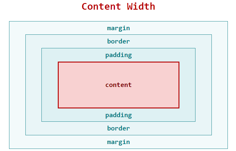
Understanding the Box Model is essential and necessary for limiting frustration when working with layout and positioning. It is one of the most fundamental concepts in CSS.
The box model is used to calculate the width and height of elements. It is a calculation step and not solely relied upon for determining the final layout and positioning of elements.
What you need to know:
Every element in HTML is a rectangular box. Each box has four regions defining the margin, borders, padding, and content areas of an element.
By default, when you set the width of an element, this sets the width of the content area only. When you add padding, border or margin to an element, this is added in addition to the width. In practical terms this means that two elements with a width of 50%, will not fit side-by-side if padding, margin or borders are added.
That's it! It’s pretty simple right? So why is this often a source of confusion? Well, you might have encountered a few situations where things seem to behave a little differently…
Fill Area permalink
When you set the background of an element this fills not only the content area but also the padding and border areas as well.
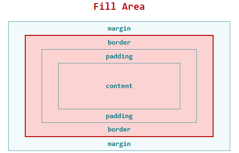
Conceptually we think of an HTML element as a single thing, so it's easy to think that the visual boundaries of an element are equal to its width however this is not the case. Although the visual boundaries of an element include the padding and border areas the width property is applied explicitly to the content box.
Note: Altering the box-sizing property can change this behaviour.
Width Auto permalink
Another source of potential confusion is how width: auto works. A width of auto is the default setting for most HTML elements and for block elements such as divs and paragraphs, auto will calculate the width so that the margin, border, padding and content areas combined all fit within the available space.
In this situation it can feel like adding padding and margins push inwards on the content, but in reality, the width is being recalculated to ensure everything fits. By comparison when setting a width of 100%, the content area will fill the space available regardless of margin, padding and borders.

Box-sizing permalink
The box-sizing property changes the way the box model works. When box-sizing is set to border-box padding and border will reduce the inner width of the content area, rather than adding to the overall width of an element. This means that a width of an element is now the same as its visual width.
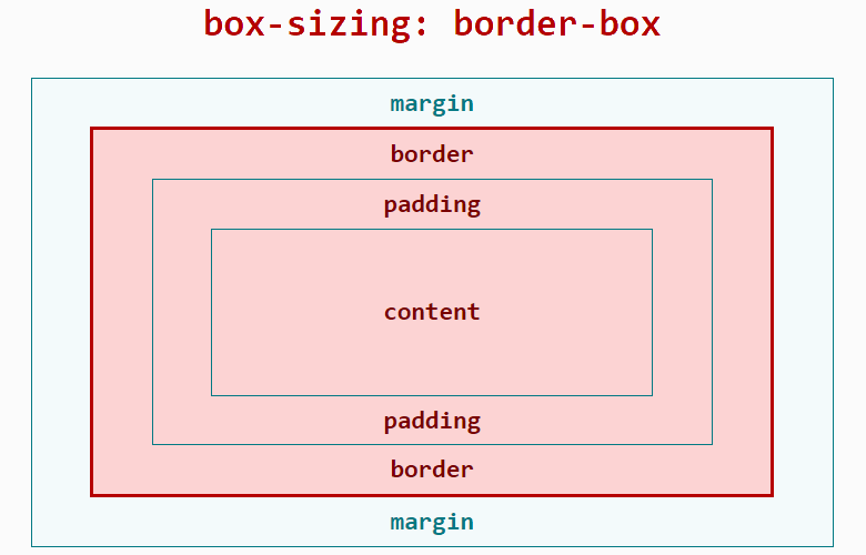
A lot of people prefer this, and if you're building a grid system, or any other kind of layout that requires aligning items horizontally, this can be much more intuitive way to work.
Collapsing margins permalink
It can be really confusing when margins collapse unexpectedly and you don't know what is going on. Margins will sometimes collapse when two or more adjacent vertical margins touch and they are not separated with padding or border. A collapsing margin can also occur if the margin of a child element extends into that of its parent and is not separated by padding.
Margins will not collapse if elements are absolutely positioned, floated, or have a different formatting context, as well as in a few other less likely situations.
If you're confused that’s ok. The rules for when margins will and will not collapse are complicated. The main thing you need to know is when elements don’t have padding or borders, vertical margins can collapse.
If you need more detail CSS Tricks has a wonderful explanation of collapsing margins.
The Visual Formatting Model permalink
While the box model calculates an element's dimensions, it’s the Visual Formatting Model that is responsible for determining the layout of these boxes. The Visual Formatting Model takes into account the box type, positioning scheme, relationships between elements and constraints imposed by content to determine the final position and presentation of each element on the page.
What you need to know:
The visual formatting model traverses the document tree and generates one or more boxes required to render elements according to the CSS box model. The CSS display property plays a key role in determining how an element participates in the current formatting context and positioning scheme. Together these pieces determine the final layout and positioning of elements.
This is a complex step and was by far the most difficult to try and summarise. If you don't follow everything that’s ok. Understanding how we manipulate positioning schemes and formatting contexts through the CSS properties is a good start. If you can follow the interplay between different pieces of this model you are doing better than most. At very least you should know that they exist.
Display types permalink
We know that setting the display property in CSS determines the how an element is rendered but it's not immediately clear how this works. In fact sometimes, it can even seem unpredictable.
This is because the display property determines the element's 'box type’. This hidden property consists of an inner display type, and an outer display type which together help determine how the element is rendered.
The outer display type usually resolves to either 'block' or ‘inline’ and is pretty much consistent what you expect of theses display properties in CSS. Technically speaking the outer display type dictates how an element participates in its parent formatting context.
The inner display type determines what formatting context that element will generate. This will impact how its child elements are laid out.
Think of how a Flexbox container works. Its outer type is block and its inner type is flex. Its children can also have an outer type of block, but their layout is influenced by the formatting context of the Flexbox container.
One way of thinking about this is that the responsibility for display is shared between an element and it's parent element.
Formatting contexts permalink
Formatting context are all about layout. They are the rules that govern the layout of elements inside a container and how they interact with each other.
Some formatting contexts can be established directly on containers such as through the use of display values flex, grid or table. Other types such as block and inline formatting contexts are created as required by the browser.
Note: At one time, because of the way it interacts with floats, it was important to understand how to make the browser establish a new block formatting context. Elements with a block formatting context will contain floats. This is not as important today as it once was. In fact it's not even how modern clearfix techniques work.
Positioning schemes permalink
A box can be laid out according to one of three positioning schemes. These are Normal flow, Floats and Absolute positioning. You are probably familiar with floats and absolute positioning because we interact with these more directly when writing CSS. Normal flow is just a name for the default positioning scheme when an element is not floated or positioned.
Normal flow permalink
Normal Flow describes the default positioning scheme and 'in-flow' describes elements that conform to this. You could consider in flow to be the natural position of elements laid out according to their source order and formatting context.
Floats permalink
Float is a CSS property that causes an element to be taken out of the normal flow and shifted to the left or right as far as possible, until it touches the edge of its containing box or another floated element. When this happens, text and inline elements will wrap around the floated elements.
Normally if not set, the height of an element will adjust to fit all of its descendant elements. When elements are floated they are taken out of flow and this means containers will not adjust their height to clear them.
It is this behaviour that allows multiple lines of text, heading and other elements to fluid wrap around floated content. But sometimes this is problematic. Clearfixes and establishing a new block formatting context will causes a container to clear its floated children. This technique has allowed floats to be used for layout which has been a corner-stone of web development techniques for a long time. It's still important to know but this is gradually being replaced with newer layout techniques such as Flexbox and Grid.
Absolute positioning permalink
Elements with absolute positioning are removed from the flow entirely and unlike floated elements they have no impact on surrounding content.
A container with relative positioning allows you to control the offset of descendant elements using absolute positioning.
Relatively positioned elements can also be given an offset but this offset is relative to the element's normal position not another relative container.
CSS properties top, bottom, left and right are used to calculate 'box offsets'. These properties are not two dimensional offsets but allow positioning of each edge, relative to its container’s content box.
Positioned elements with overlapping offsets can result in elements occupying the same space. A stacking context is used to resolve this.
Stacking contexts permalink
Stacking context determines the order that things are rendered to the page. You can think of a stacking context like a layer. Layers on the bottom of the stack are painted first and elements higher up the stack appear on top.
Placing a z-index on an element that is absolutely or relatively positioned is the most common way to establish a new stacking context. But there are a number of other ways a stacking context can be formed including, setting opacity, transforms, filters or using the will-change property.
Some of these reasons are not intuitive and have more to do with rendering performance than developers expectations. It helps to understand that these layers can be rendered separately by the browsers. As a result it can sometimes be useful to intentionally to create a new stacking context for performance reasons.
Setting a z-index has no effect unless a stacking context is established. The higher the z-index the higher up the stack the layer is placed.
One of the most confusing parts about stacking is that a new stacking context can be established inside an existing one. This means you can have layers of layers.
In this situation, it's not always a case of the highest z-index wins.
That's it! permalink
Almost 3000 words and I've only briefly touched some of the important hidden parts of CSS. If you’ve read this in full congratulations and please be sure to let me know, because you deserve some kind of reward!
If you've just read some parts that’s ok too. I hope I’ve managed to clarify something or give a general insight into the processes involved. It’s been a real challenge to explain this stuff in simple terms without sacrificing accuracy. I hope got it right.